Marketplace
The Problem
eGifter’s Marketplace was the first one on The Internet to accept Bitcoin to purchase branded gift cards. Therefore, the majority of the site’s initial users were “bitcoiners”, who are technically advanced and would suffer through clunky user interfaces and slow transaction speeds so long as they could convert their crypto into buying stuff they needed. The sentiment was: “As long as we can use our Bitcoin on everyday items, we'll find a way.” Being a crypto guy myself, I fully understand.
This is all well and good, yet eGifter needed to reach a wider audience for their own site as well as to make their Marketplace solution "White Label", thus allowing clients to license, brand, and use it for themselves.
With many of our components now in place through my Atomic Design deliverables, in addition to many features added via client work in my Gift Card Experience, it was time to carry it all over to The Marketplace.
As we can see, the Live UI was functional, yet showing its age. My first priority was to understand what we currently had, to leverage as much of it as I could while streamlining the whole platform for mass adoption. Being this was a live site, I had to keep in mind our current userbase in my redesign while making it modular, sleek, and clean. After much user research, it was clear the majority of our tech-savvy userbase were primarily using Android and Windows OS, so I decided my designs would extend Google’s Material Design, following UIUX best practices as the core.
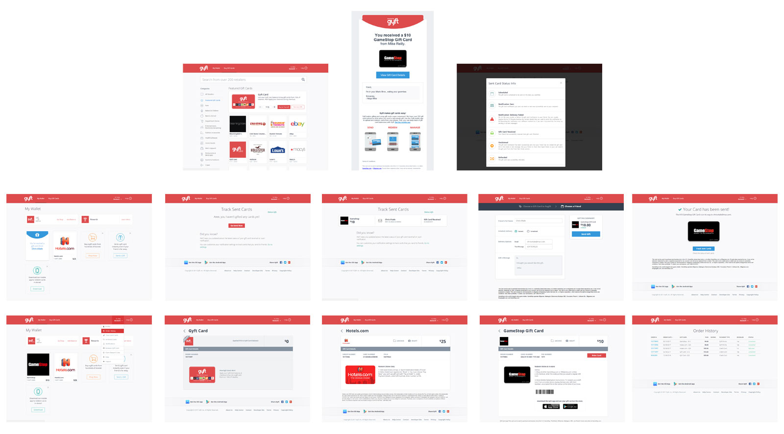
Gyft Competitive Analysis
One of the more mobile-friendly sites in the space was Gyft, and they had some feature sets that were analagous to eGifter's, albeit Gyft was more focused on B2C then B2B. Nevertheless, the benefits of studying their experience were clear, specifically when it came to their purchase flows and digital wallet.
Hotfixing The (old) Current Version
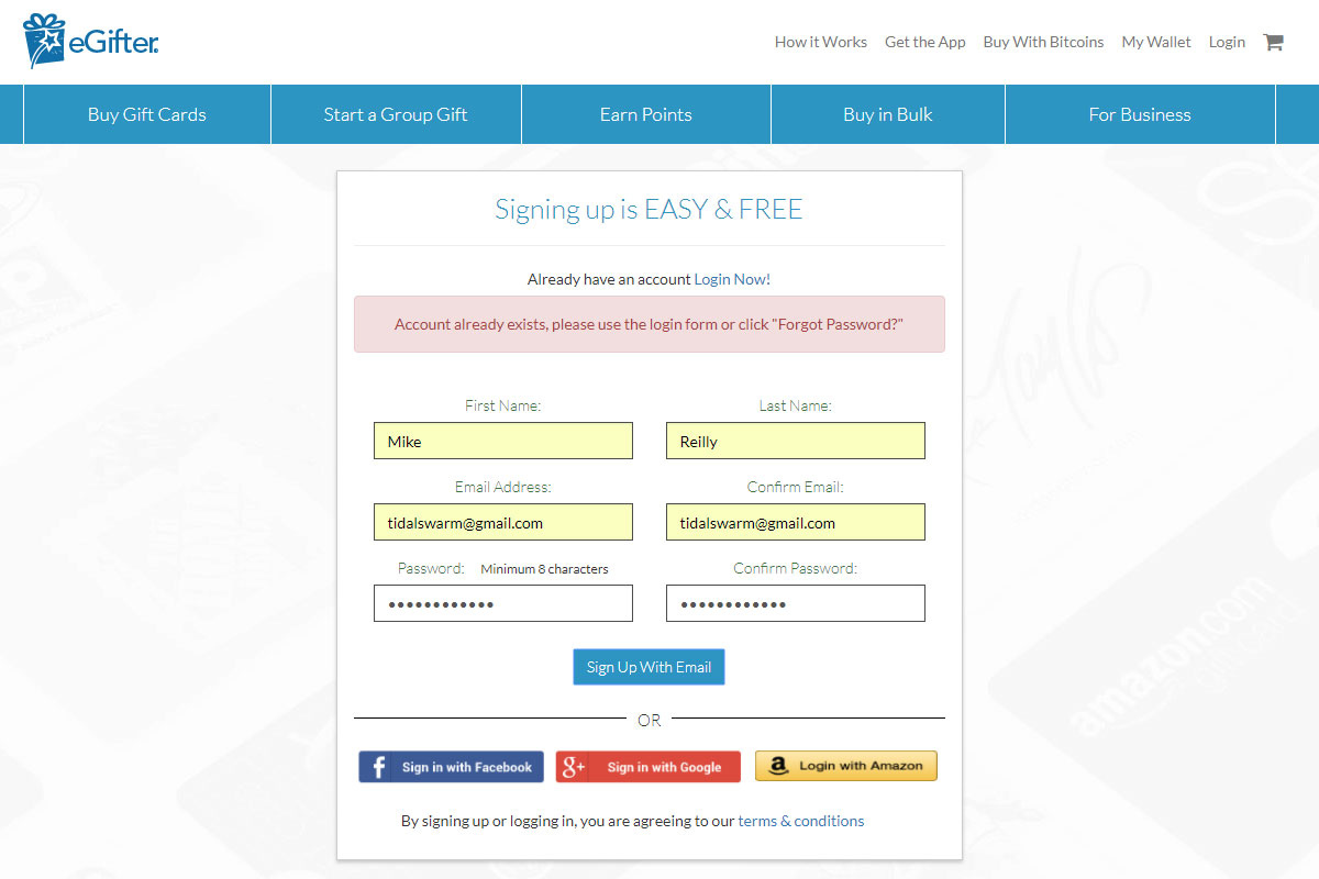
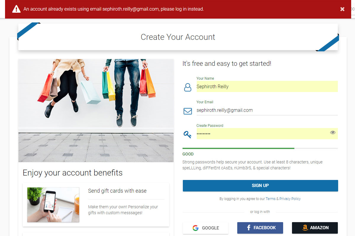
There existed an issue where the user would sign in using Facebook (or Google or Amazon) Login that had a particular email address, but then would not be able to create an account on the eGifter site using that same email address. Conversely, if a user created an account on eGifter before attempting to use Facebook, Google, or Amazon Login with that same email address, there would be two (or more) redundant accounts on the eGifter site.
Naturally, this created a whole load of confusion by itself. What’s worse, being that gift cards, account balances, and all user funds were associated to one email address and login method, in any of the above cases, users would panic by either not seeing their funds in their account or be frustrated by not being able to access them.
To stem the bleeding, and save our Customer Support many sleepless nights, I diagnosed and demonstrated the problem, then designed several solutions to help Development and Engineering solve this.
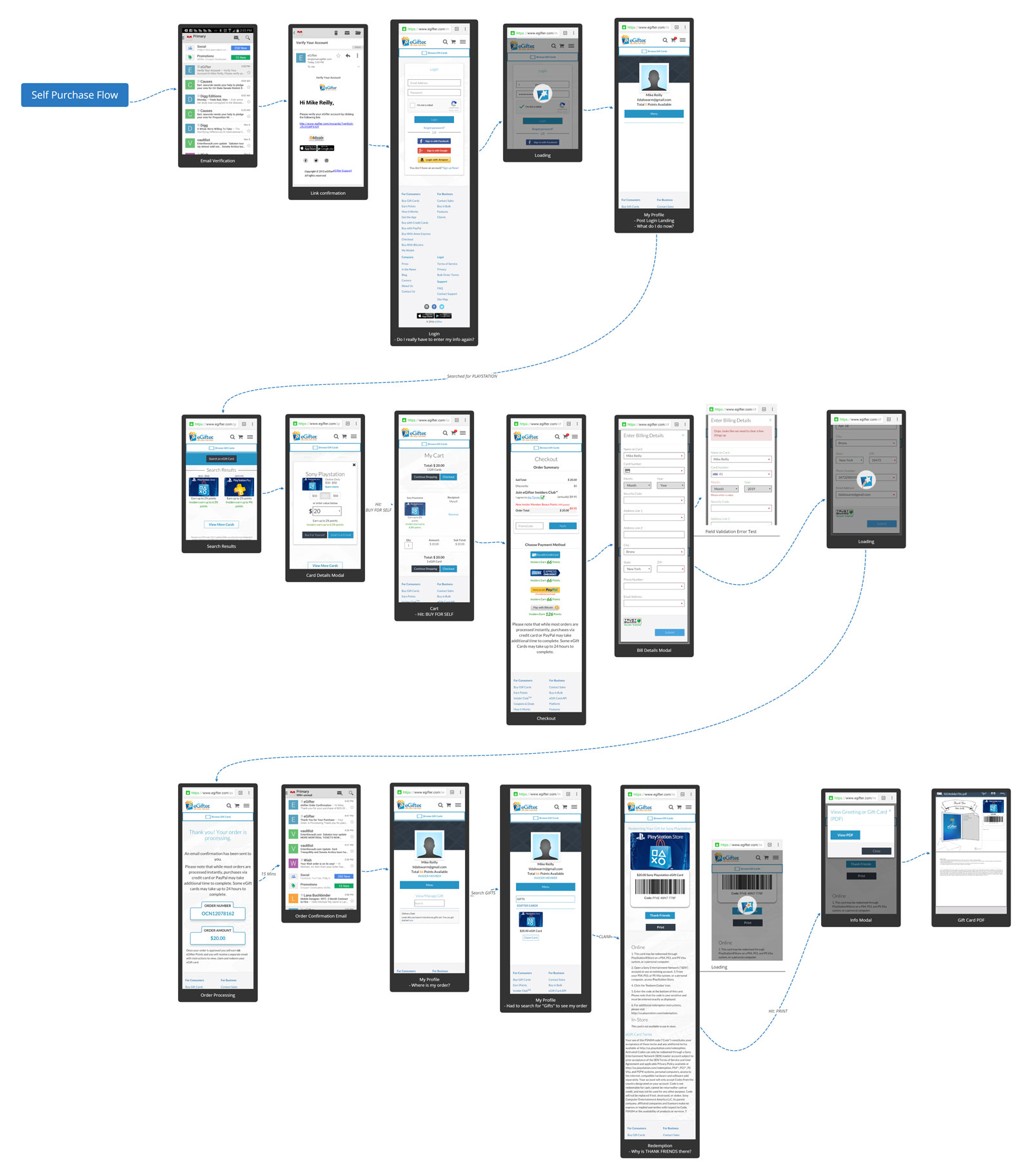
Diagnosis
Here I show where the pain points exist by flowing the stunted user journeys on email and Facebook Login paths
Play Prototype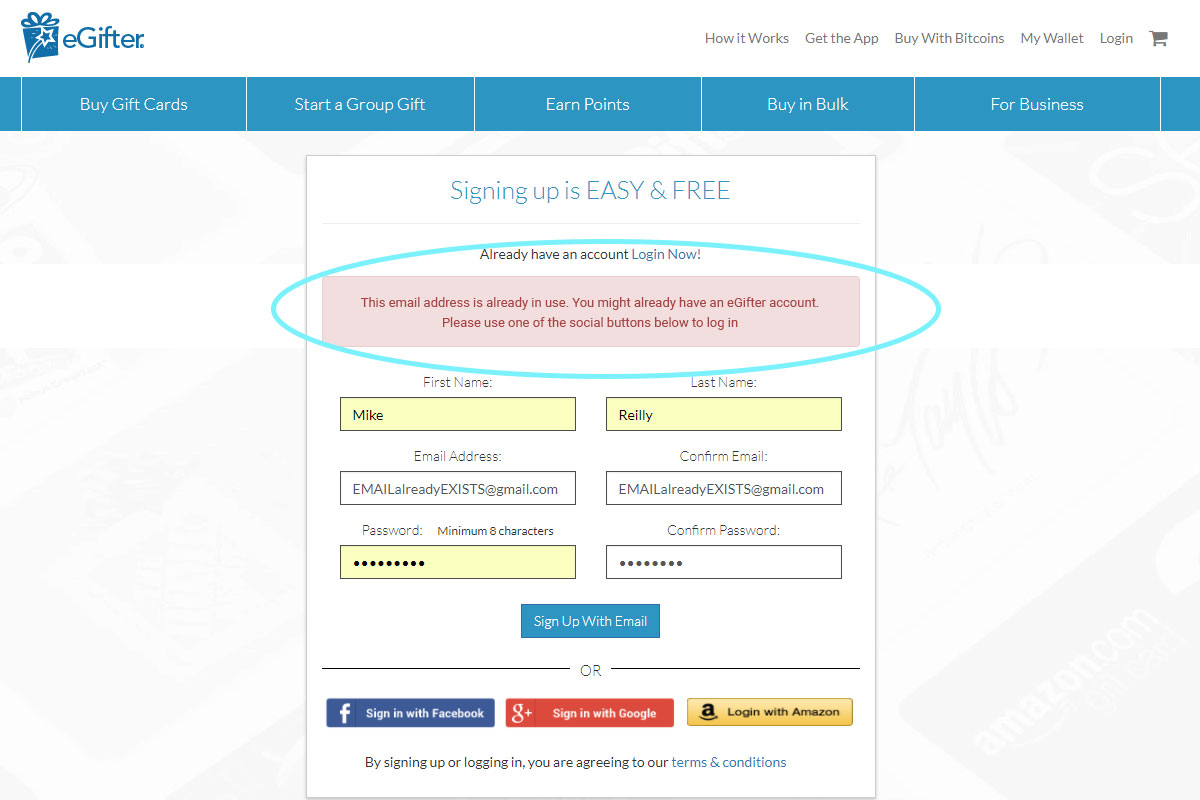
Solution: Prevention
First, we had to stop more of these redundant accounts (and support tickets) from being created to begin with
Play Prototype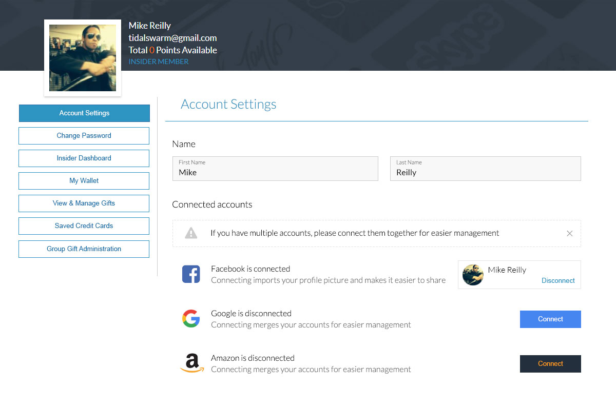
Solution: Linking Accounts
Second, we simply needed one screen with API calls to every login method so users can merge their accounts
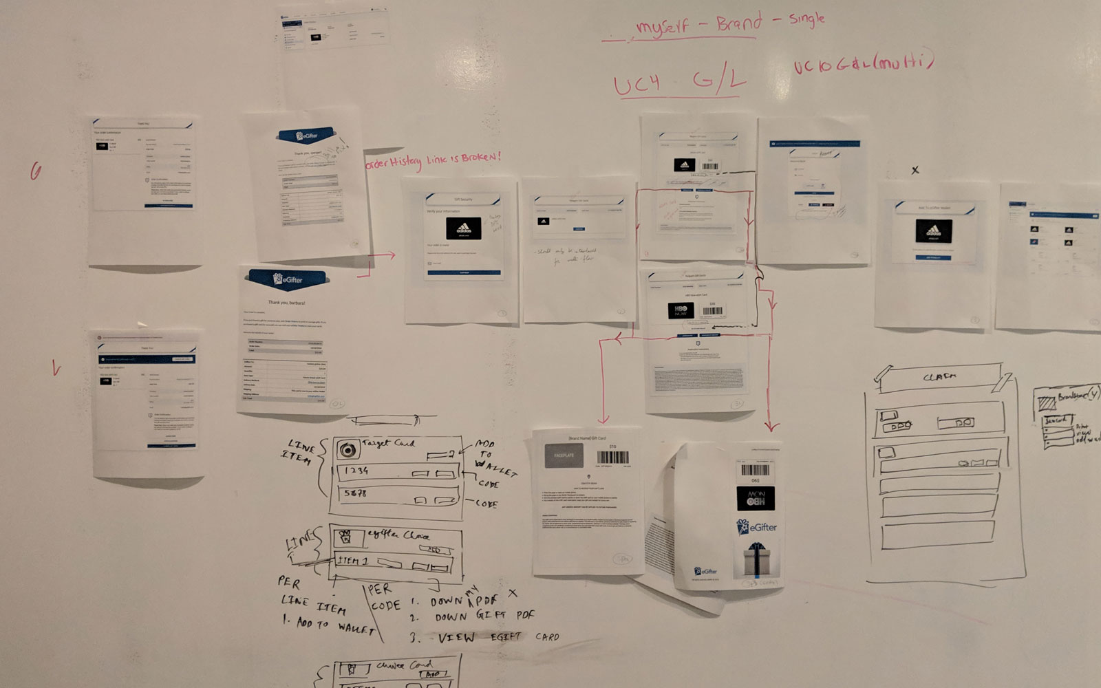
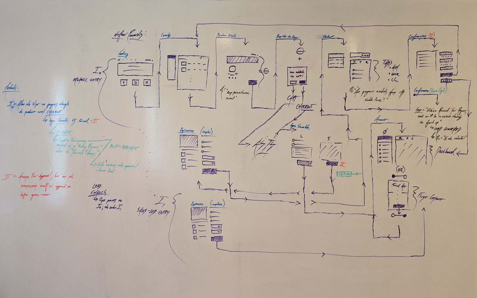
View ImageWhite Board Storm
Once the main features were outlined for the new Marketplace redesign, I gathered squad mates from Engineering, Development, Business, and Operations to zero in on several key areas to find alignment.
Factoring Rewards, Points, and Guests
Enjoy an insight to how my brain does things. Applying my Mathematics background to The Art and Psychology of UIUX, I factored in myriad variables, pathways, entry points, flows, and incentive methods. I solved how we would increase mass appeal, transactions, and conversions by supporting guest checkout while leveraging reward points using suggestive intentional flow stumbles with post engagement methods, such as retroactive email triggers. All the while, reusing components from other arms of the company I've designed to make it clean to use and efficient to build.
Testing Layouts
Everything was on the table. We iterated through the brand panels, flags, top navigation, categories, and whether we should go with a liquid layout or a container with a maximum width. We also took a look at whether we should allow the user to open more than one brand panel at once or have them as a floating panel overlay.
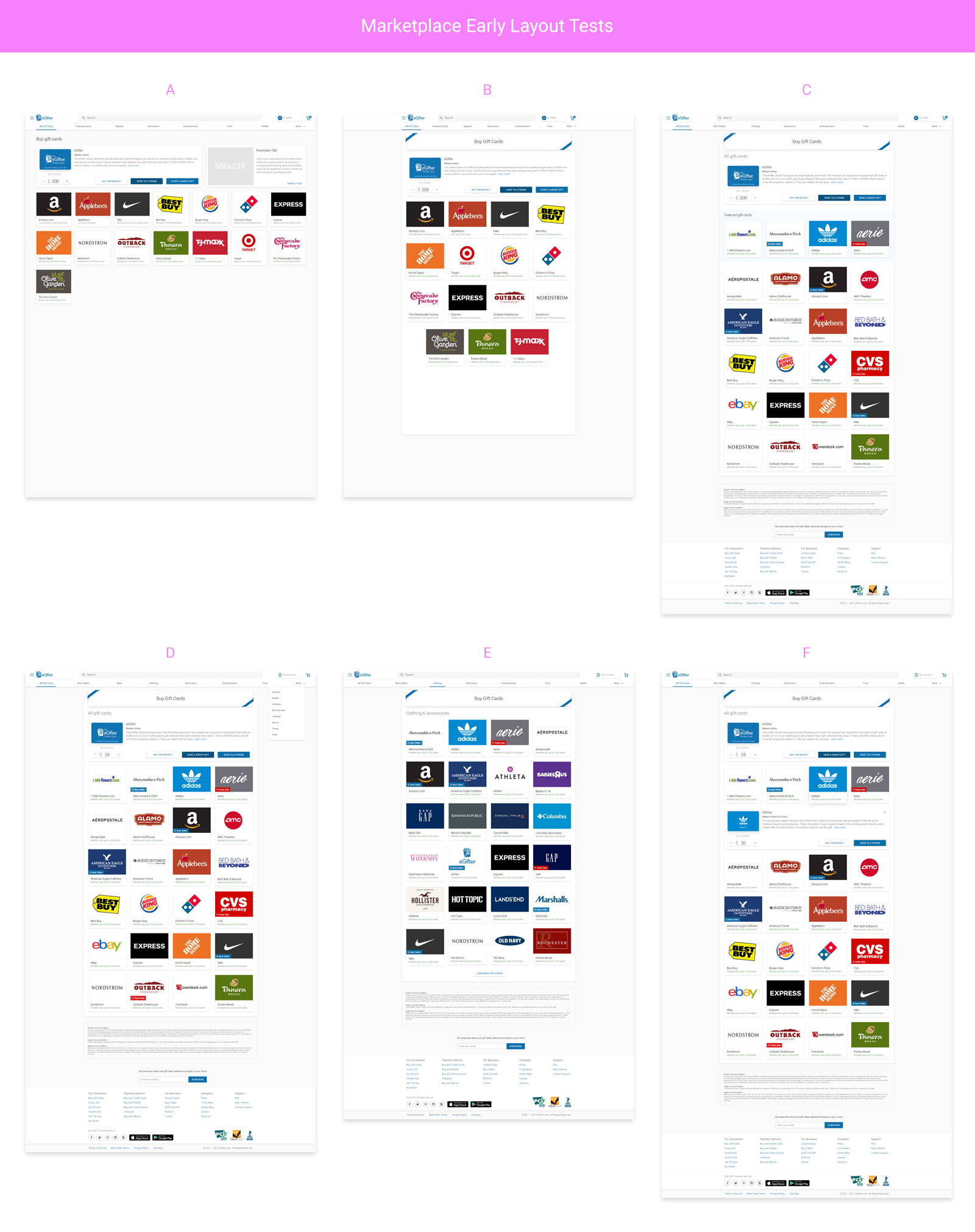
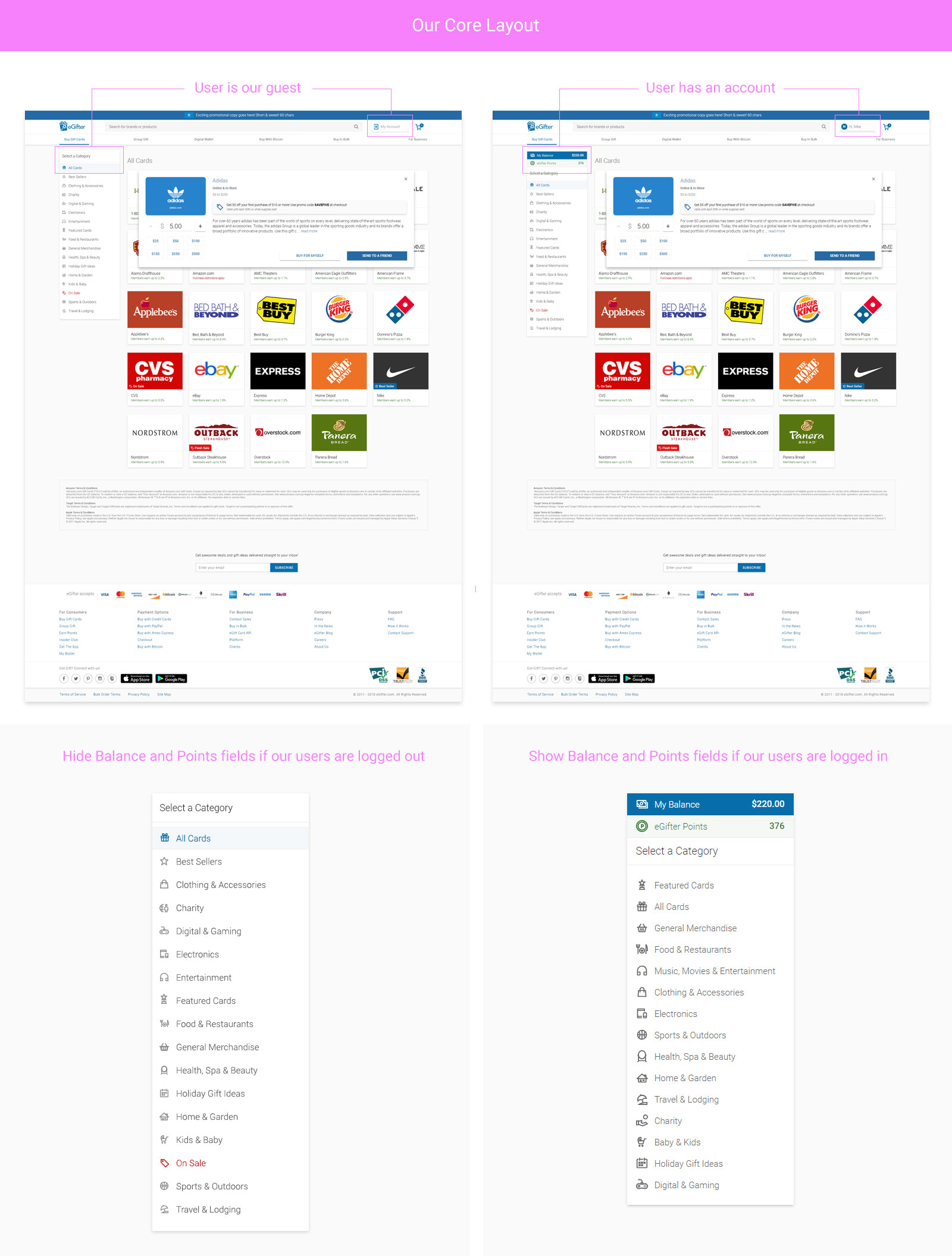
The Winner
Upon much user testing and cool comparison, we found the emergent winner. The left navigation panel would collapse behind the mobile navigation and we would add "account balance" and "reward point balances" at the top of the left menu panel, which would be contextually driven.
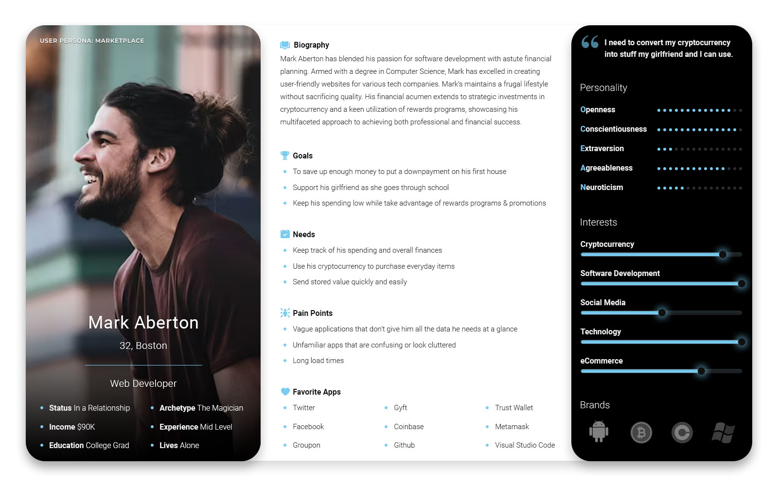
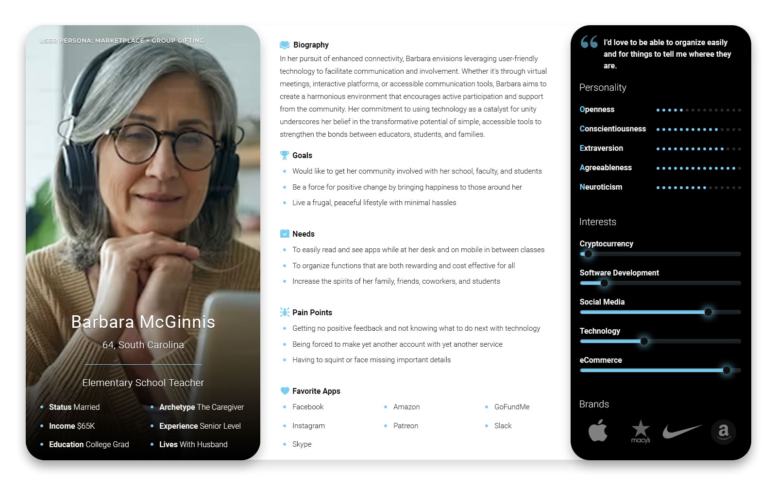
Main Personas
Given that the majority of the live v.1.0 Marketplace's installed userbase were technically advanced bitcoiners, Mark served as the representative for our criitical core audience. Then I added Barbara as his diametric counterbalance to represent users when designing for mass appeal. Naturally, if you create a product even grandma can use, you win.
Marketplace Material
Leveraging Material Design principles throughout the design process, I designed our White Label Marketplace solution with our users, personas, clients, and accessibilty compliance all in mind. Through iteration, fine tuning, and meetings with cross-disciplinary members from Engineering, Development, Business, Operations, and Customer Support, my designs balanced cleanliness, minimalism, and familiarity to the Android and Google user interface guidelines.
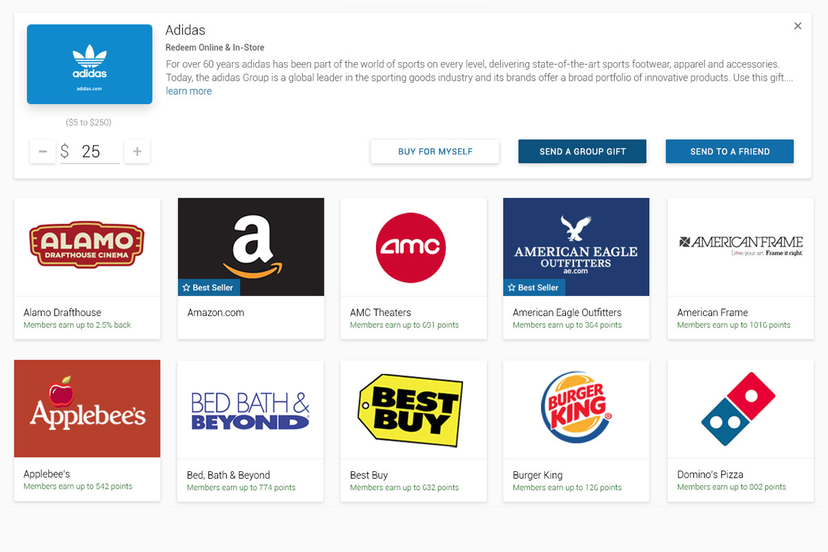
Adding Cart Items
Laying out the initial iteration of the white label marketplace using Material Design principles
Play Prototype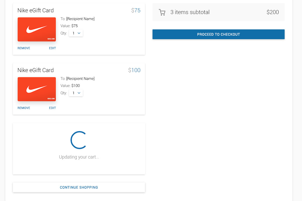
Fluid Cart Focus
Streamlining the cart with asynchronous updating, line item removal, quantity selectors, and so forth
Play Prototype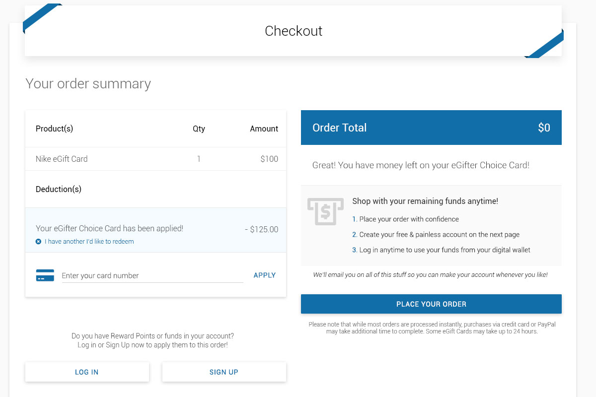
Surgical Checkout
Fine tuned attention to detail to handle preloaded funds, special cases, validation errors, API calls, etc.
Play PrototypeAuthentication: Method A vs B
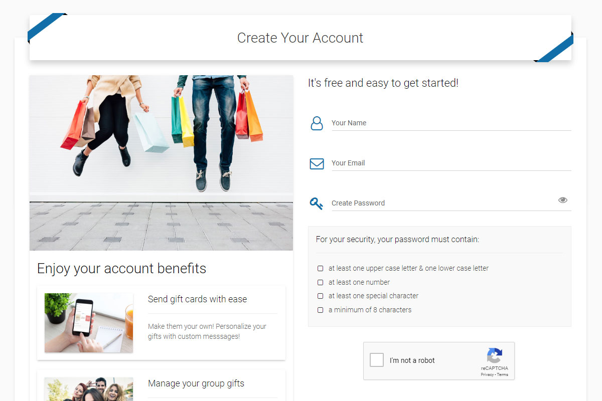
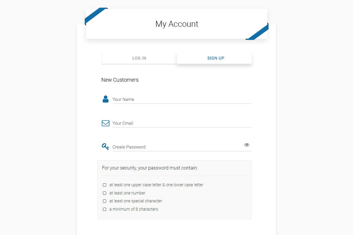
While I was at it, I took this opportunity to design the Log In and Sign Up screens, presenting them to our users and my team to decide which style worked best.
Evolving The Solution Forward
We took the lessons learned from our account hotfix and applied them to the new authentication screen designs.
Resolution: Prevention Wins
Here we see a sample of my user acceptance testing (UAT) run, ensuring we hit our mark with my new platform design
Play Prototype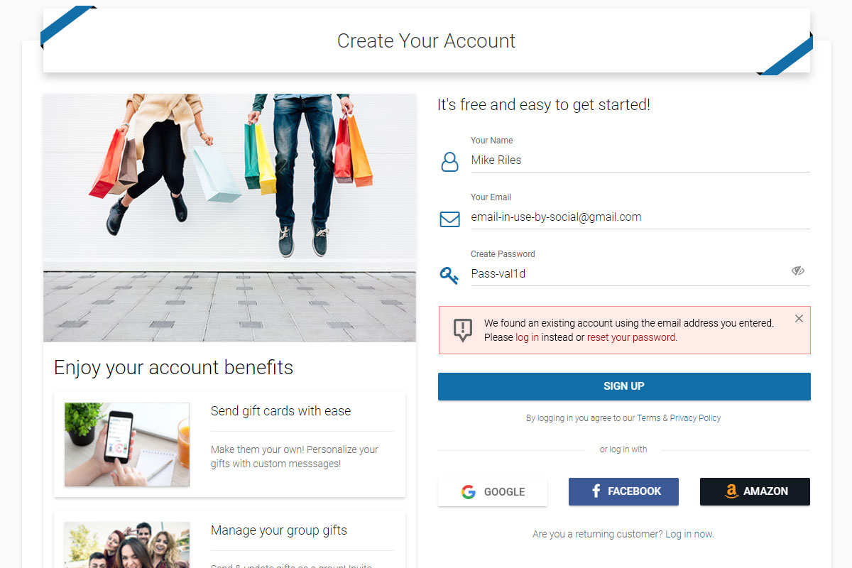
Email Check Warning
When finding an existing account with an email address, users were informed to take the right path
Play Prototype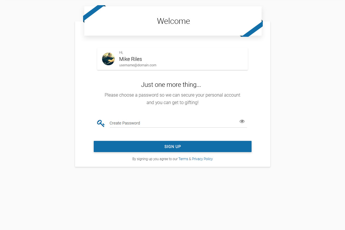
Social Login Accounts
By prompting users with social accounts to create a password, we reduced redundant accounts
Play PrototypeSitewide Search
Check out several early iterations of how we tested to extend the search to be more user friendly
Global Search Skeleton
Populate to search in runtime to give users hints as to what data they can search for
Play Prototype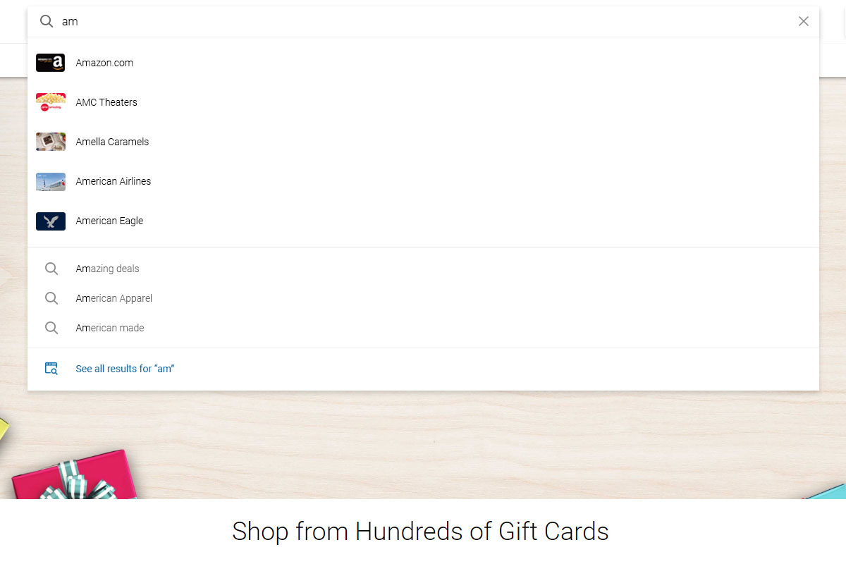
Categorical with Typeahead
Listing categories and brands with suggestive autofills as users enter text
Play Prototype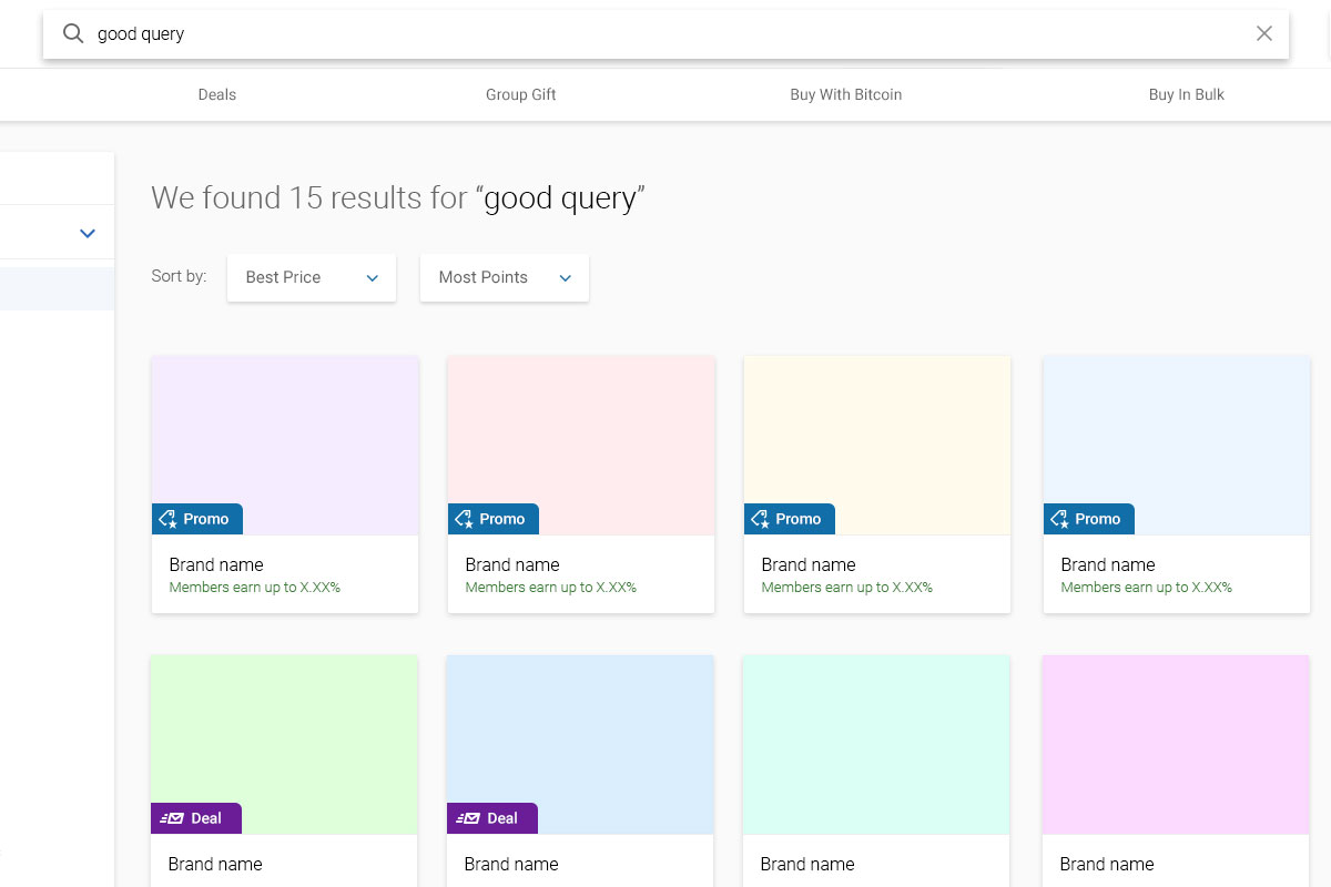
Assistive Method
Another method of giving users subtle hunts and suggestions to improve their search
Play Prototype
Search Bar with Paths
One way to have the search bar front and center balanced by buttons we want them to glance at
Play Prototype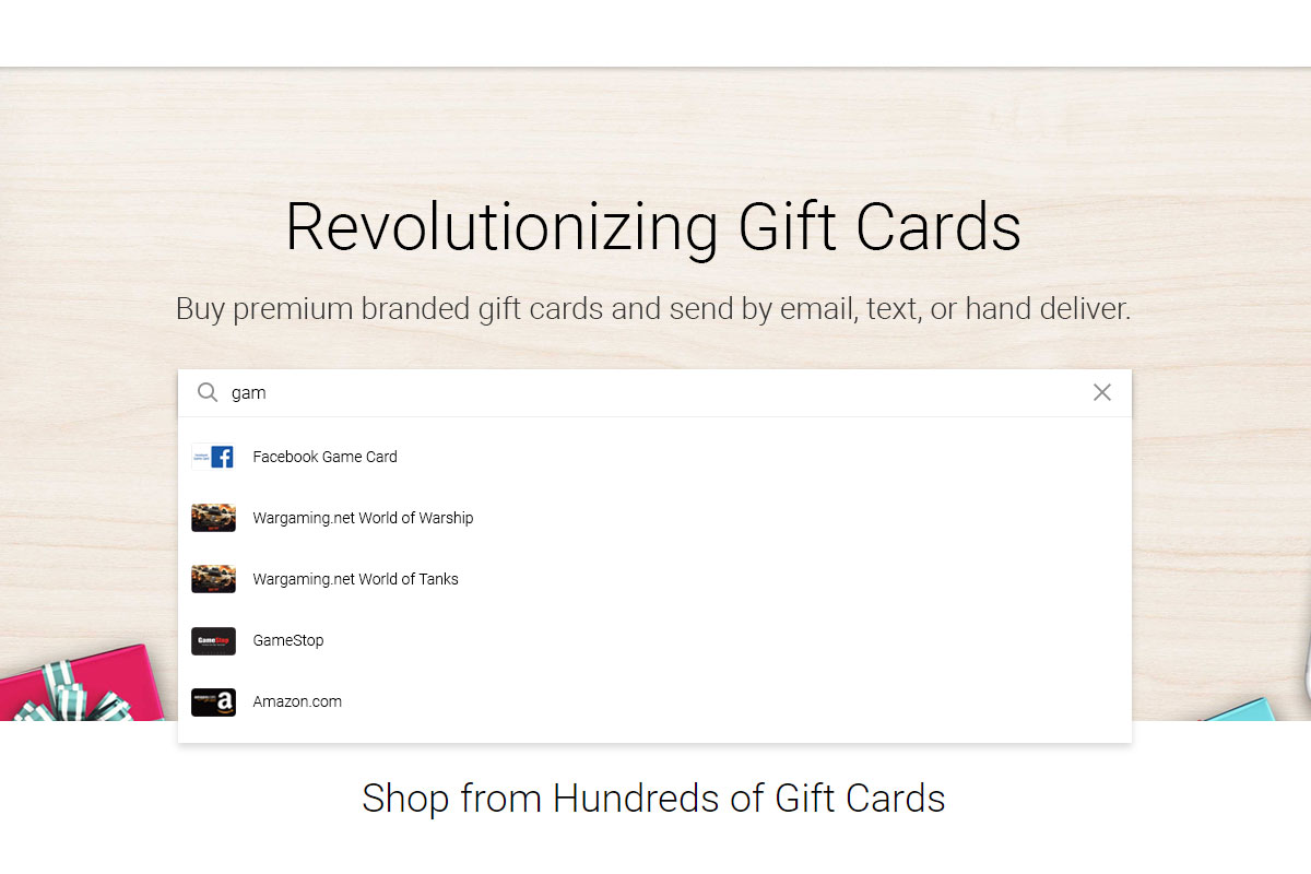
Search Bar Alone
Clearing everything away to make room for a more prominent search bar
Play PrototypeMarketplace Drafting
Then came designing several core areas, from payment methods, the cart, and the critical checkout
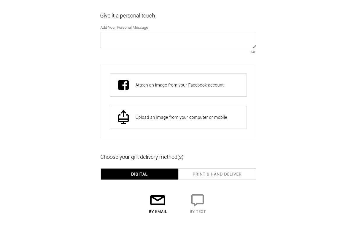
Adding Facebook Image
A lo-fi flow on how to import Facebook albums and images and use them on the platform
Play Prototype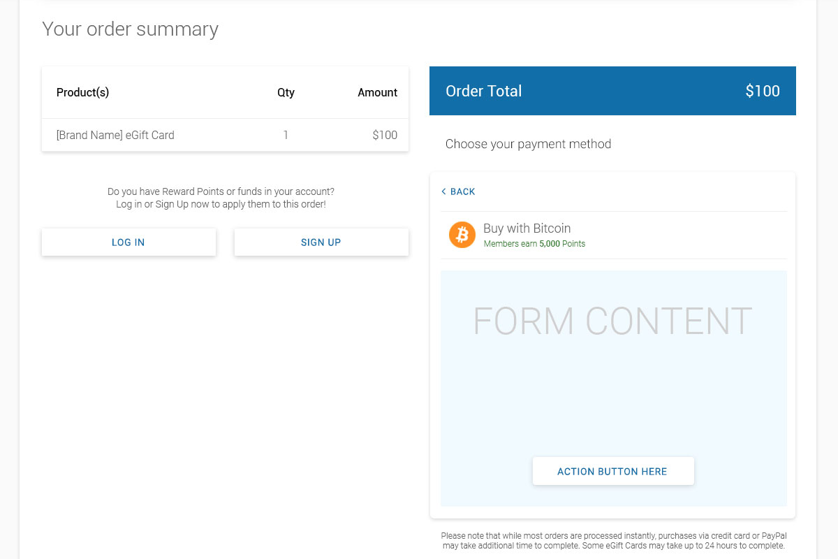
Stacked Payment Methods
When giving users many payment options, here's how to handle many of them
Play Prototype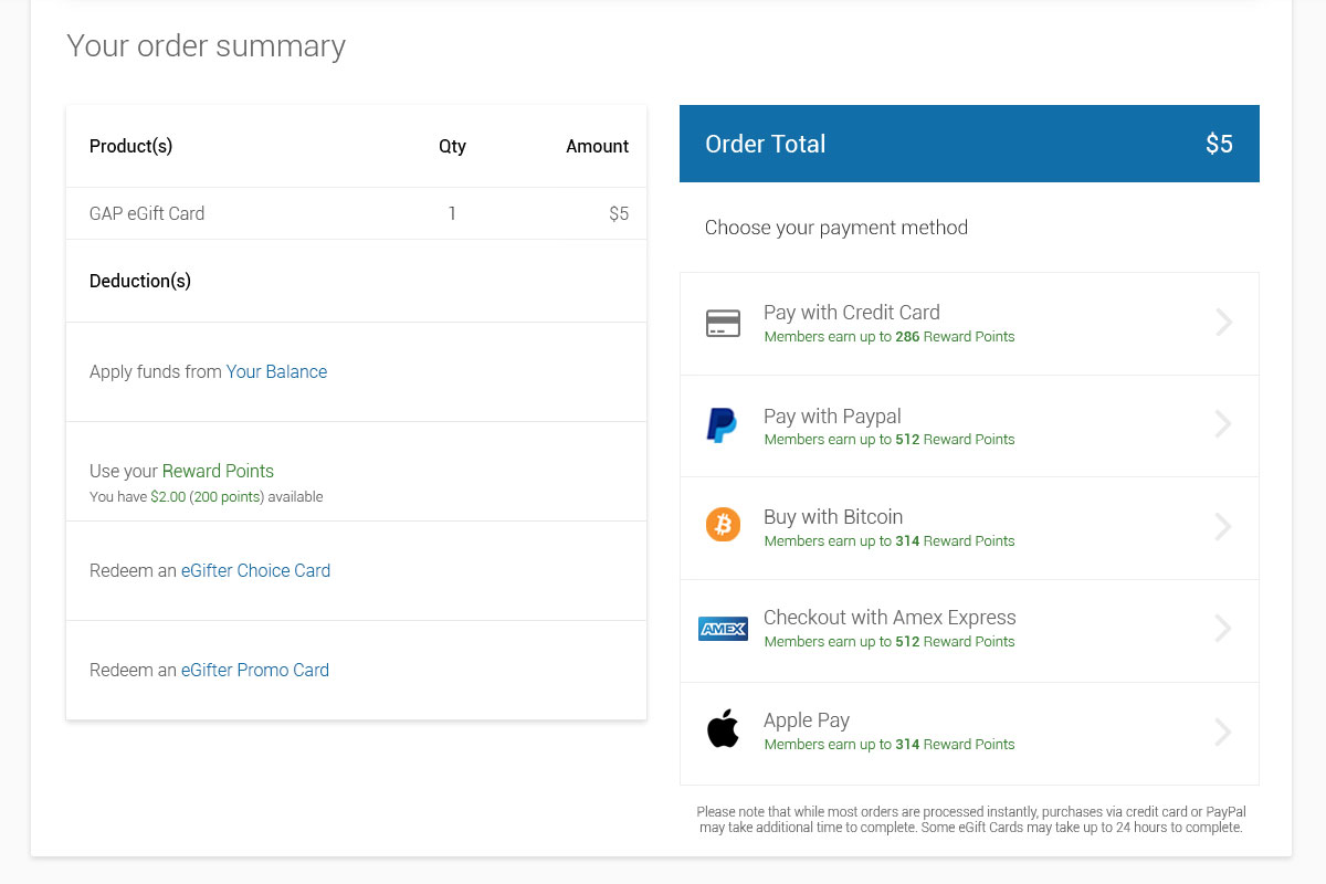
Promo Applied at Checkout
Redeem a promo card seamlessly, then order when your balance is zero
Play Prototype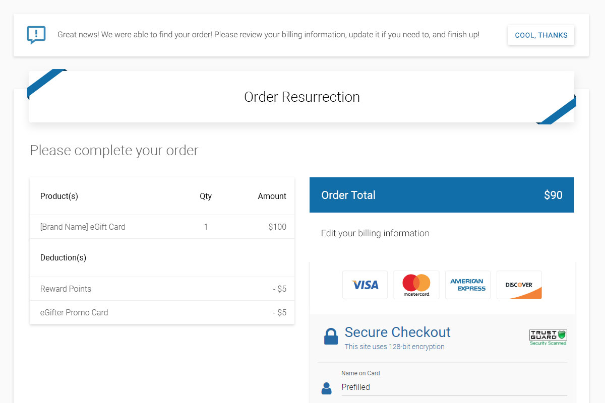
Resurrecting Orders
How to bring users back to complete their order when there's a credit card payment error
Play Prototype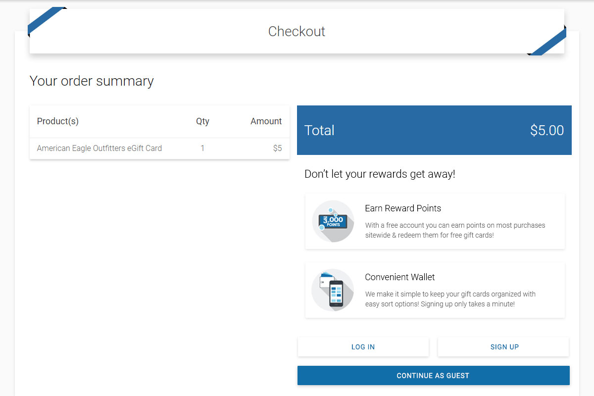
Guest Checkout
Do you really need another account? Yeah, me neither, unless I can see good reasons
Play Prototype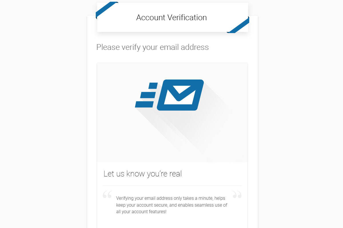
Account Verification
The subtle art and sweet science of creating an account without creating an account
Play PrototypeSupportive Patchwork
As I designed solutions for one use case after the next, handling platform upgrades both small and large, we always had room for fine tuning and further tightening, espcially when they helped our customers and support staff.
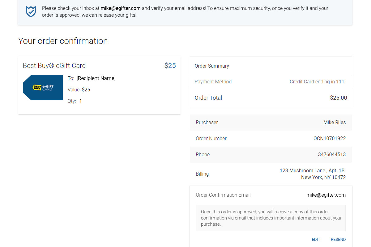
Confirming Order Confirmations
Customer Support was getting hit with users not receiving their order confirmation due to typos in their email address. This fixed it.
Play Prototype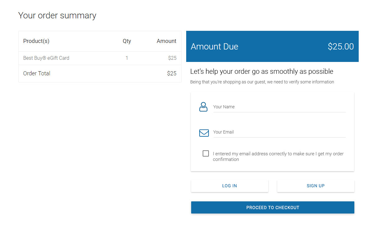
Capturing Guest Emails
Rather than making guests type their email twice (or copy-pasting their typos) this one checkbox cut down support tickets dramatically
Play Prototype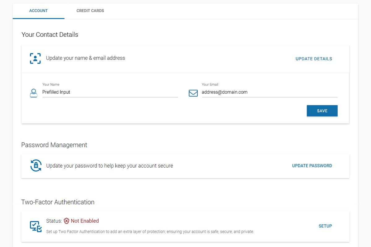
Updating Account Email
One quick uniform panel, some prefilled inputs, and a quick success alert is all it takes to reassure account security
Play Prototype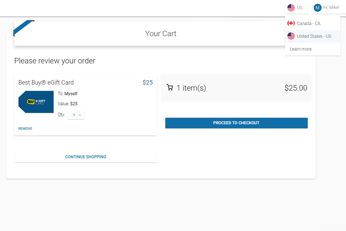
Switching Countries
When international business rules prevent users from mixing their cart across nations, a head’s up is in order
Play PrototypeSpecial Checkout Rules A vs B
At times there were special case cards, business rules, or both that could prevent our users from completing their purchase. Rather than having the user double back or second-guess anything, we found simple ways to give the user the ability to remove speedbumps without ever leaving checkout.
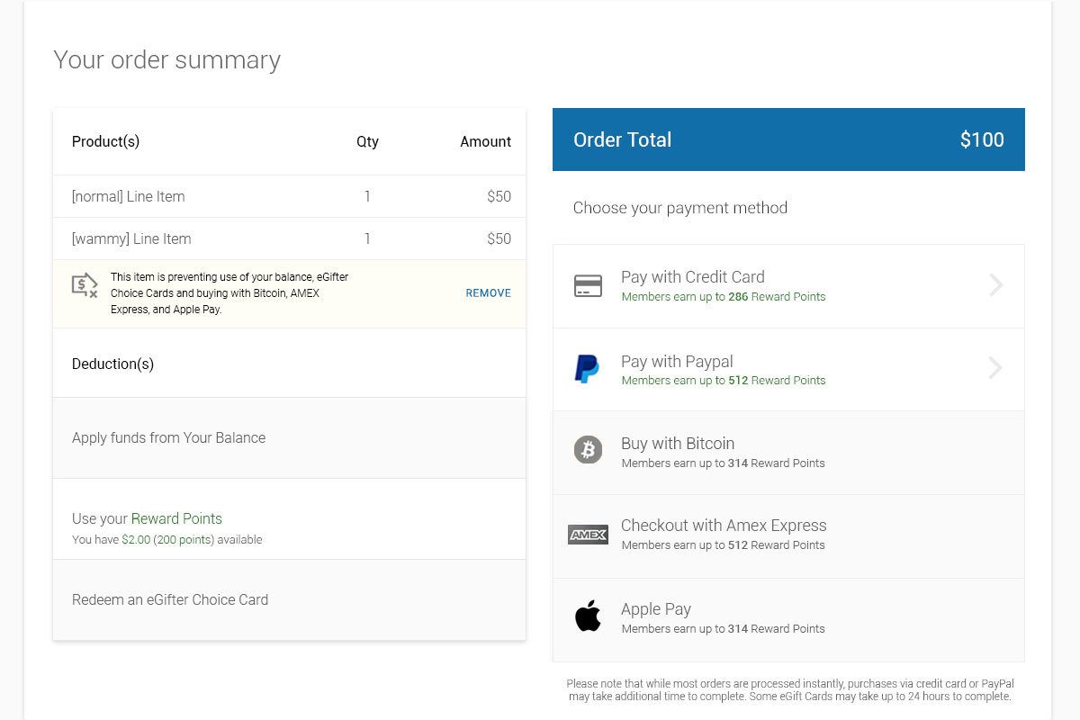
Clear Wammies A
Error object removal and lingo in the case we knew what was deactivated
Play Prototype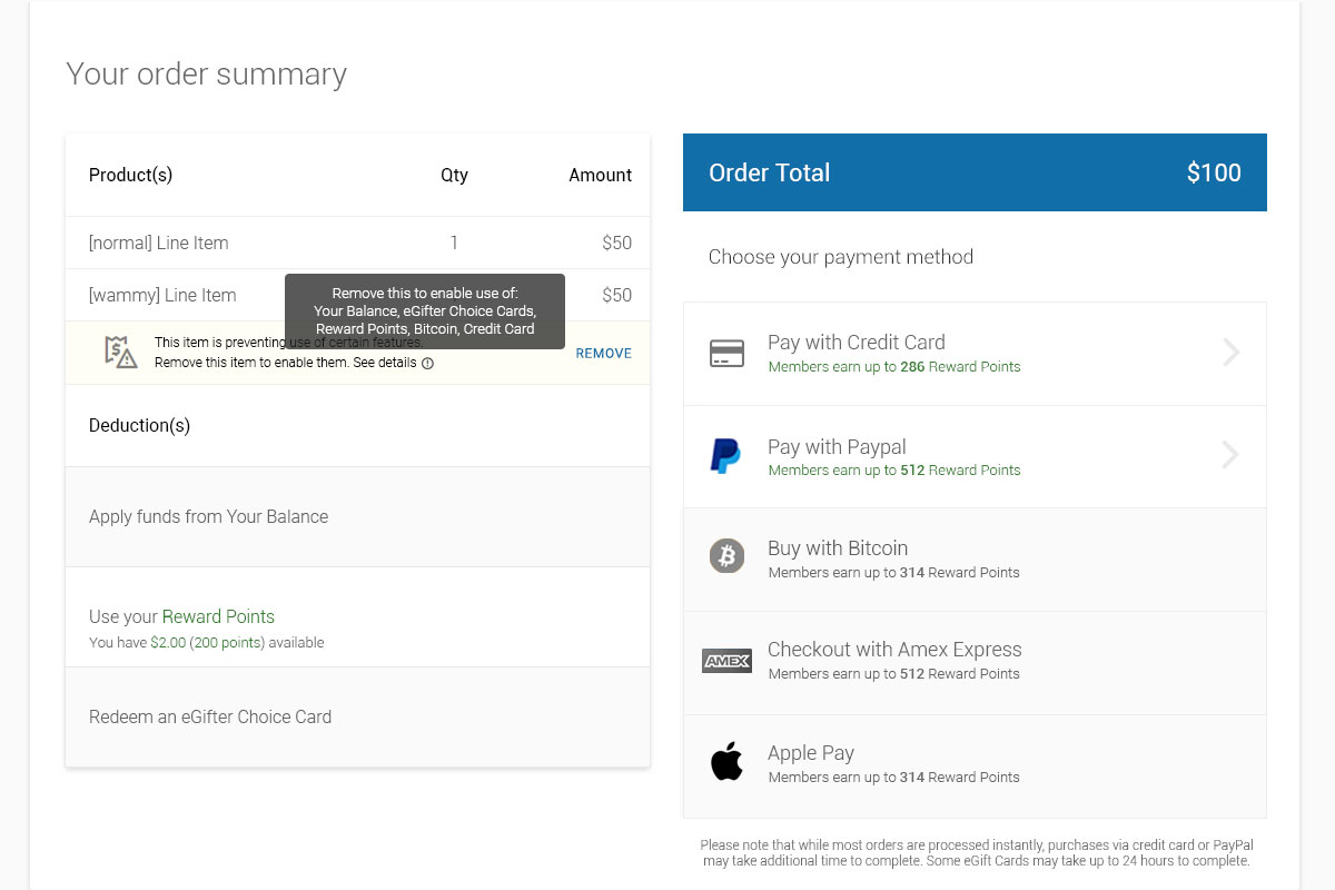
Swapping Brands - Iterative Fine Tuning
Another innovative step forward that allowed our users to change their gift card brand on the fly, before redeeming their card's value. Here I made three possibilities, each one getting closer to making it to The Source of Truth.
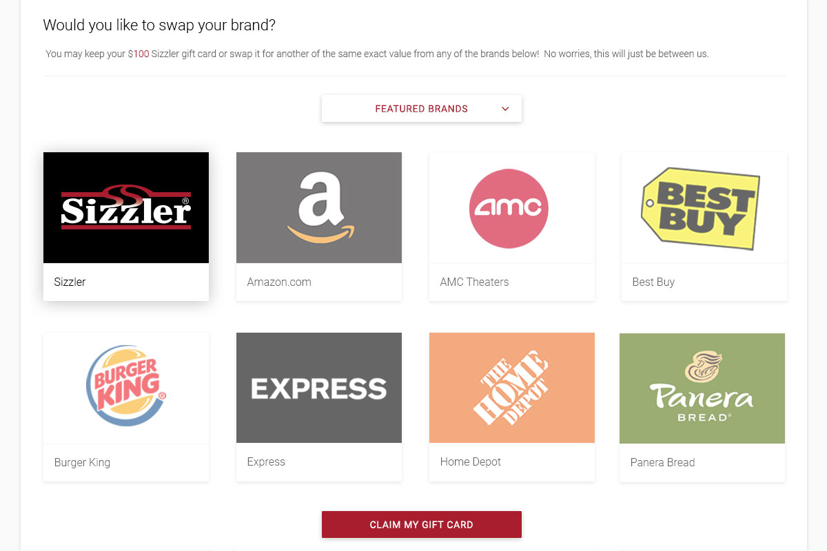
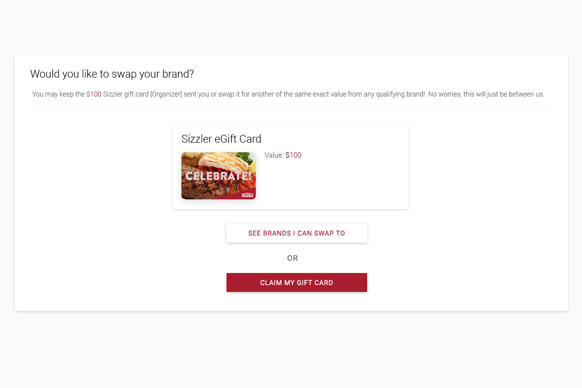
Brand Swap v.1.1
A simpler style that explicitly states your current gift card brand and its value
Play Prototype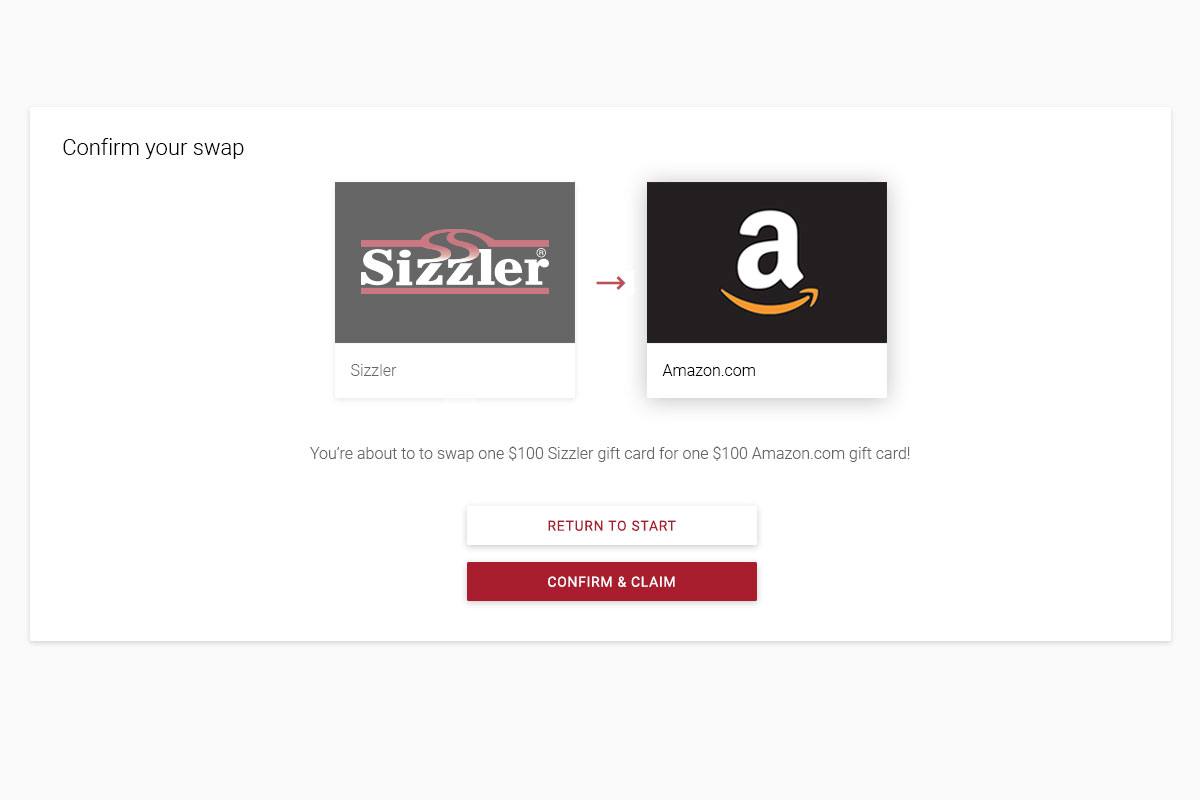
Brand Swap v.1.2
A more explicit, easier to see brand swap with a checkmark and confirmation
Play PrototypeGift Status - Interpersonal Clarity
In preparation for my The Digital Wallet designs, we wanted to associate gift cards with friends, family, and others for a more social experience. From repeated use, it became clear that there were certain actions users would take given the gift card's status, whether it was claimed or not, in processing limbo, stored away, and so forth. Additionally, sending value back and forth would now have a more personal feel.
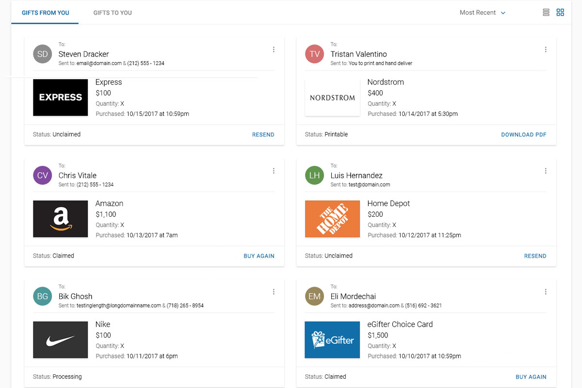
Gifts From You
The contextual flat action buttons on each card panel either addressed user pain points or gave convenient fast actions
Play Prototype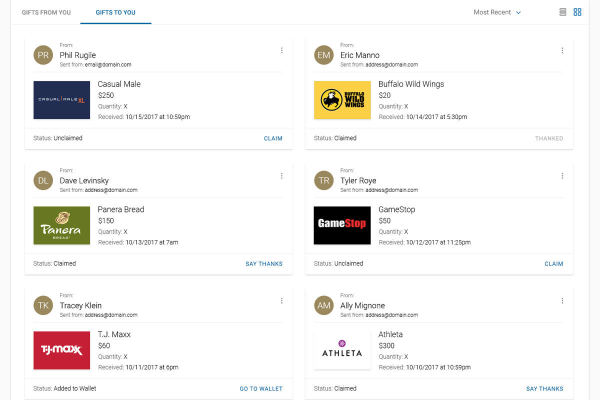
Gifts To You
Tracking who sent you value would encourage reciprocation, gratitude, and loyalty. Plus it's just cool to see beyond money
View ScreenPromotion System
Designing and evolving both The Marketplace and Gift Card Experience simultaneously proved advantageous, seeing as they would inherit from one another, each benefitting from all the knowledge and efficiency gained through our journey.
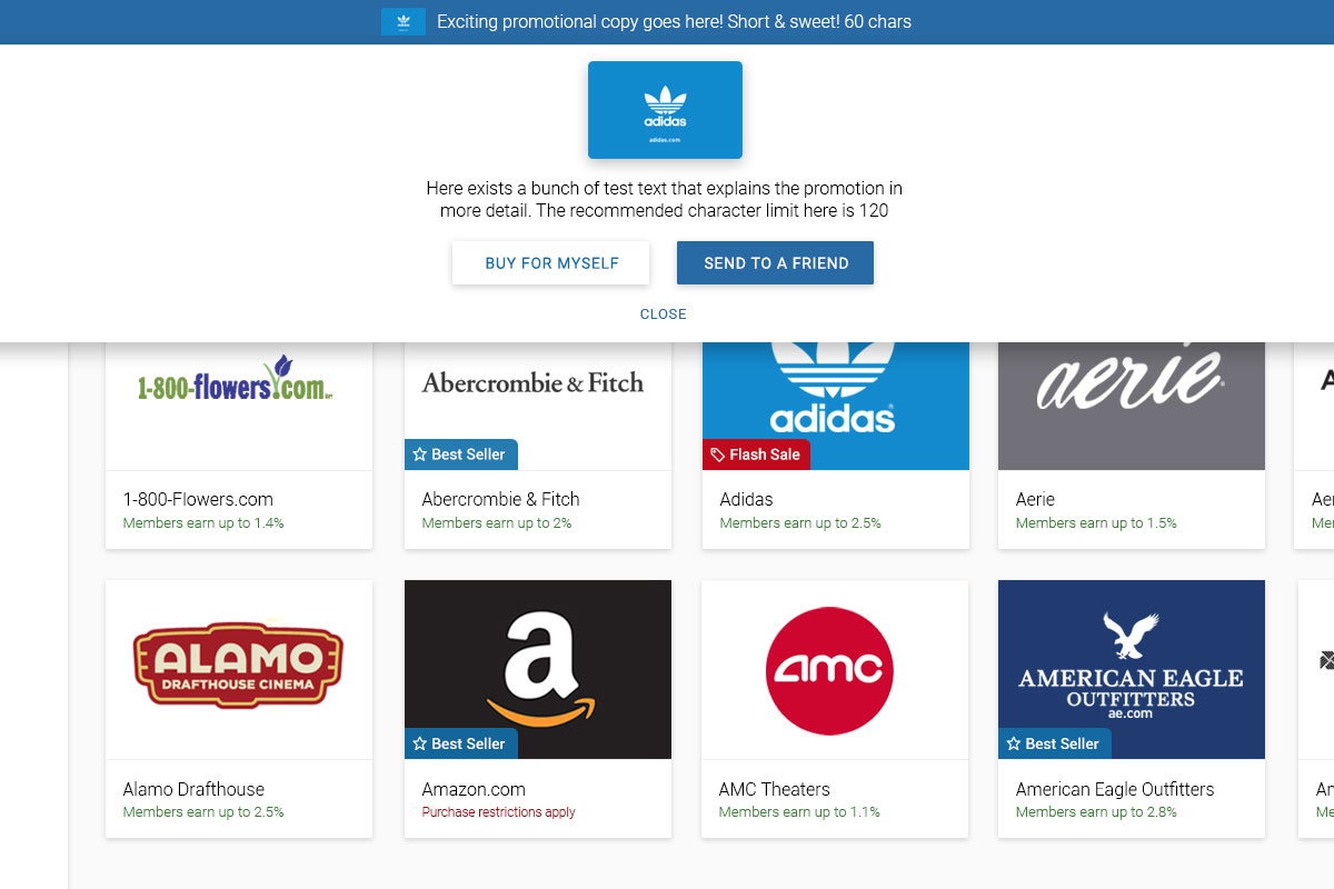
Sales and Codes
Adding "Flash Sale" flags on brand tiles while handling the tricky "promo code" field at the shopping cart
Play Prototype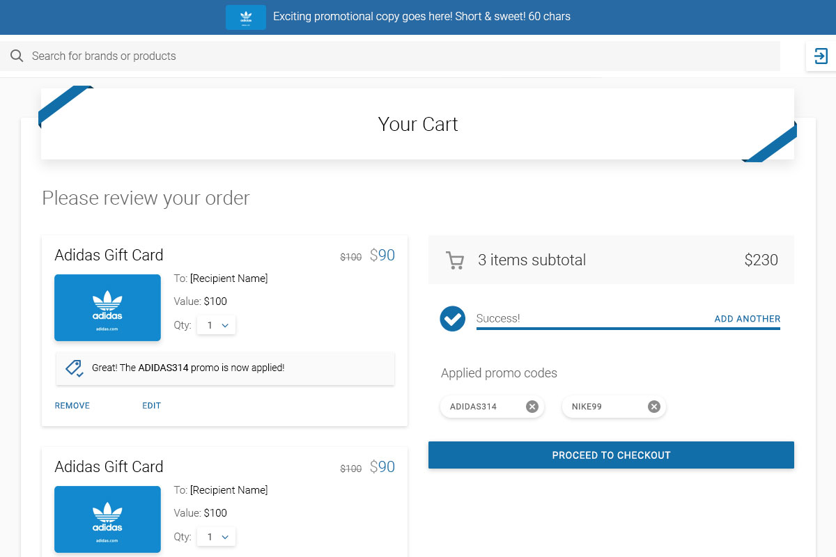
Promo Code Removal
This shows how to handle multiple promo codes on the shopping cart at once and how to clear them inline
Play Prototype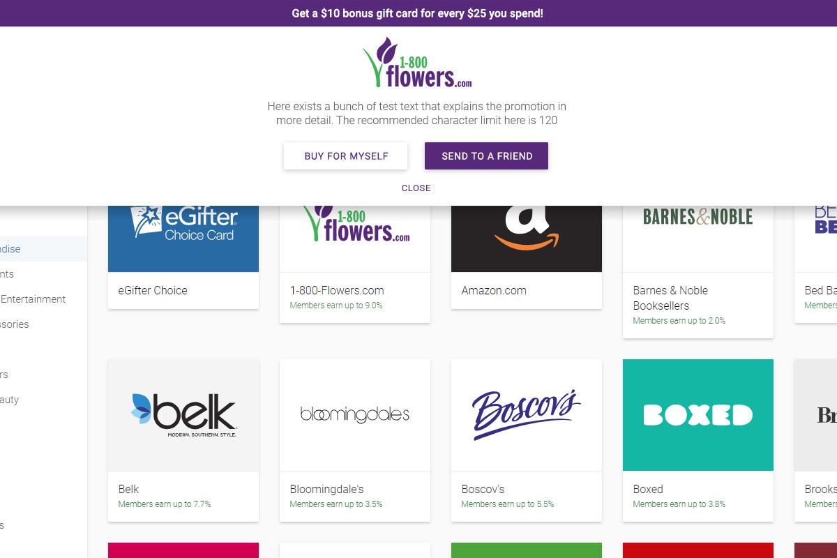
Various Brand Promos
Testing the same component with various brand colors and logos to ensure look, feel, and ADA compliance
Play PrototypePromotion System - Sold Out!
On one end we had excited buyers flooding in to take advantage of promotions, and on the other, we had ways to catch them in the case they came a little too late. Serving stoked users while looking out for our Customer Support team was what this was all about.
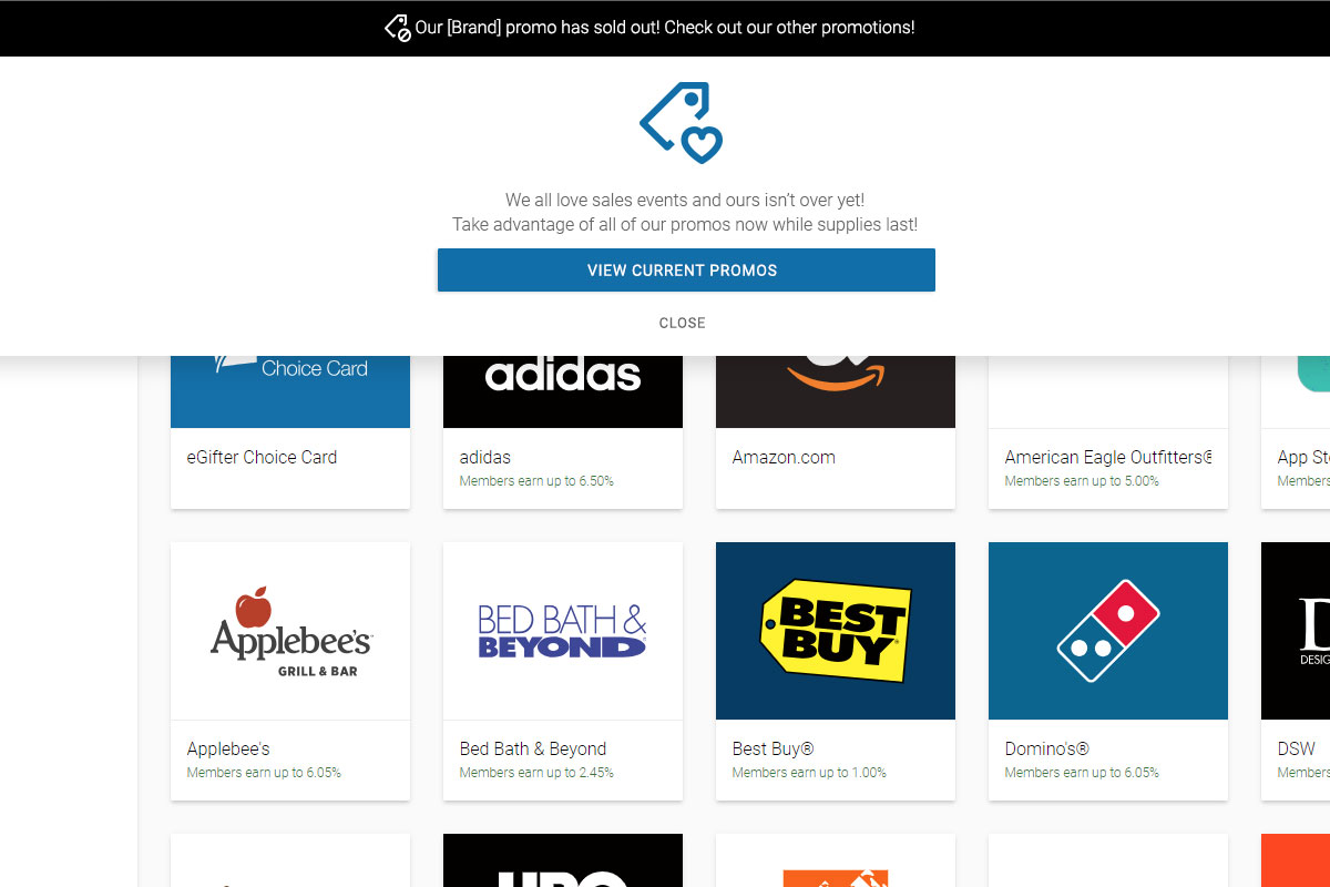
Already Sold Out
When ads were flying yet our promo inventory was zero, "Sold Out" notes saved our users untold clicks
Play Prototype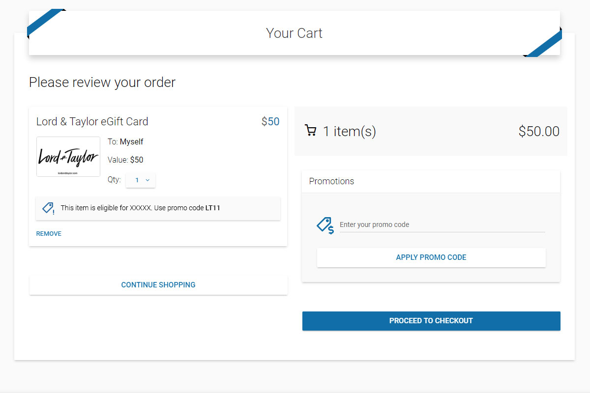
Sold Out at Checkout
Brands flew when sales hit, so this special case stemmed much frustration as it came before payment was sent
Play Prototype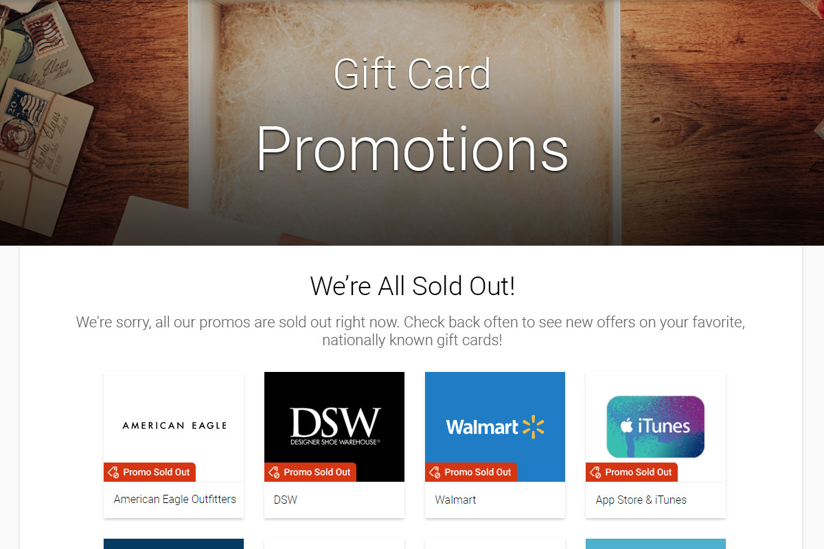
Promo Page States
The red hot promo page would intelligently evolve to reflect the status of sales and promos sitewide
Play PrototypeVirtual VISA Special Case
Getting a massive brand like VISA in our catalog deserved special attention. Their business rules were a curveball when compared to how we normally handled brands, yet it was worth it.
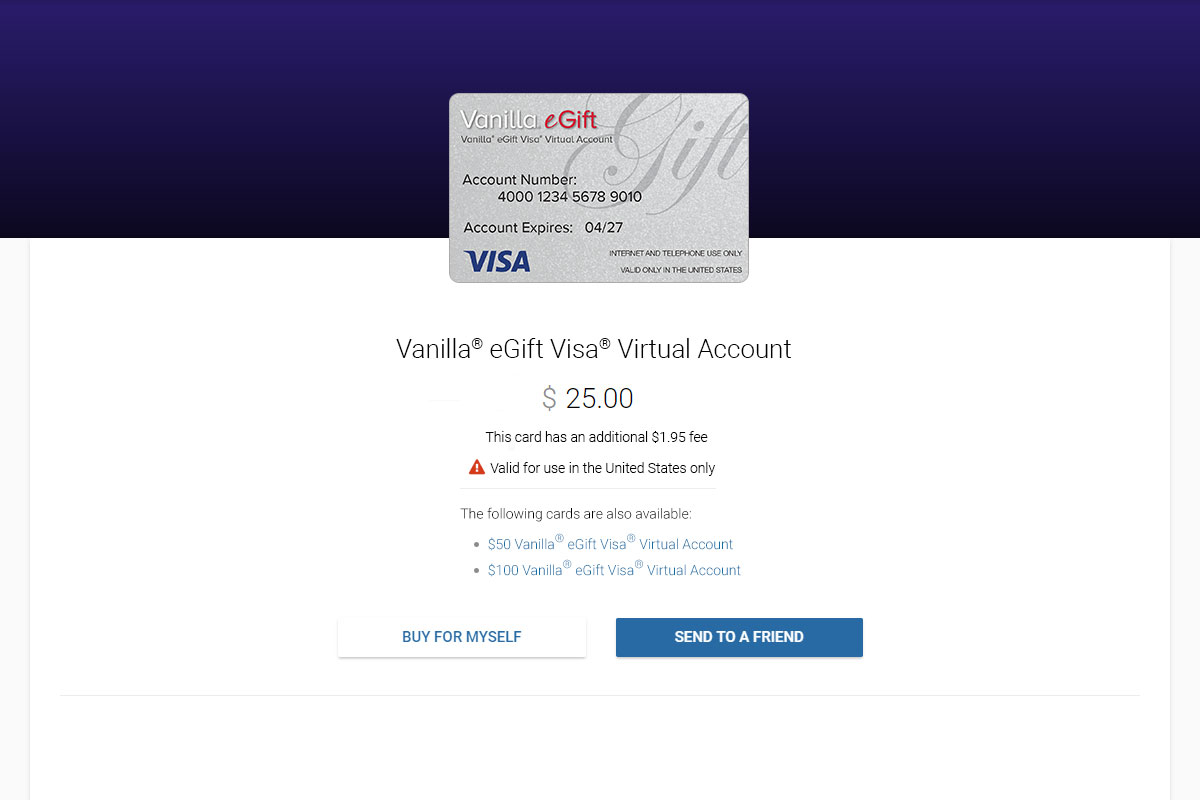
VISA Brand Page
Handling special business rules while informing our users as to their fees
Play Prototype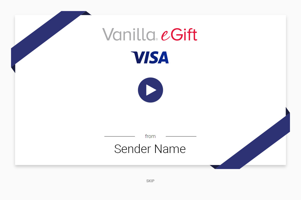
VISA Recipient Experience
Showing the treatment to VISA stakeholders before being listed gave them confidence
Play PrototypePhysical Cards
Now that digital use cases were vetted, we took the next logical step to plastic gift cards adding shipping.
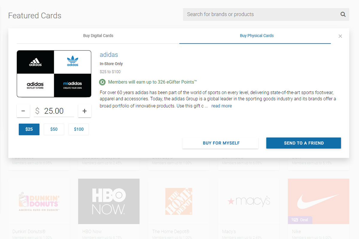
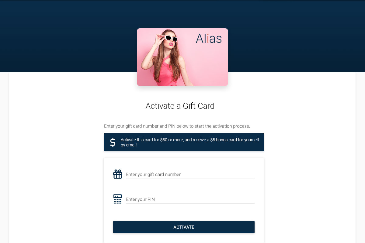
Home Activation
Load any plastic card with value easily, then receive a bonus gift card upon checkout
Play Prototype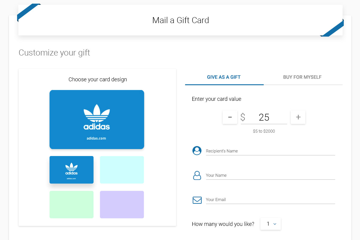
Buying Plastic Cards
Purchase without having to create an account, featuring a retroactive Rewards Points Claim incentive stumble
Play Prototype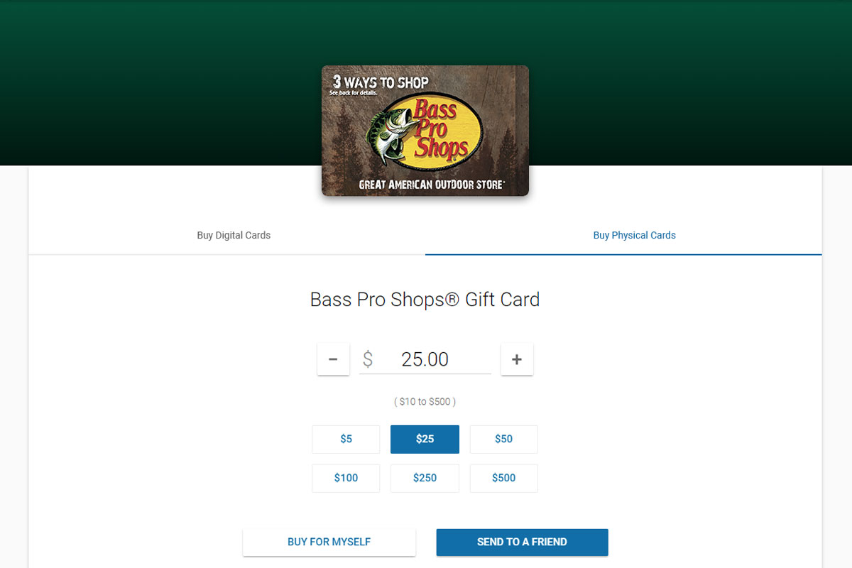
Brand Page Treatment
Keeping the top tabs consistent with the brand quick selector on the main Marketplace page
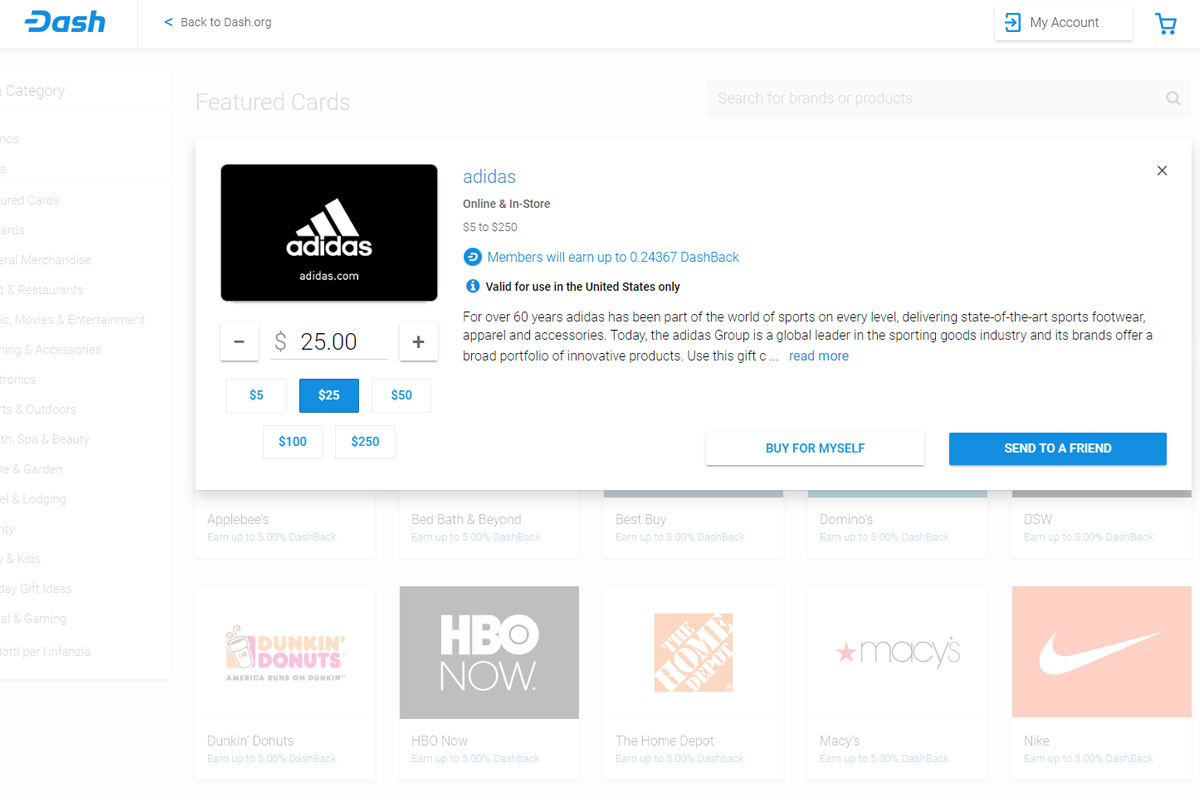
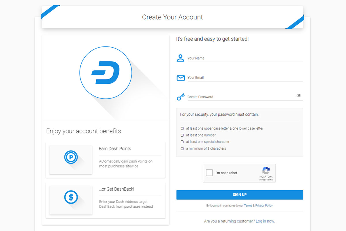
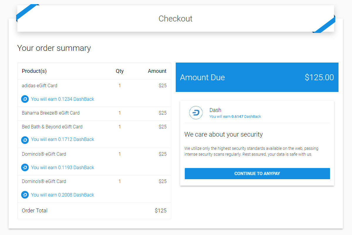
Play PrototypeDash Branded Marketplace
One example of how we fit our entire White Label Marketplace for Dash, including their rewards schema along the full user journey
Bitcoin.com Marketplace
Another massive success story for our Marketplace with deep, fully featured integrations in partnership
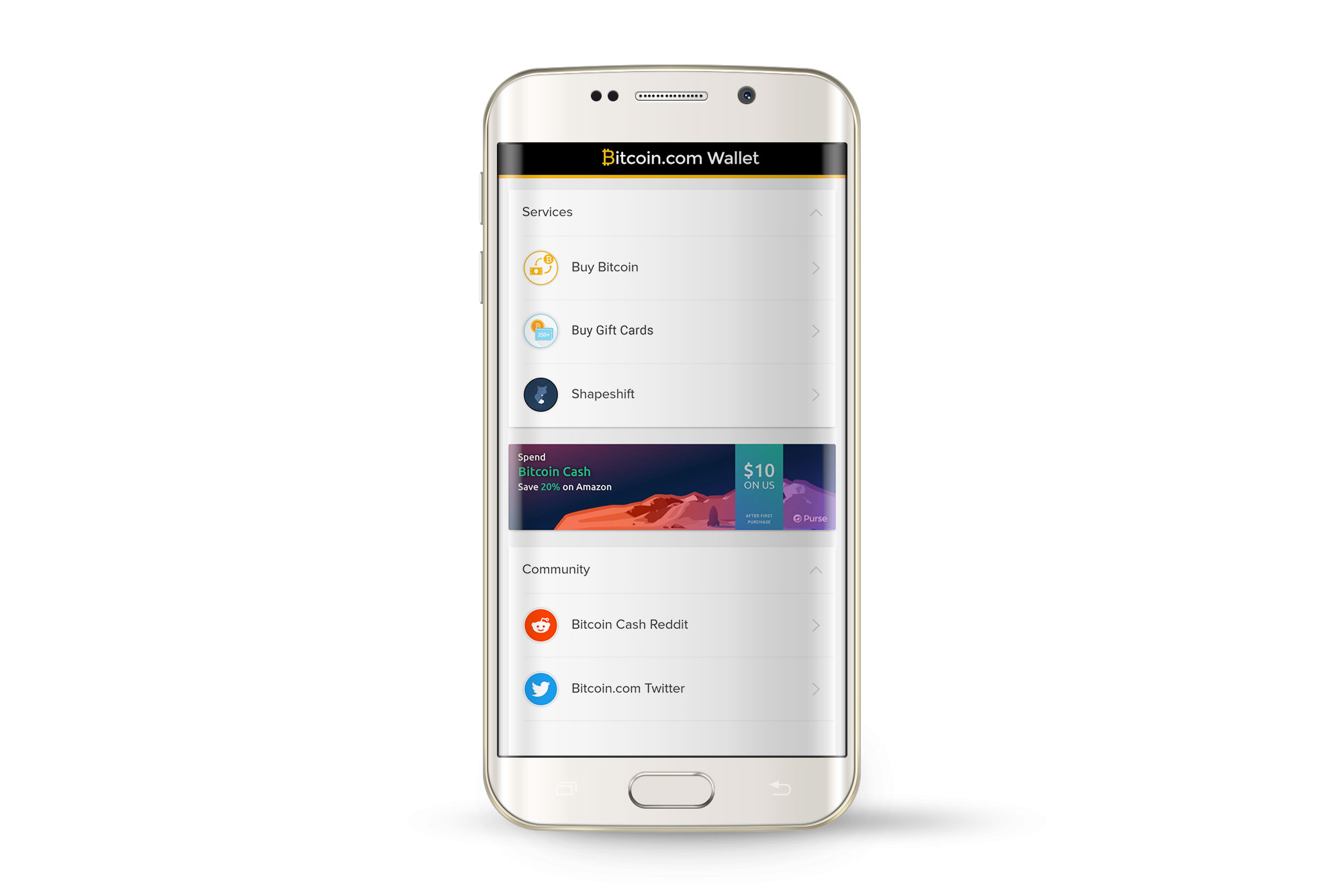
Bitcoin Wallet Integration
Seamless integration within Bitcoin.com’s Wallet app allows for users to easily purchase branded gift cards with crypto
Play Prototype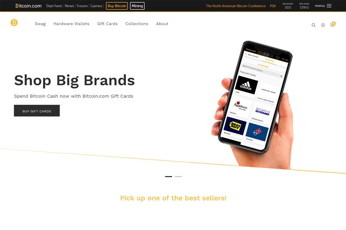
Bitcoin.com Site Integration
My designs hit front and center, unlocking smooth purchase flows for the top cryptocurrency by market cap
Play PrototypeDive Deeper
Flow further along this current to see more cases

Estée Lauder Product Redesign
Defining The Standard for all critical internal applications
View Project