Digital Wallet
The Problem
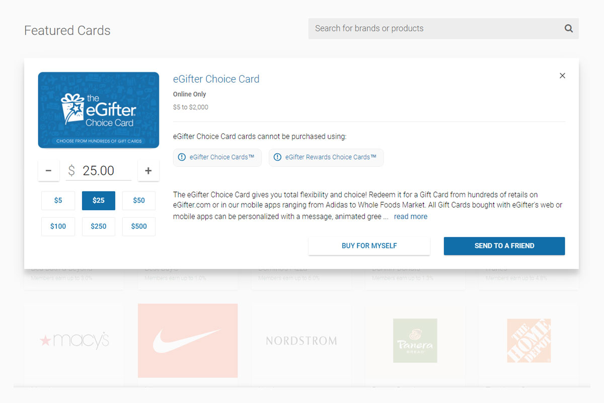
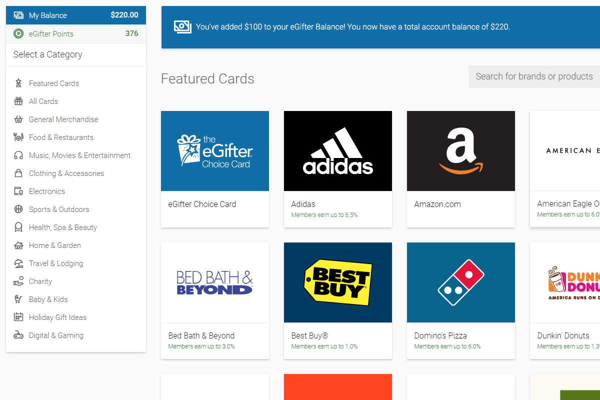
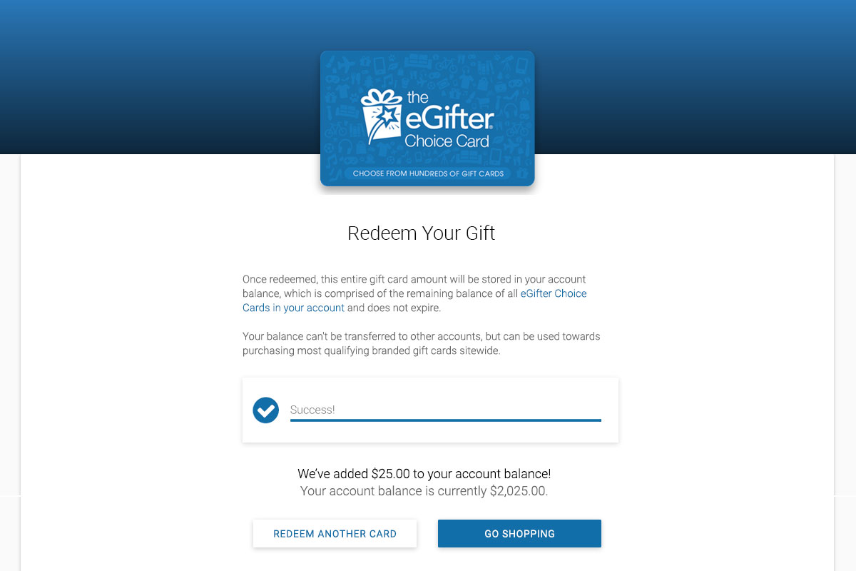
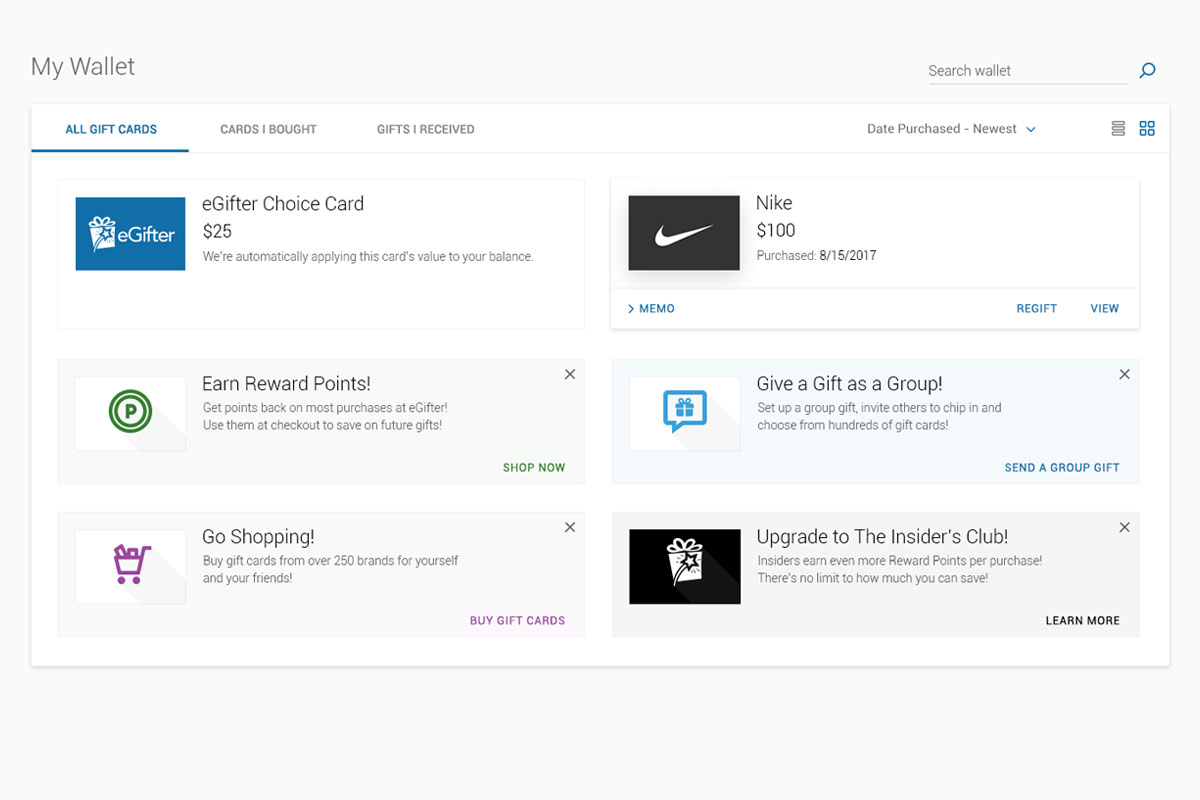
eGifter has a proprietary gift card, called “The Choice Card”, which is simply a method of adding funds to your account balance. You’d either get an email, text message, social media notification, or a physical gift card in your hand that says: “You got a $25 Choice Card!”. Upon further inspection, you’d find you can use its redemption code to add $25 to your account, which could be then used to purchase other items across the site. This would often be a user's first exposure to eGifter.
Got that? Cool.
There also existed Reward Point Systems, which gave points back to you post-purchase, depending on your payment method and other factors. Plus, given that users could hold hundreds of different gift cards in their wallet, including various Choice Cards, it could quickly get confusing and cluttered in there.
Now, few knew what “The Choice Card” was all about. Once they figured it out and added funds to their account, they couldn’t see where all their balances were at the account level or at checkout. Positive user feedback in the interface was nowhere to be found and the instructions as to what to do next were scarce.
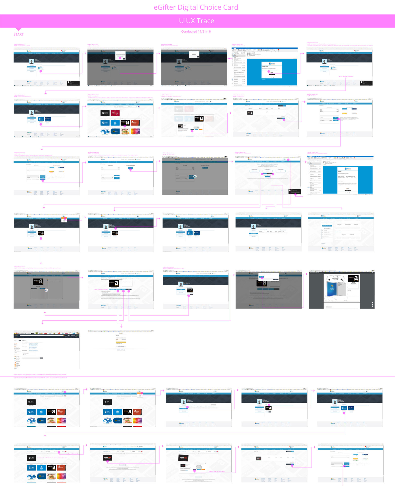
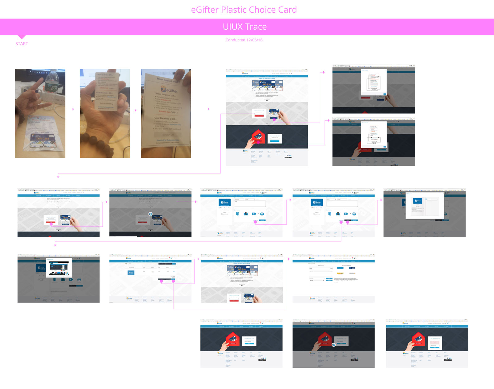
Being that “Account Balances” and “Reward Points” systems both existed throughout the entirety of the user journey, the wisest course of action was to first map out the entire user experience, end-to-end, and identify where these elements were being used on the live site. During this process, I conducted user interviews to identify their pain points, confusion, and frustration each step of the way.
Only then would I have the wisdom to address this holistically. First, take in the battle map on the primary use case: “The Digital Choice Card.”
The Problem Comes Into Focus
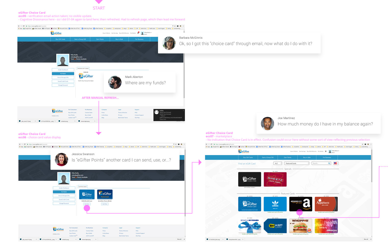
After experiencing various pain points conducting my UIUX Trace of the platform, I interviewed users to get their viewpoints. Our shared pain both validated and augmented, I expressed perspectives through the lens of various personas. It was clear that there were many speedbumps preventing a smooth experience in the current live version of the app. This screen is one sample of putting our collective finger on the nerve.
The Problem... Now in Plastic!
To design a fully systemic, holistic, and unified solution, one must first wrap his head around the entire product scope, both in digital and physical form. Only then may one find their common factors and and solve for those with elegance. Once the core flows are in place, then the ability to handle special cases unlocks.
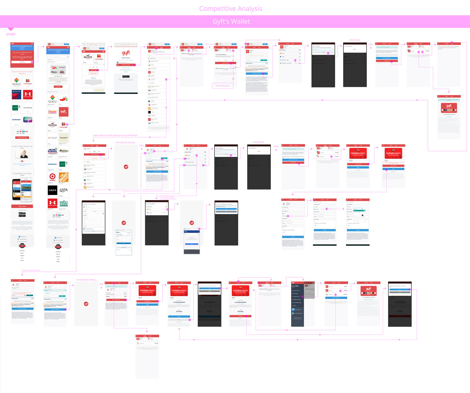
Gyft Wallet Competitive Analysis
Understanding the competitive landscape is mission critical. Gyft was doing a lot of things right, except they only had one product to worry about: Gyft itself. Given I had several products and clients to solve for, factoring the wallet down to its most simple form - while paradoxically keeping it fully featured - meant that the depth of my knowledge had to submerge to the innermost core.
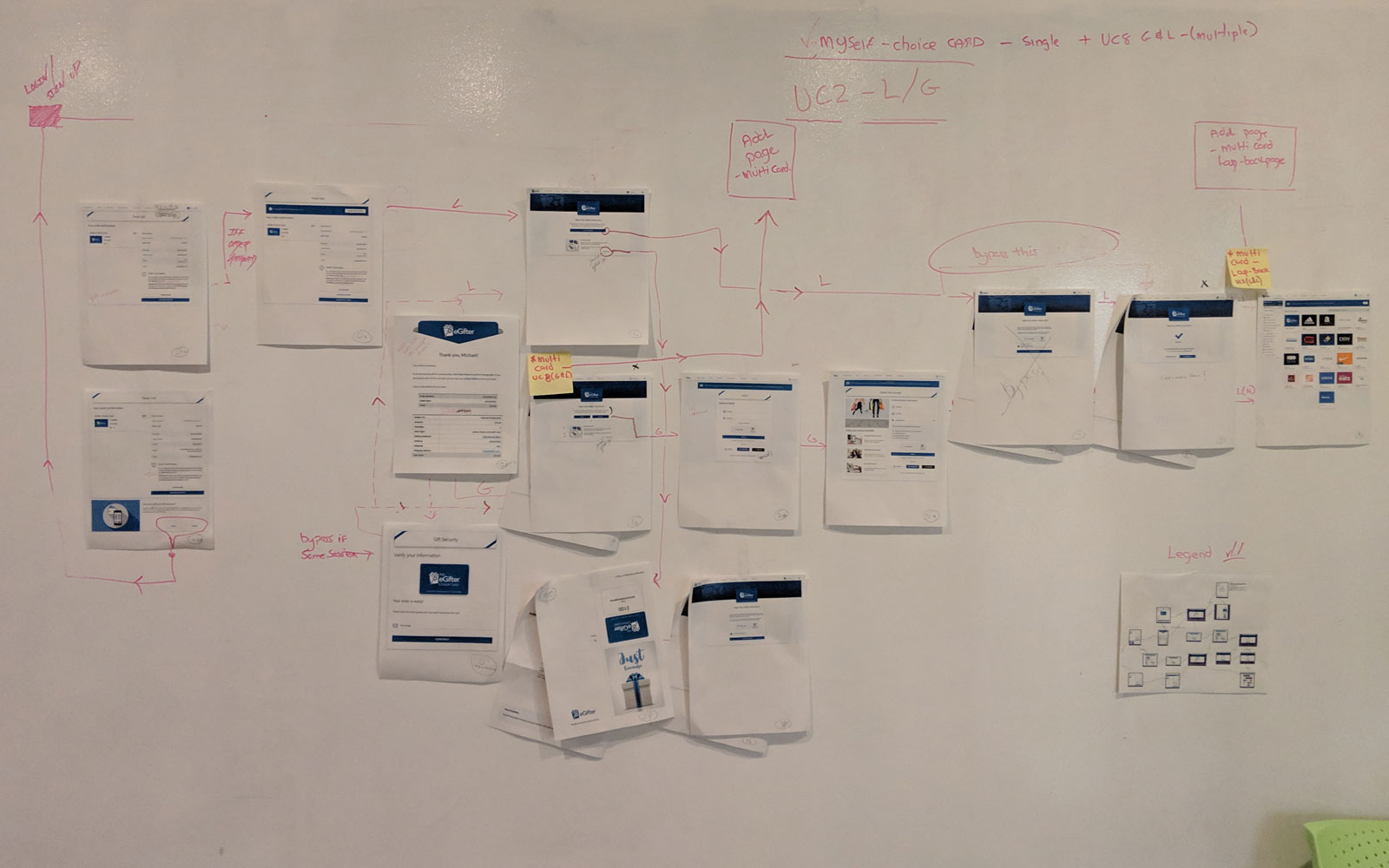
White Board Jam
In concert with my teammates from Development, Engineering, Business and Operations, we used the wall, coated in dry erase paint, to lay out and improve flow sections.
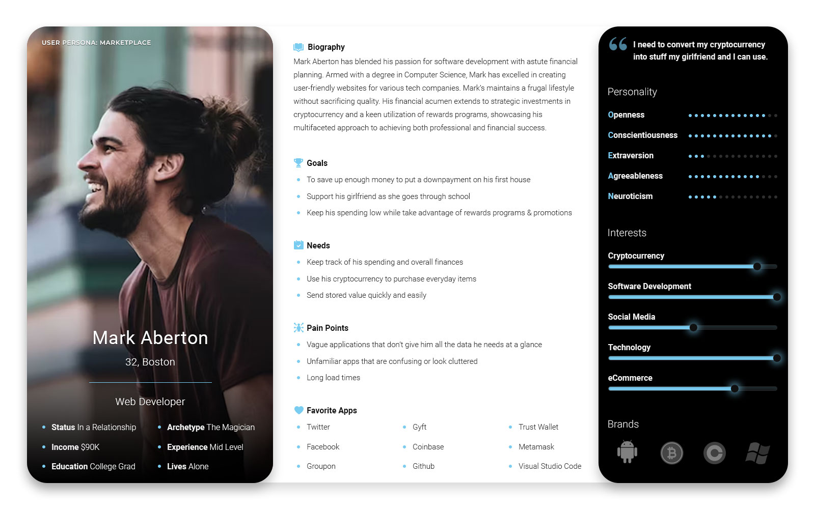
Keep Users In Mind
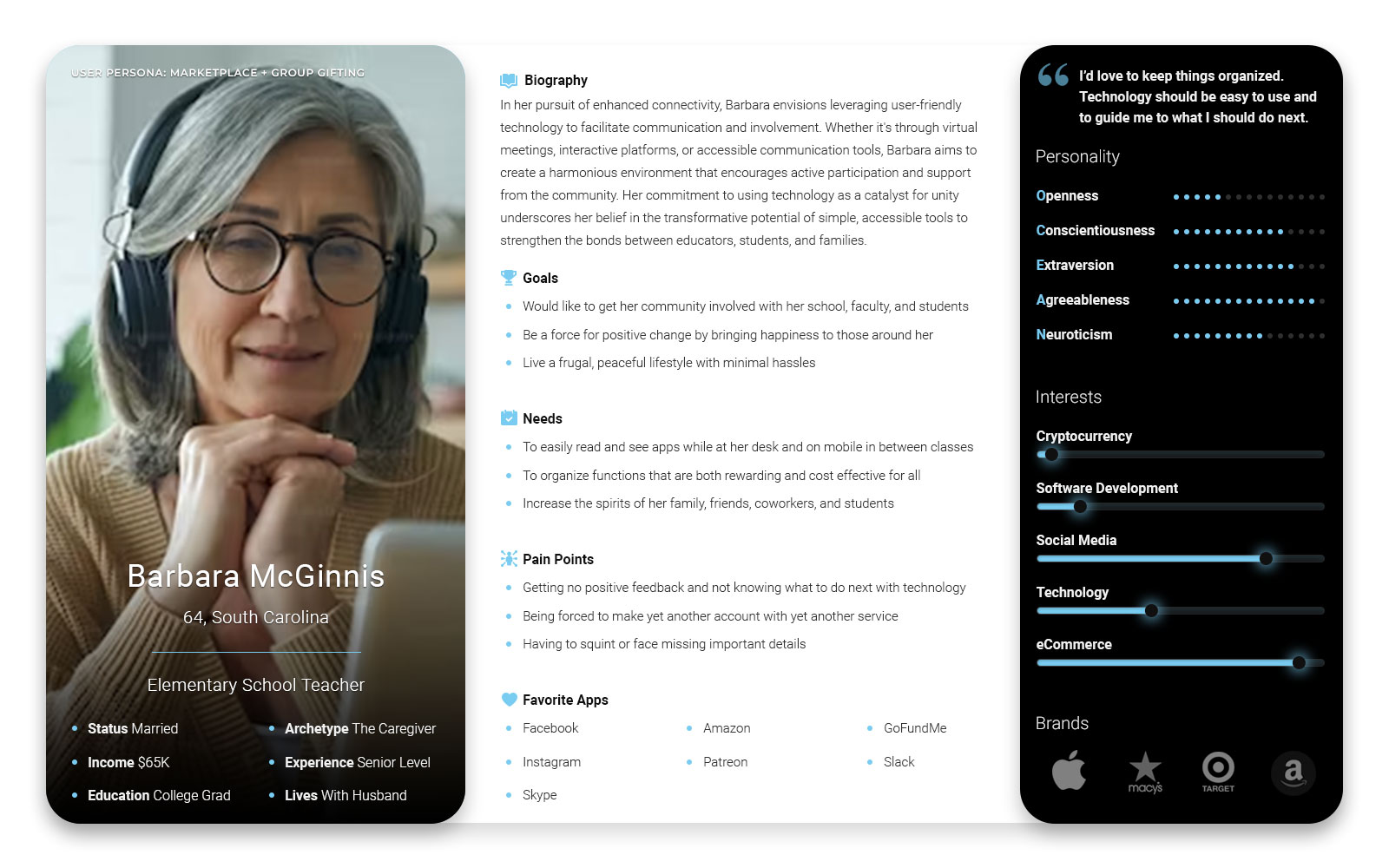
We knew who our initial core audience was. They were technically savvy and technologically advanced, yet another major objective was to design this for mass audiences. Rich with features, informative, and modern, while keeping ADA accessibility standards. Clarity and cleanliness in the UIUX were critical. Hence, the wide range of user personas being referenced.
Flowing Funds
I prototyped how Choice Cards and Brand Cards enter your wallet in the popular Guest Checkout use case.
Choice Card - Guest Checkout
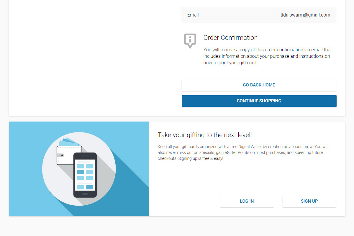
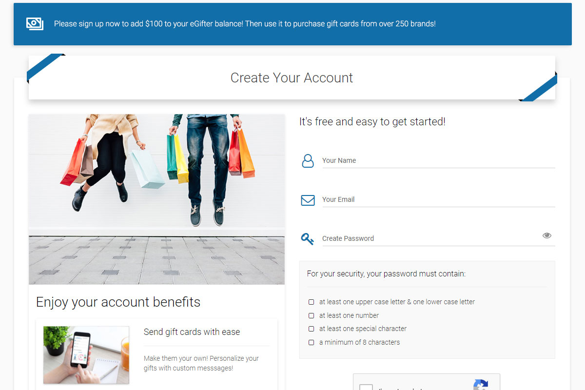
Purchasing without an account with incentivized, retroactive account creation to increase your balance
Play PrototypeChoice Card - Recipient
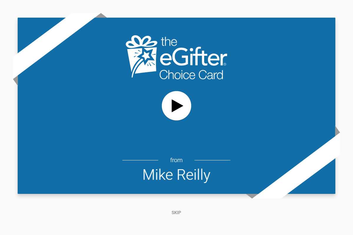
The recipient experience that introduces the notion of having an account to add funds to your balance
Play PrototypeBrand Card - Guest Checkout
Removes account creation friction to allow you to simply buy what you want with positive feedback alerts
Play PrototypeBrand Card - Recipient
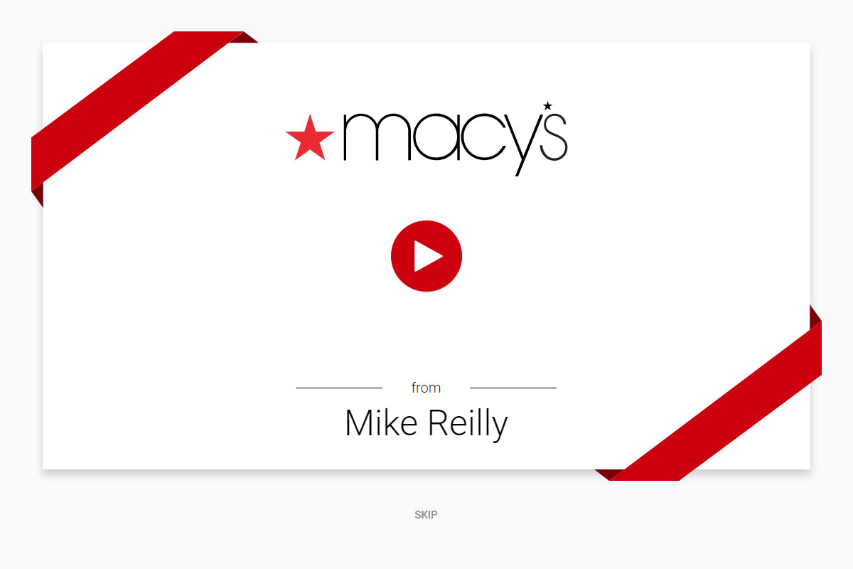
The typical first exposure flow with a quick nod towards the option to swap out the gift card you received
Play PrototypeFine Tune Testing
After making a set of three prototypes, I then presented these to stakeholders and test users so we would learn which method they liked the best.
Positive Feedback - Method A
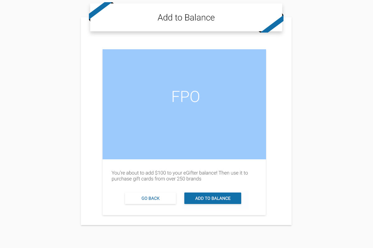
This alert appears post-action, updating the user retroactively what was just accomplished to reinforce trust
Play PrototypePositive Feedback - Method B
This method exhibits a pre-action alert, advising the user to complete their action for an anticipated incentive
Play PrototypePositive Feedback - Method C
This style simplifies the user's decision making process by showing simple windows with clear action calls
Play PrototypeThe Critical Checkout
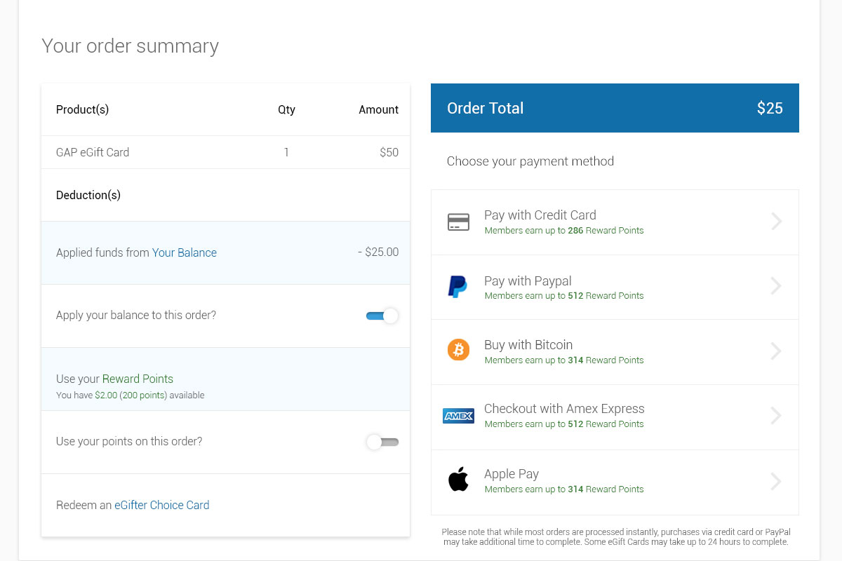
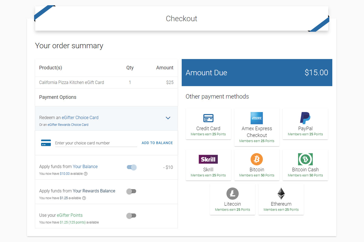
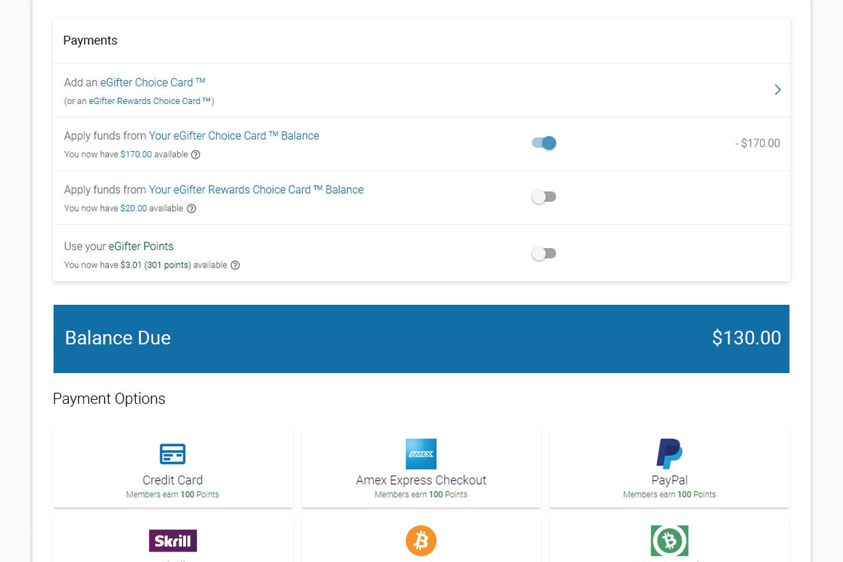
Having a uniform treatment in place at checkout that could handle all the special cases presented by The Choice Card, Reward Points, and so forth is vital. So I dedicated significant focus perfecting this area, being that checkout dropoff rates are generally quite high in eCommerce.
Simple Switches
User testing iterations on the checkout components for account balances and reward points
Play PrototypeUnified Payment Method Toggles
This style treated the deductions from the amount due on the left with the payment methods on the right
Play PrototypeFullwidth Test
This full width variant is a control in my user testing, mainly to ensure which views were most pleasing
Play PrototypeRedeeming Card Value
Focusing on getting cards into the user's wallet in the first place.
Quick Claim
A streamlined way for users to add Choice Card funds to their account balance
Play PrototypeAdding Cards in Bulk
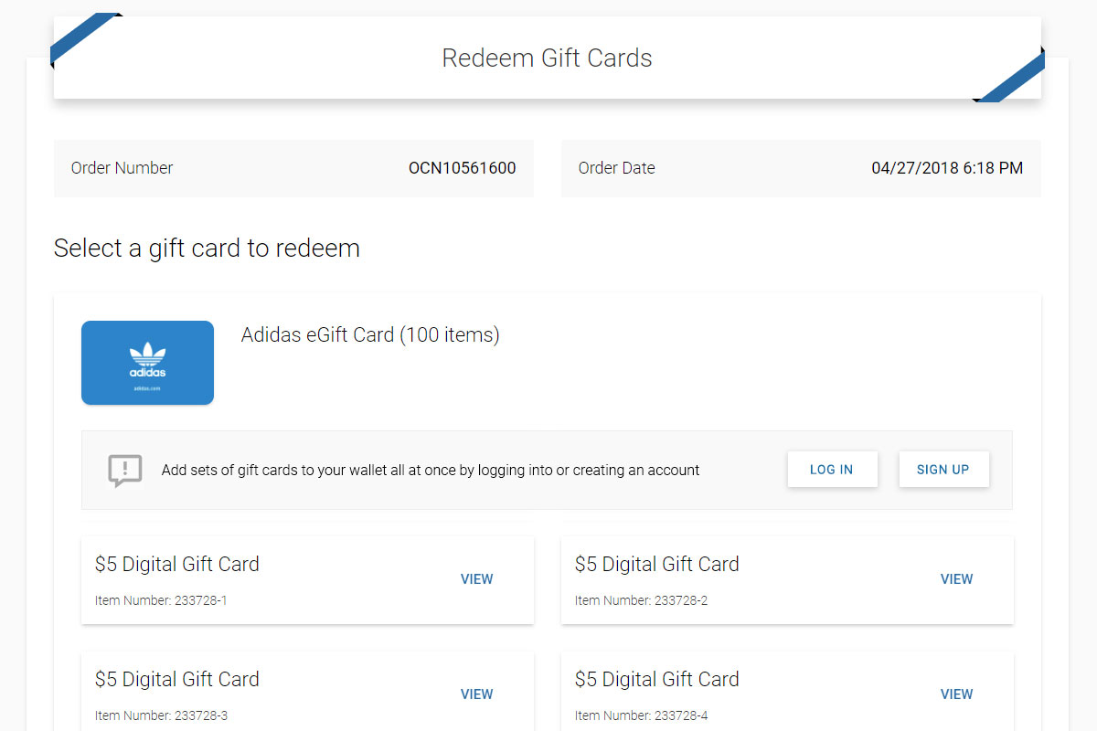
Methods to allows users to rapidly add many cards to their wallet in one shot
Play PrototypeContext Matters
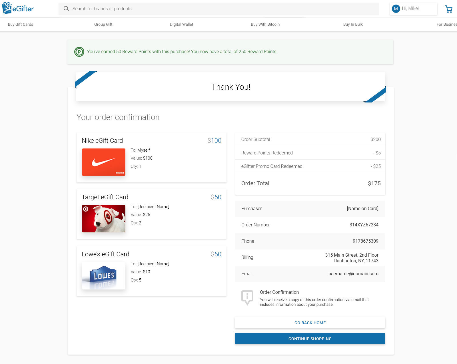
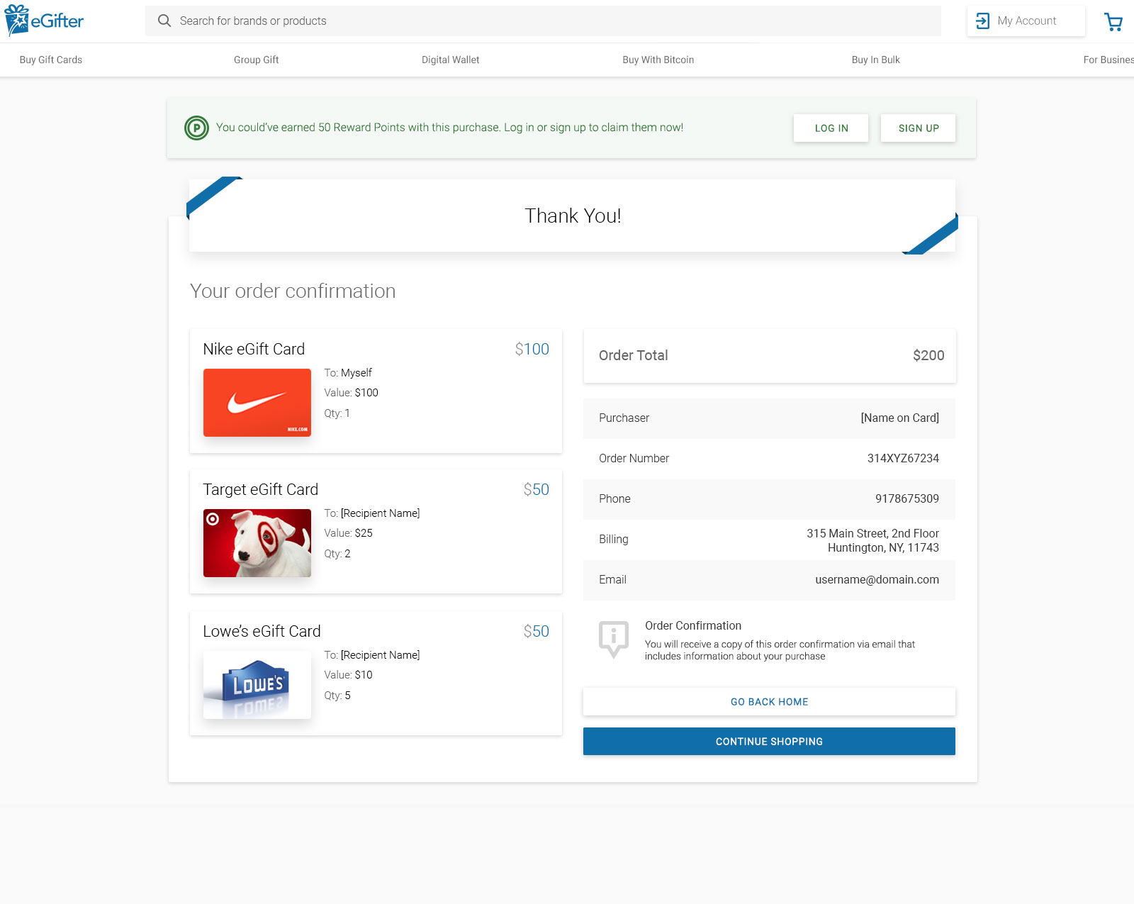
Small differences between logged in and logged out users make all the difference.
Bitcoin.com and Coinbase Wallet Integrations
It was exciting to design solutions integrating the largest crypto companies in the world.
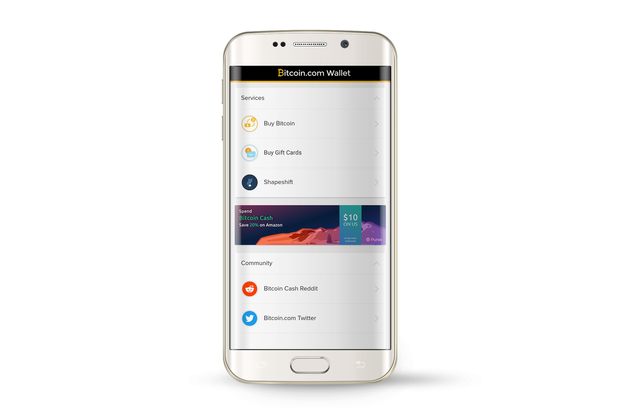
Bitcoin.com Wallet Checkout
Injecting our solution directly in Bitcoin's most popular wallet
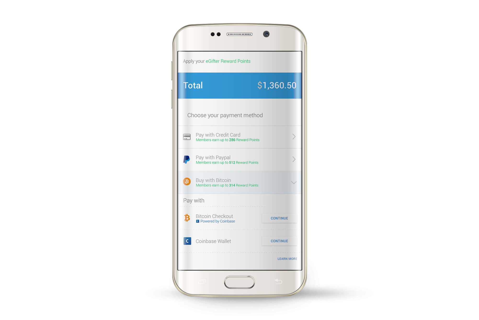
Play PrototypeCoinbase Wallet API Call
Integrating the most popular US crypto trading platform within our payment methods
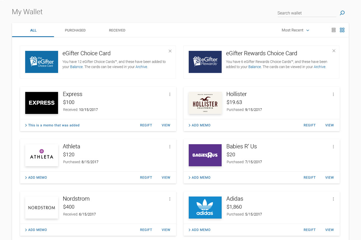
Play PrototypeDigital Wallet Main Usage
Play with various prototypes to see what the wallet can do for you.
Wallet Prime Views
Run through a relatively open simulation of each of the digital wallet's main areas
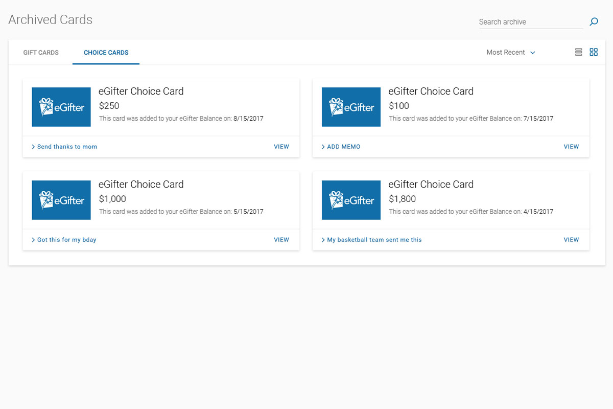
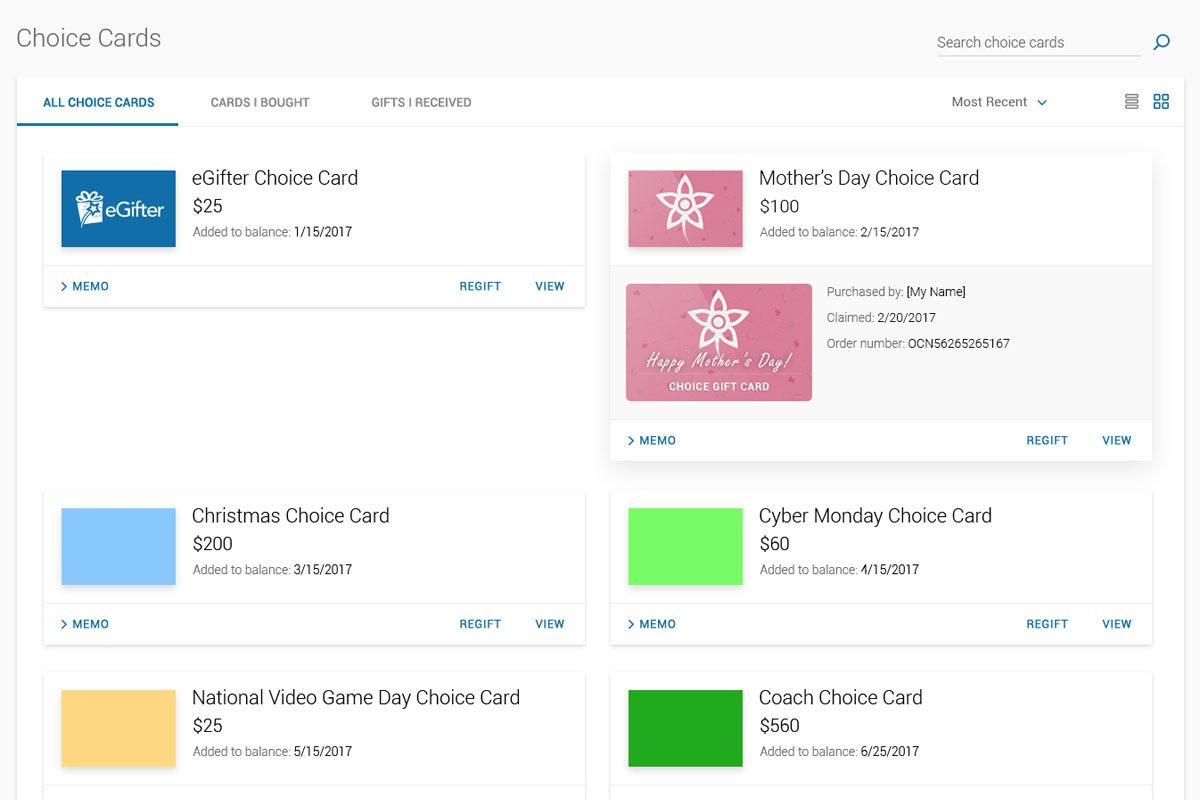
Play PrototypeChoice Card Archive
To clearly draw the distinction between cards which added to your account balance and external branded cards, separate them
Play PrototypeVarious Entities
Flat panels for Choice Cards, raised ones for branded gift cards, and flat color coded elements serve as user guides
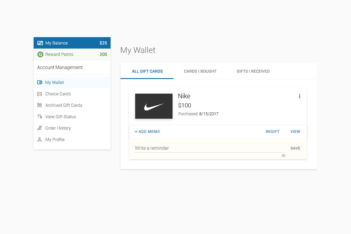
Play PrototypeCustom Memo
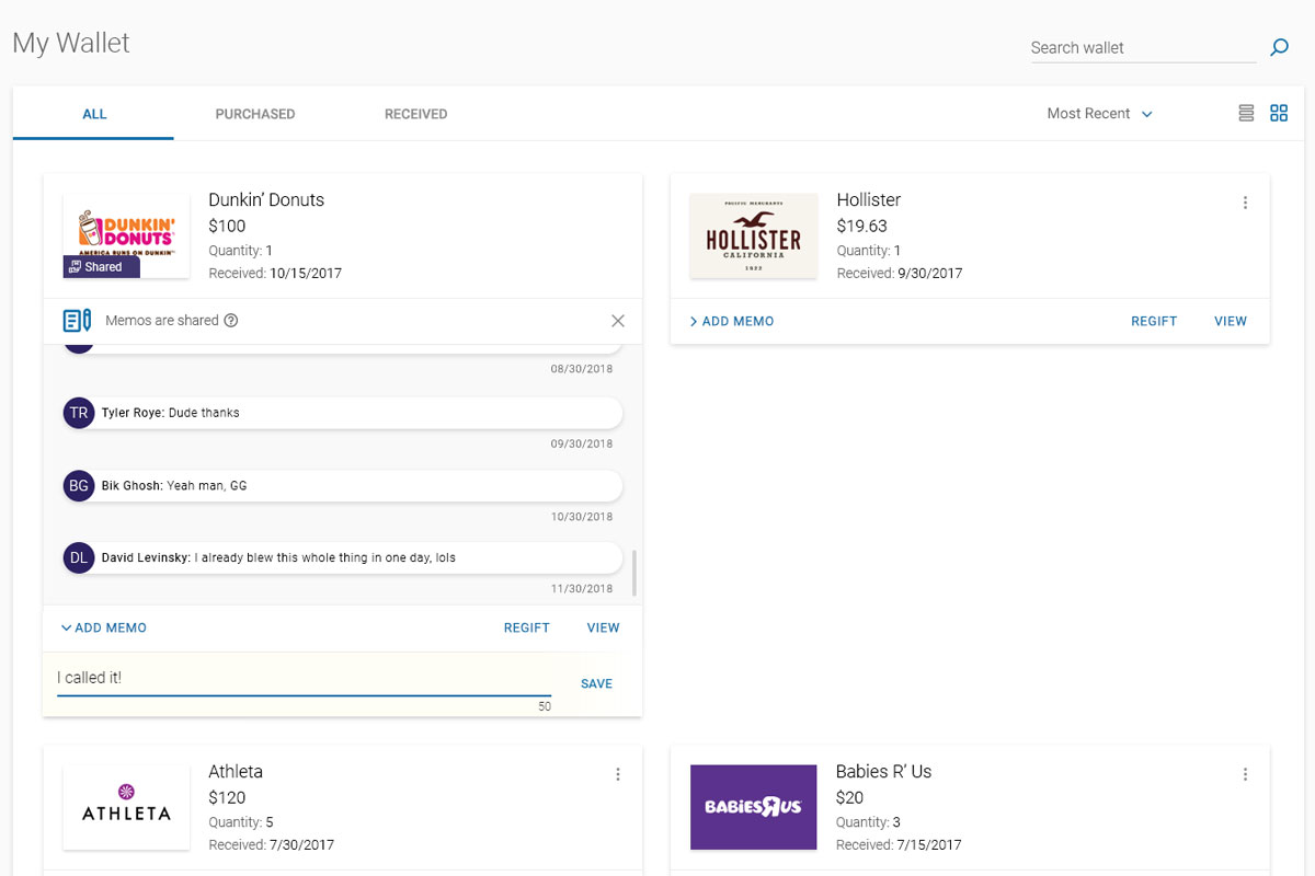
Users frequently requested the ability to write, save, and edit memos to each of their gift cards. So it is.
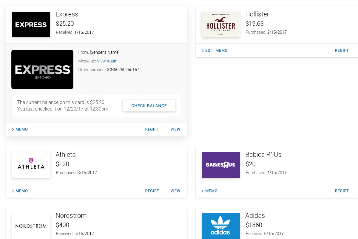
Play PrototypeBalance Check
Another highly requested feature was updating card balances. Each brand handled this differently on their end, yet I designed all cases similarly on ours
Play PrototypeThemed Choice Cards
I kept UIUX continuity for these in relation to branded gift cards, yet sectioned them in their own home for clarity
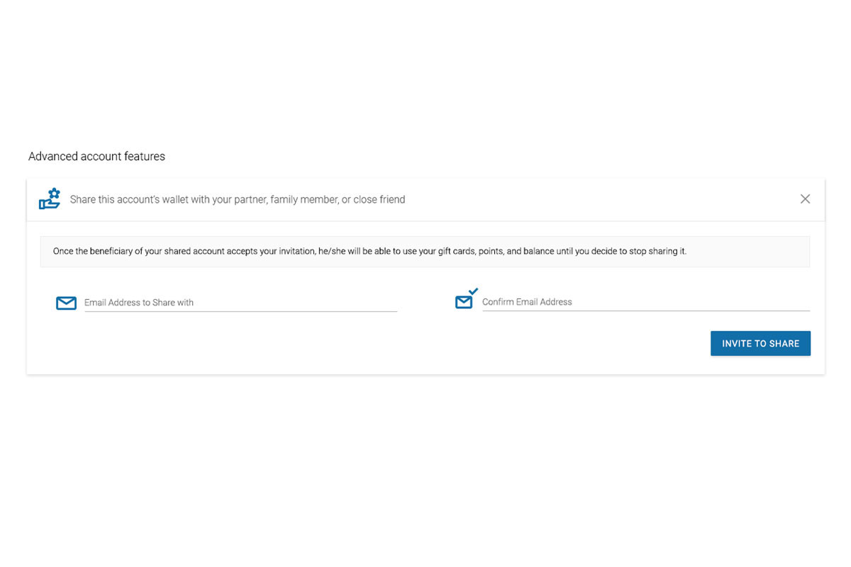
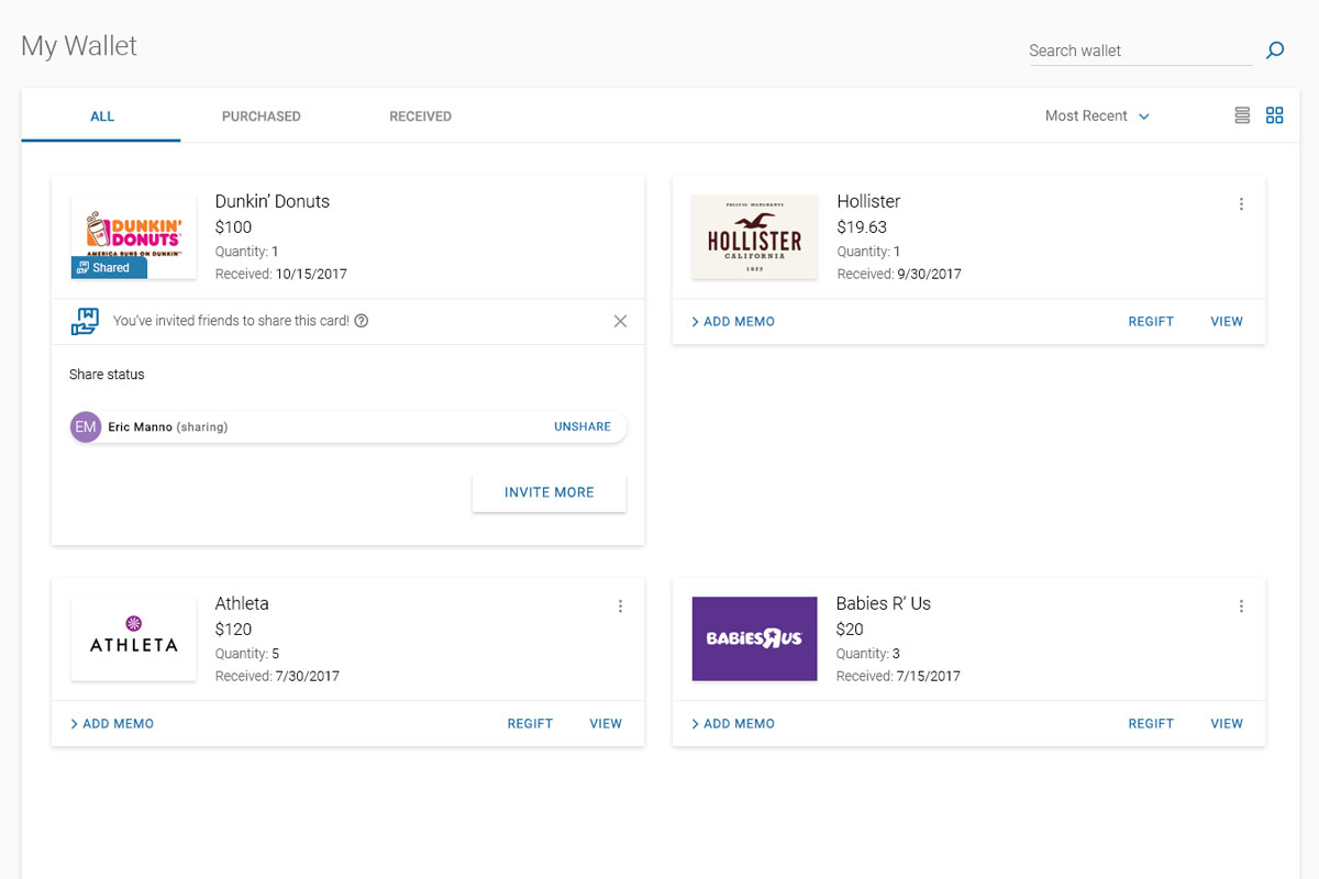
Play PrototypeSharing Your Wallet - First Pass
Continuous user testing and iterative prototyping were the main methodologies I used to zero in on the answer to this one.
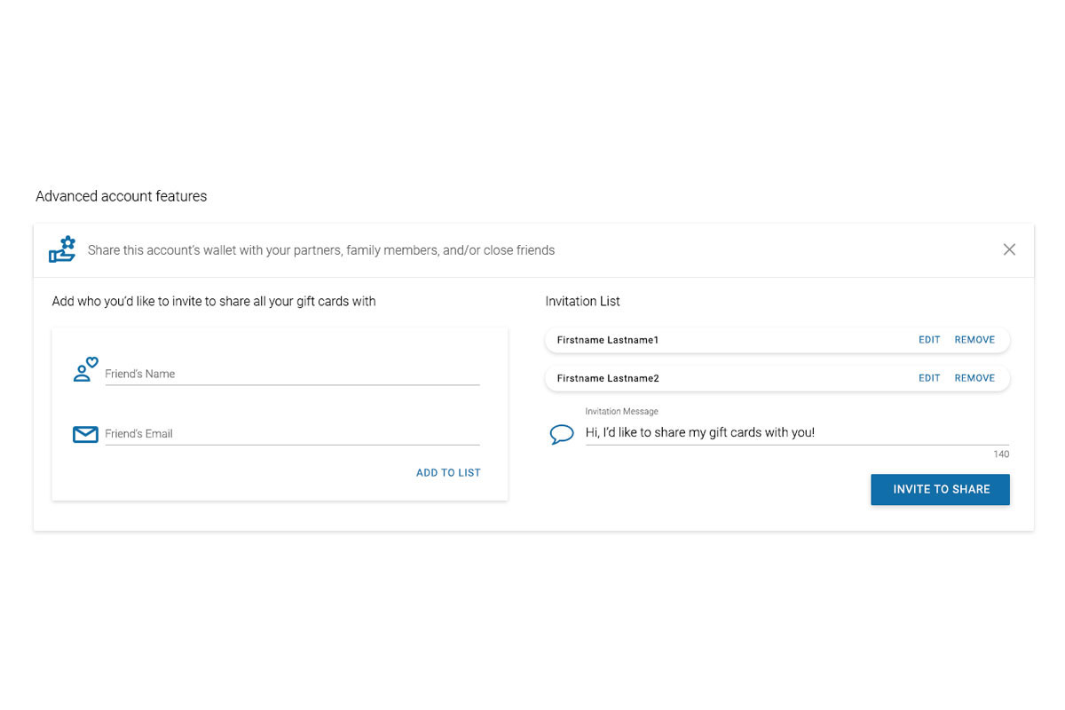
Sharing Your Wallet - Second Pass
The next evolution expanded feature sets and gave additional clarity to the user when initially exposed to these innovative wallet abilities.
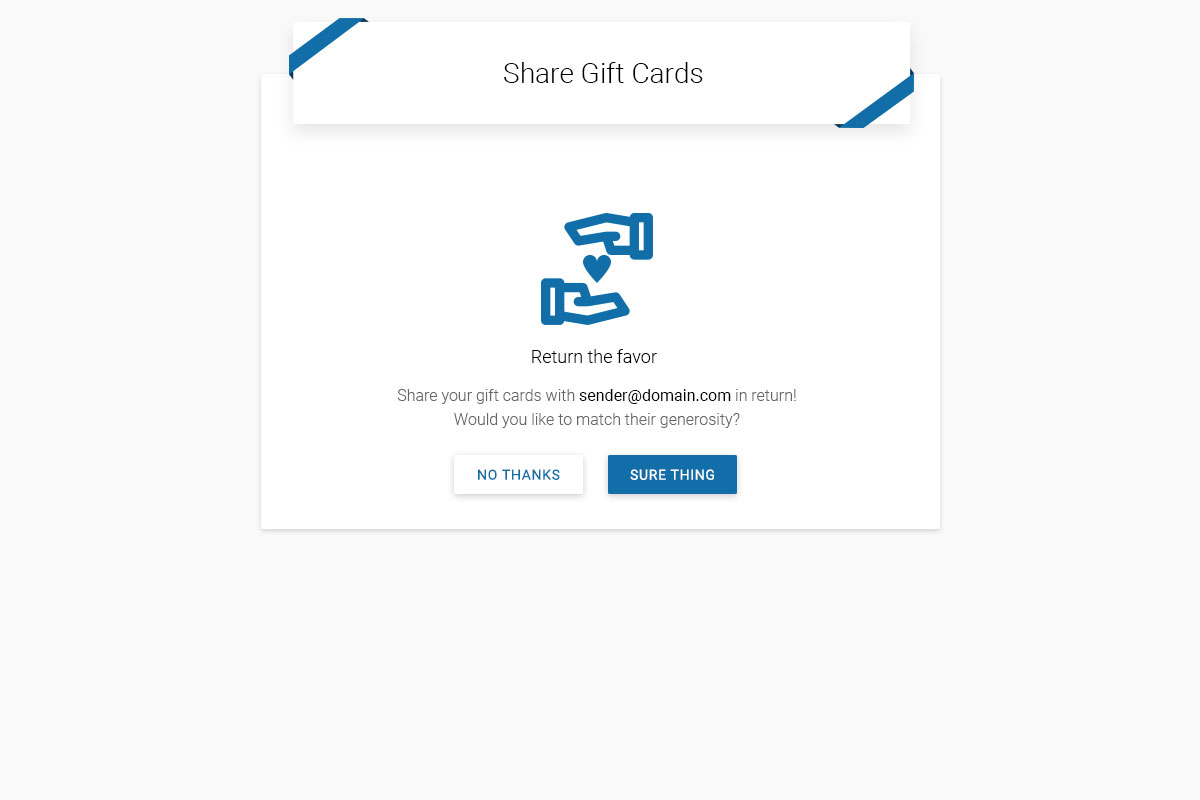
Receiver Gets Invitation
What the invitee sees when someone offers to share his wallet
Play PrototypeReceiver Admin Screen
Once you've accepting the invitation to share a wallet, here's what's next
Play PrototypeClear Card Method
Stash the shared card right away in its own place to avoid wallet clutter
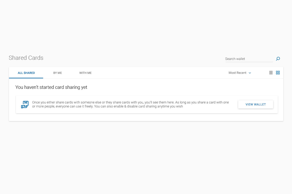
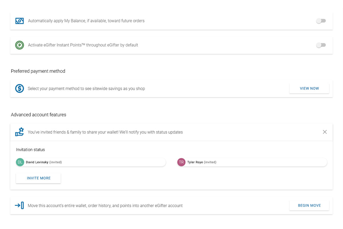
Play PrototypeYour Wallet is Now Shared
What it looks like when your wallet is shared with various friends
Play PrototypeInviting and Management
Welcome multiple people to share your wallet and update their access
Play PrototypeSharing Your Wallet - Third Pass
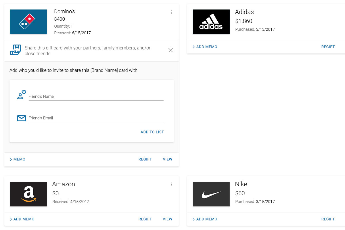
Many of the main sections now perfected, we felt another iterative improvement of this feature would knock it out of the park.
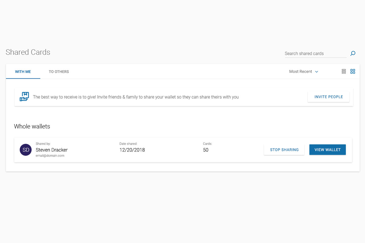
Sharing Whole Wallets
This works on the account level, where all funds and cards are shared between multiple users
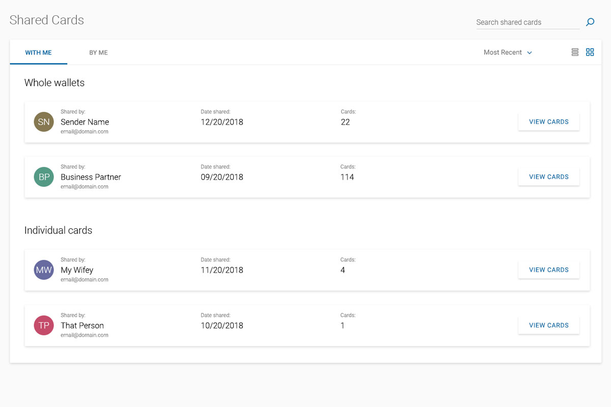
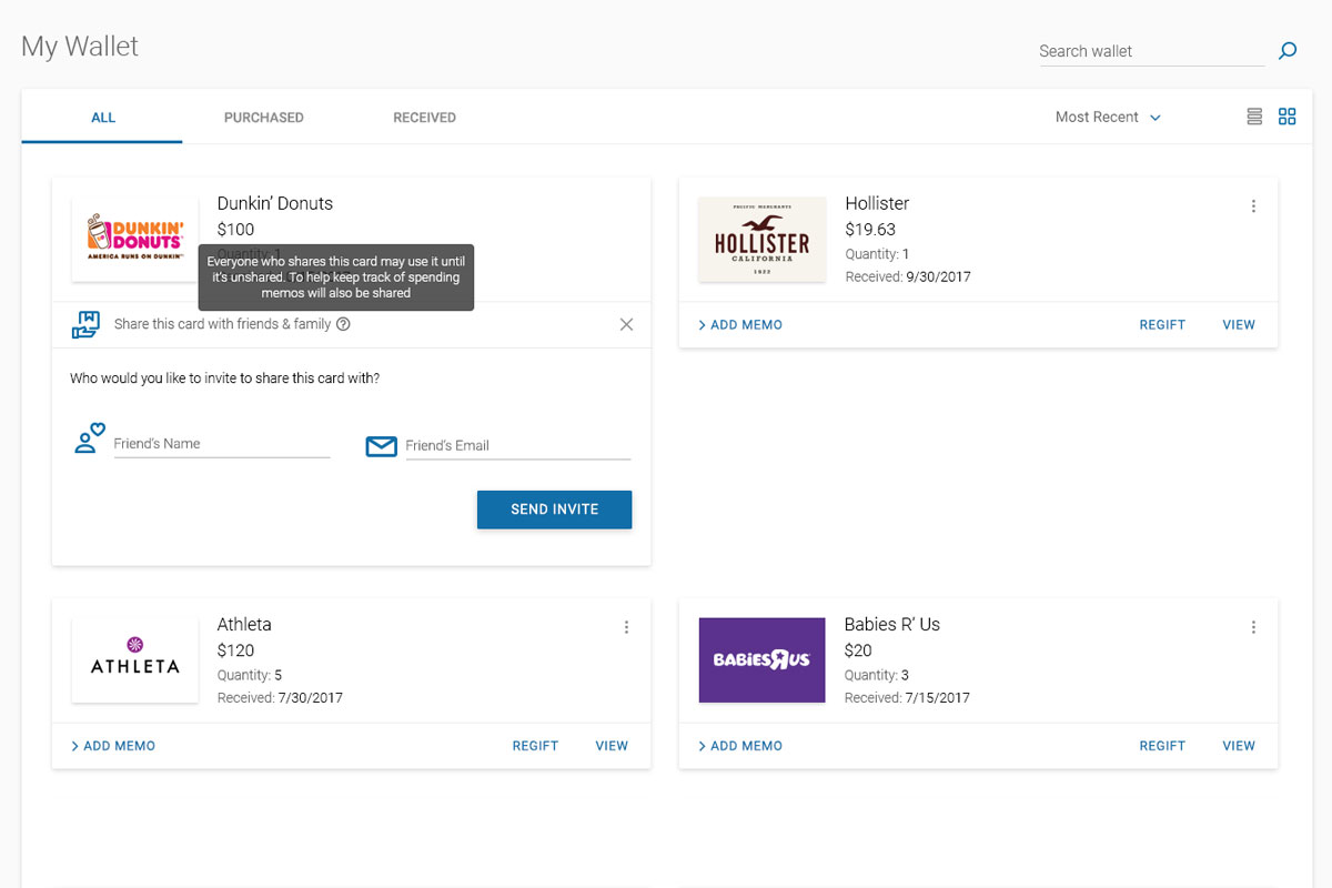
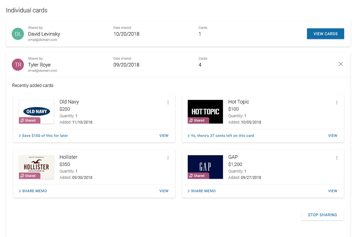
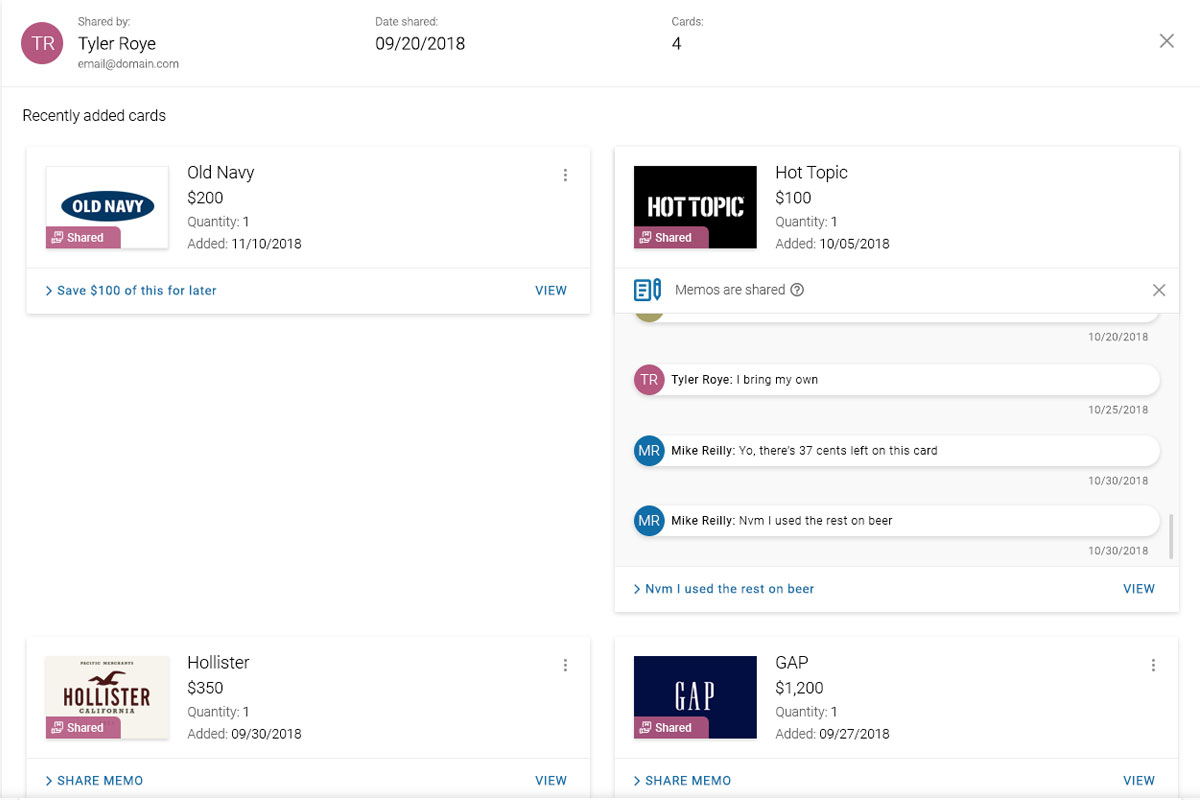
Play PrototypeShare Individual Cards
In this scenario, the wallets between users are not shared, yet the individual cards are
Play PrototypeReceiver Gets Invitation
Present the first contact user with cool options in a quick, easy to understand way
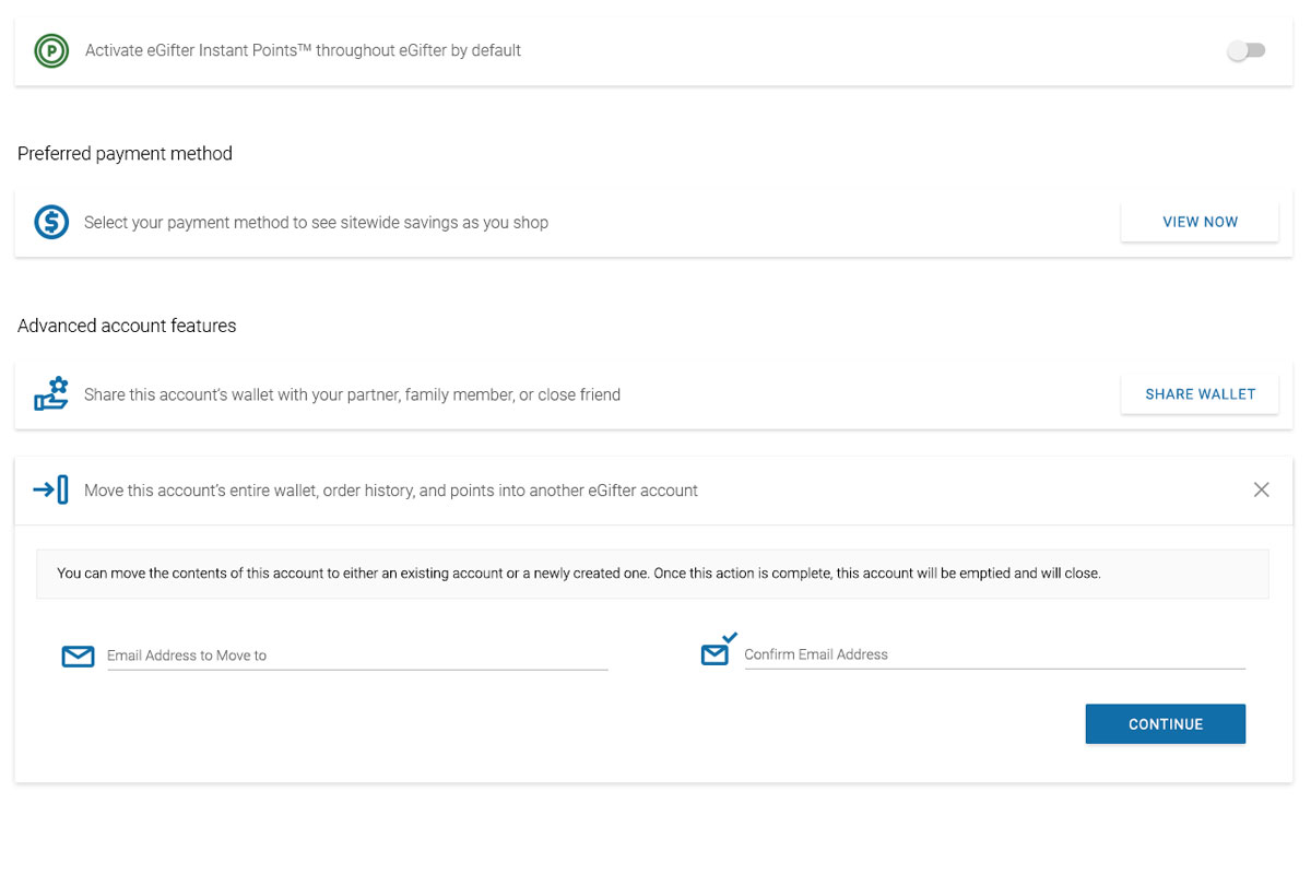
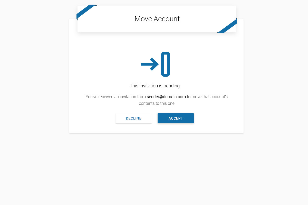
Play PrototypeMove All Cards and Data to Another Account
We got intermittent user requests to allow them to do a full account migration, deleting the previous account in favor of a shiny new one. Here are the results fulfilling those asks.
Regifting, Ungifting, and Deleting Cards
Every other wallet feature and function well in hand, I kept extending innovation to push its logical and artistic extents.
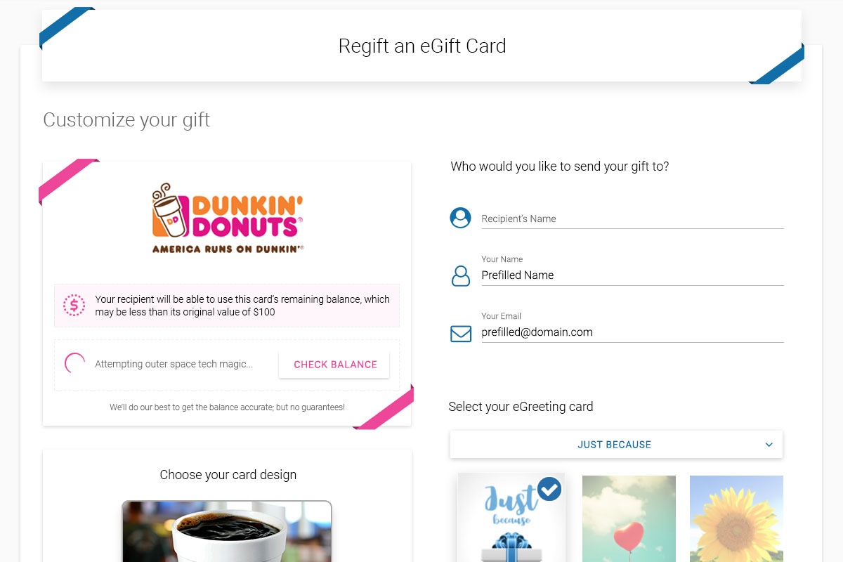
Regifting Flow
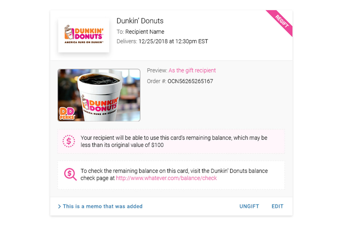
The digital gift card equivalent to hand me downs, pass your old cards along like they're new
Play PrototypeUngifting Flow
Changed your mind? Just hit The Undo button. It'll be fine. No one noticed anyway
Play PrototypeDeleting Cards
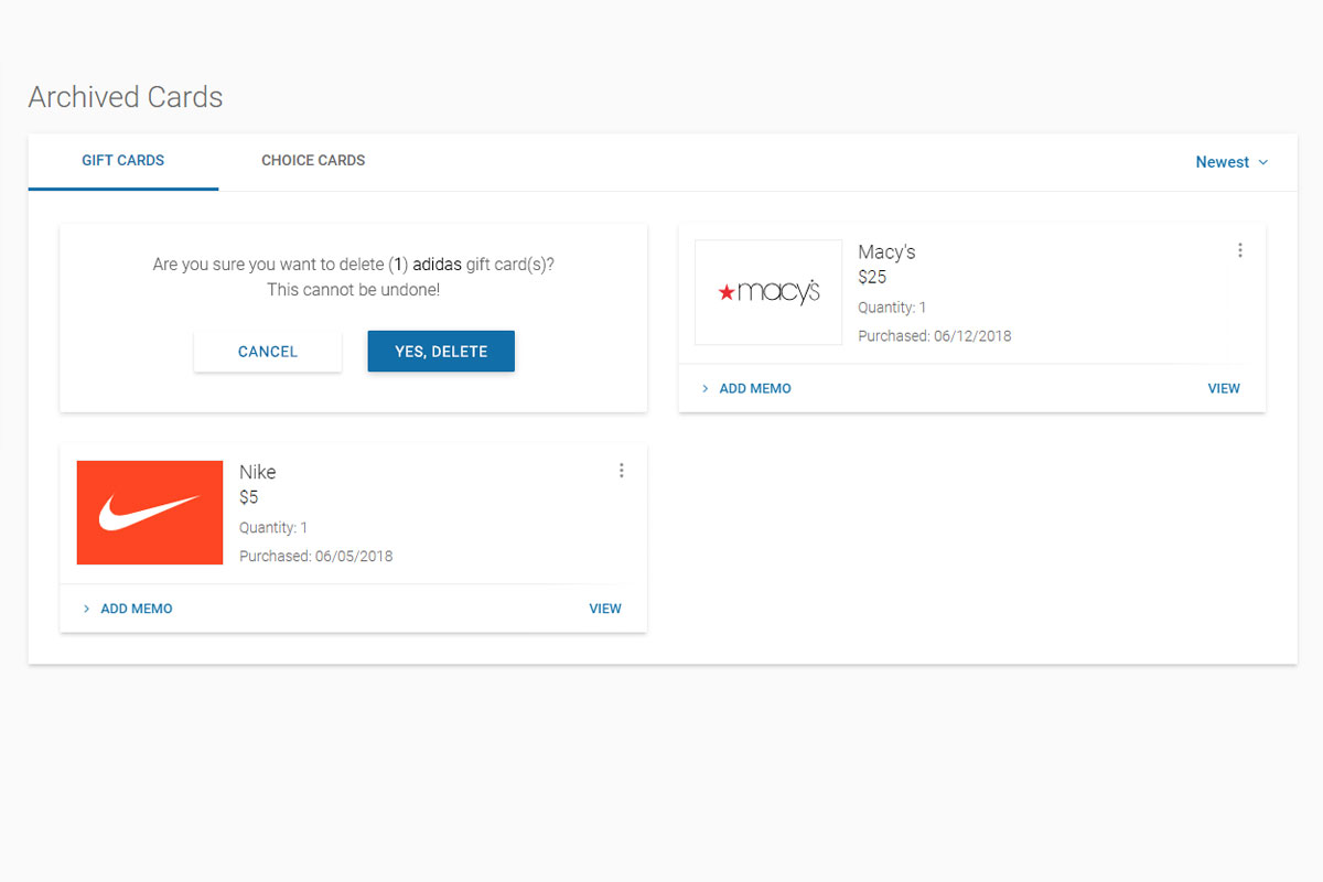
Another massively user requested ability, delete old cards to keep your wallet clear
Play PrototypeDive Deeper
Flow further along this current to see more cases
Estée Lauder Product Redesign
Defining The Standard for all critical internal applications
View Project