Gift Card Experience
The Problem
My new team at eGifter was under extremely tight deadlines from the moment I began as their Senior UIUX Designer. They’d already implemented a functional “Version 1” (v.1.0) of this arm of their B2B2C platform, yet were experiencing low usage and even lower conversion rates on it. Adding onto the pressure, we had over twenty brands, ranging from local favorites to high-profile globally recognized behemoths, coming in that were slated to inherit eGifter’s myriad solutions, of which I would come to design and upgrade them all.
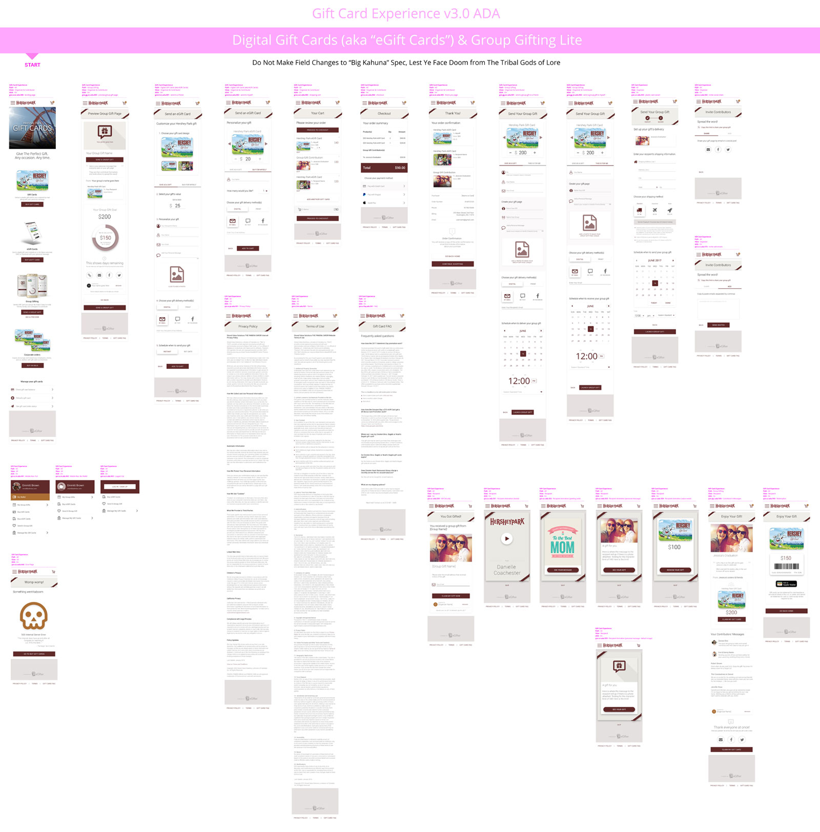
For now, the most pressing item was redesigning their currently live v.1.0 solution to its “Version 2” (v.2.x) iteration, which would form the basis of their platform. Conducting user interviews and applying empathy to discover their pain points, it was evident much of their friction came from the web form feeling as though it was a lot of work for them to complete. Further, the color contrast, typography, overall layout, and so forth rendered their current UI subpar in consideration of WCAG ADA Compliance Standards.
Last, even though their v.1.0 solution was relatively mobile responsive, it could use many more mobile-friendly upgrades. It also wasn't component-driven, so each time we were to spin up another version for an inbound client, the build cycle would be a significant developmental lift. The opportunity to standardize all of this in a streamlined way was exciting, and would come to lay the foundation for an efficiency explosion, putting us far ahead of the competition, driven by clean, battle-tested, user-vetted UIUX geared for mass appeal.
Understand The Field
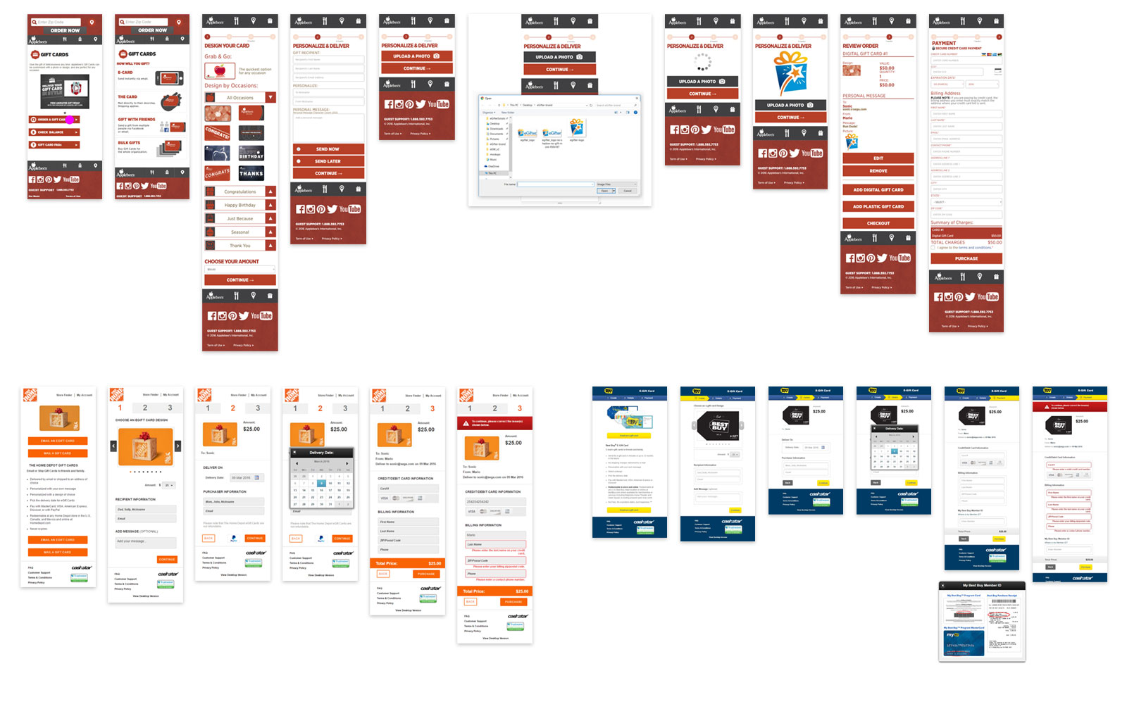
Once I understood what their v.1.0 platform was capable of, I ran competitive analysis on several brands, including Applebee's, Home Depot, and Best Buy. This gave us insight on what they were doing better, plus ideas on how we could improve upon their respective approaches.
Factoring Them Down
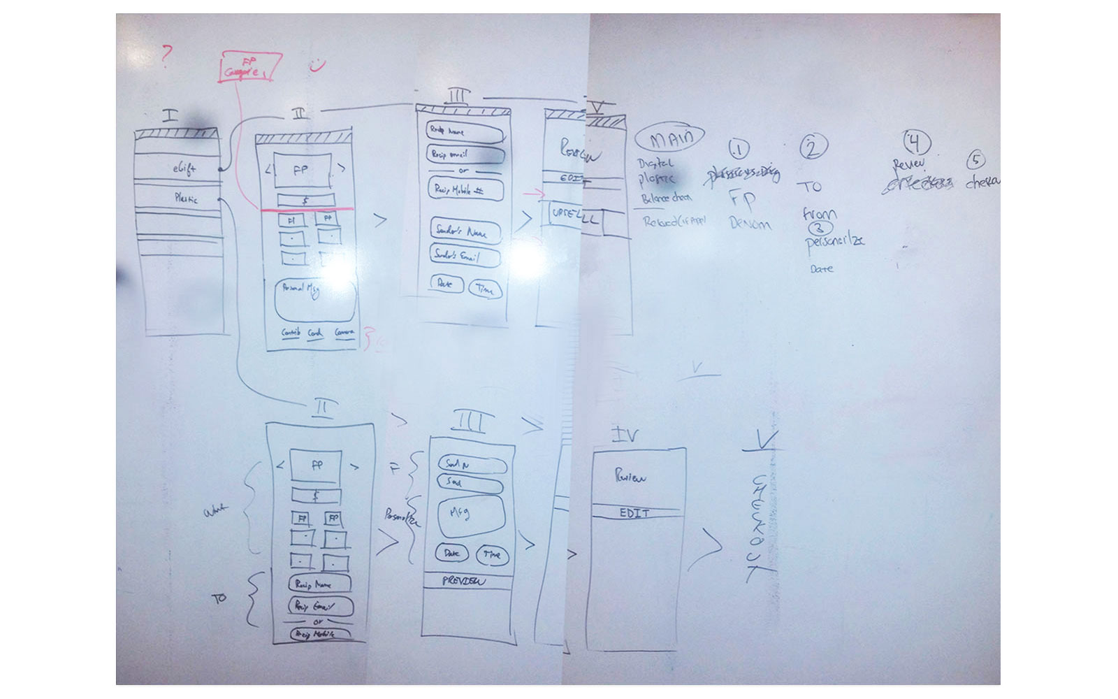
Armed with a deeper understanding of the landscape, I jammed with our Front End Developers and Chief Operating Officer to boil it all down to its minimal wireframe skeleton.
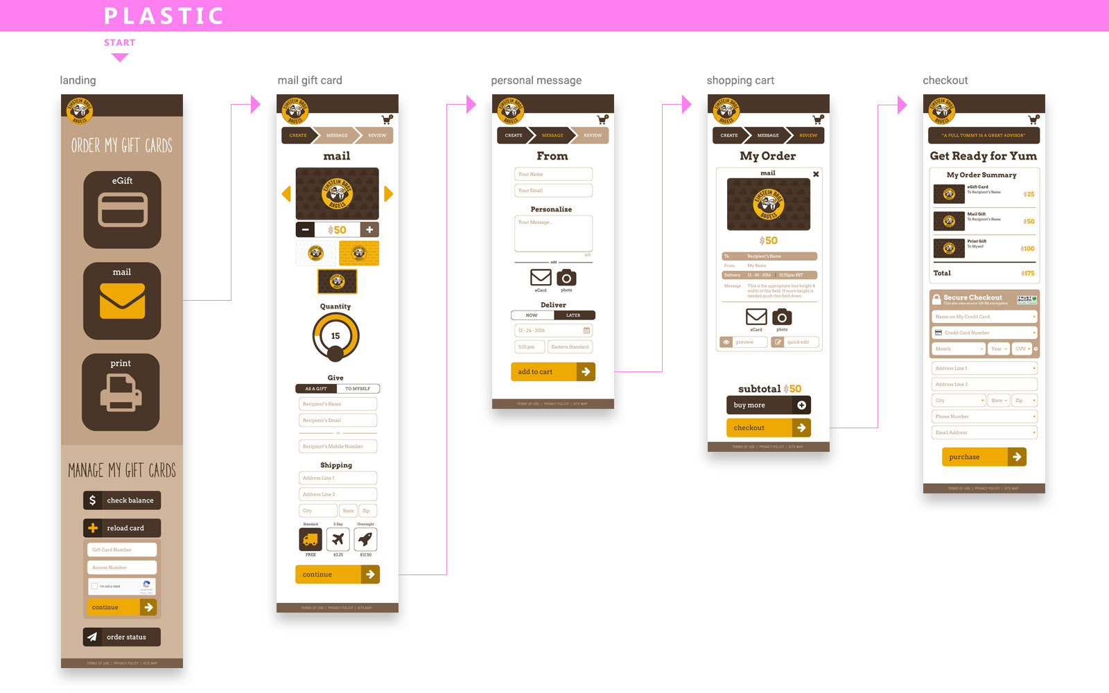
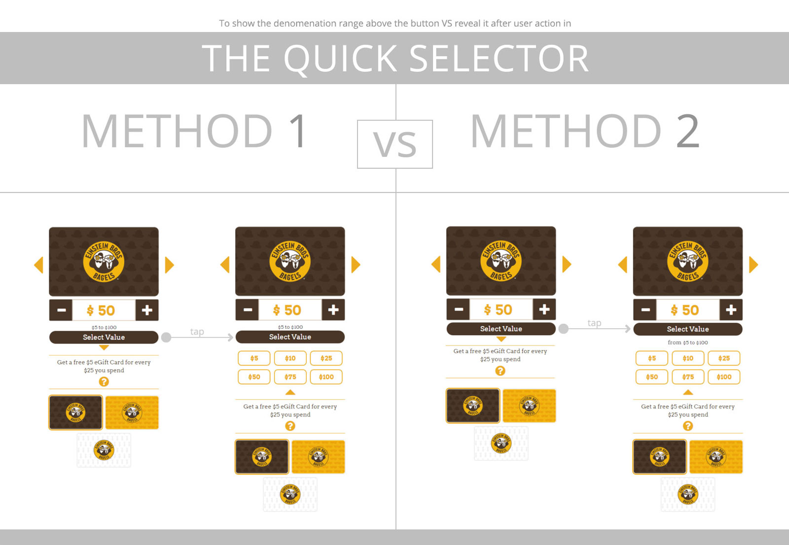
The Minimal Lo-fi
Seeing the core structure come into focus, I decided to break down their forms into steps, which favors lower cognitive load and less visual noise upon the user, thereby reducing their sense of working to complete it.
Obtaining Stakeholder Feedback
Once laid out, I then presented three possible lo-fo flows to our Chief Operations Officer to feedback upon. Naturally, his notes were encouraged, and it was awesome to see him write out "you're the man / thank you" at the end. You're the man too, Eric!
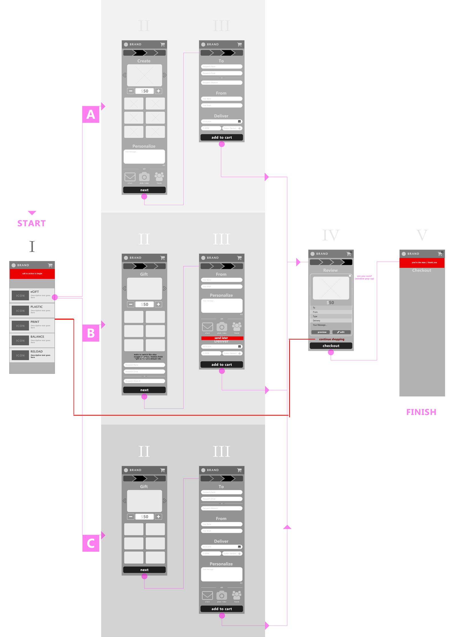
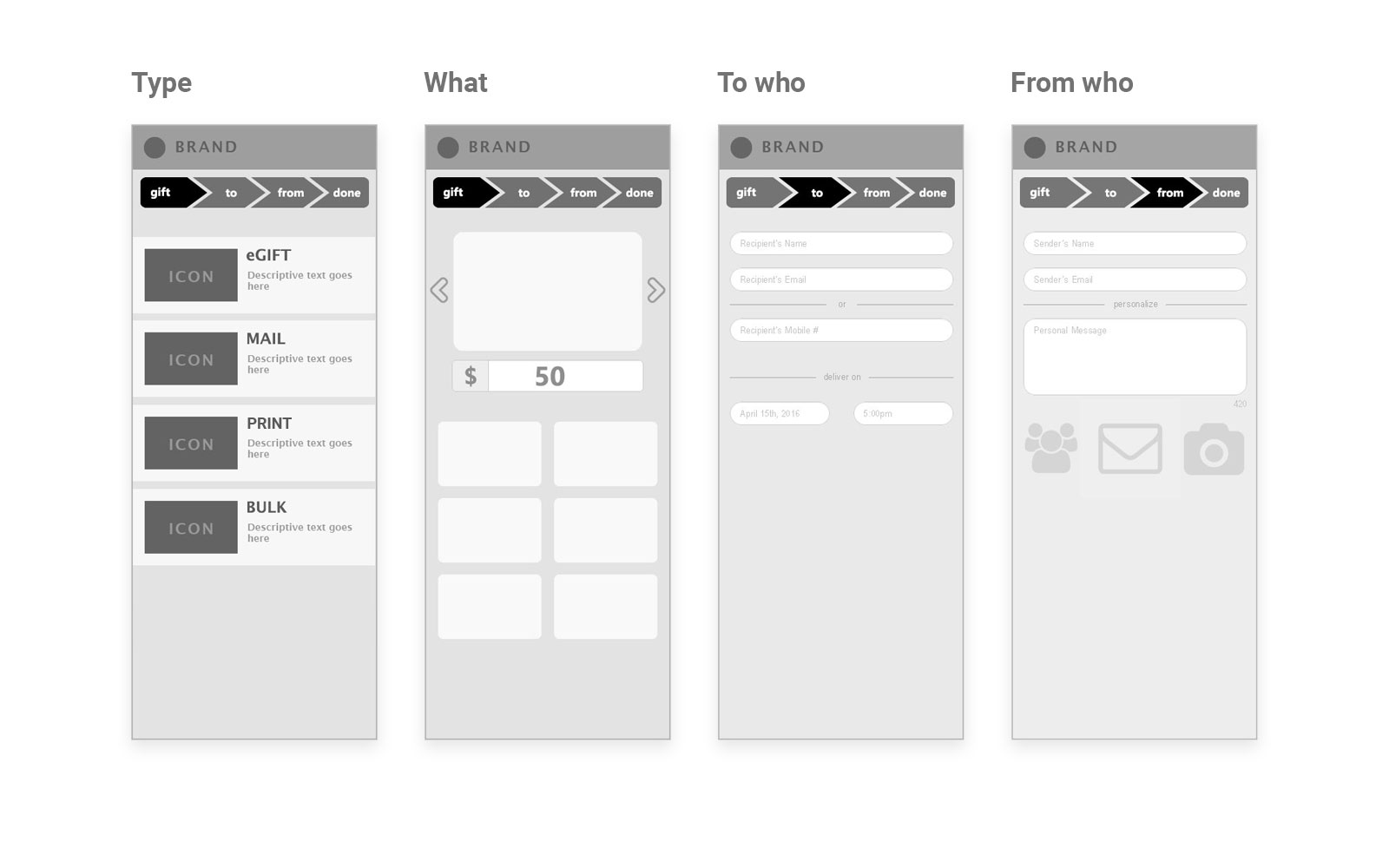
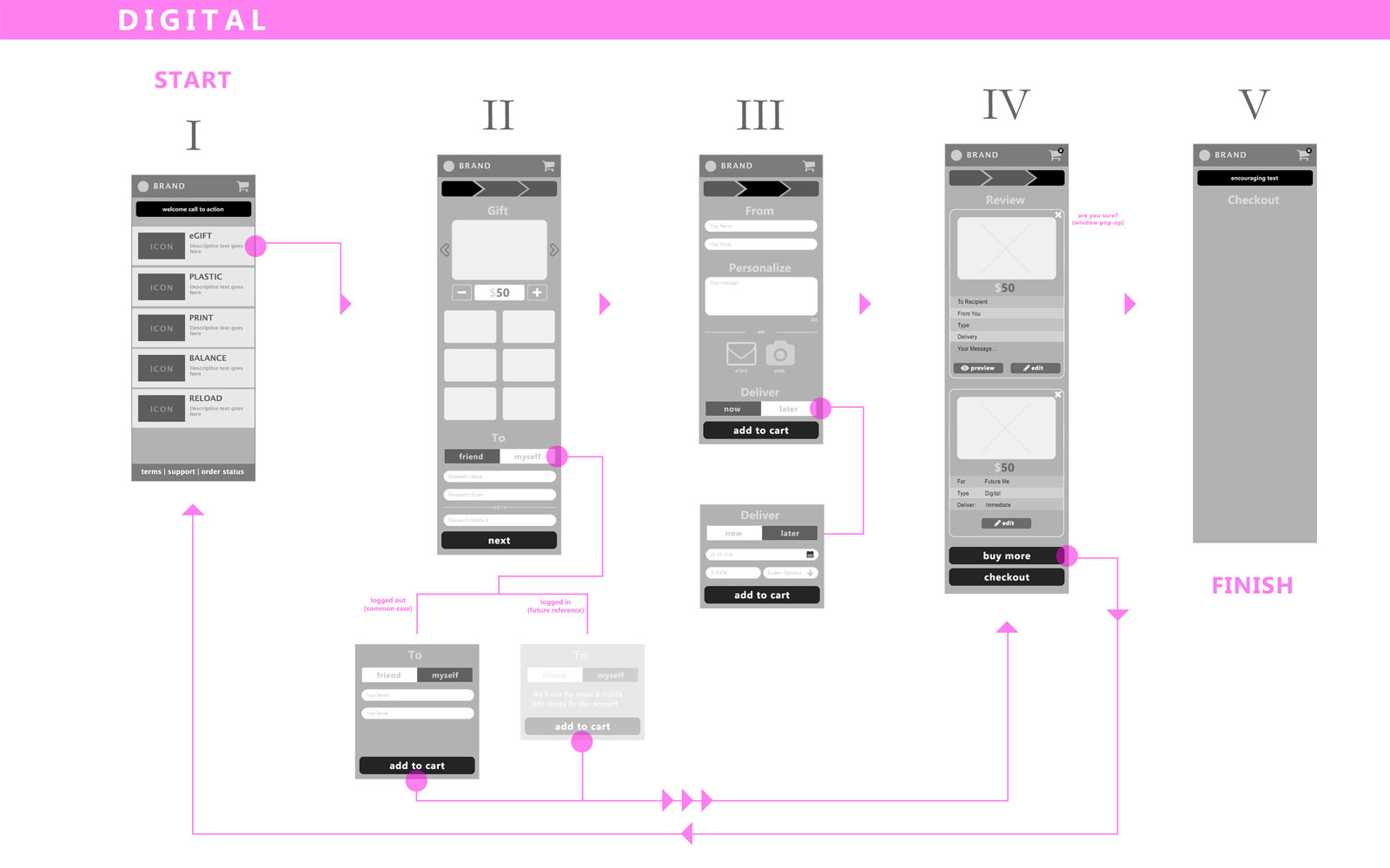
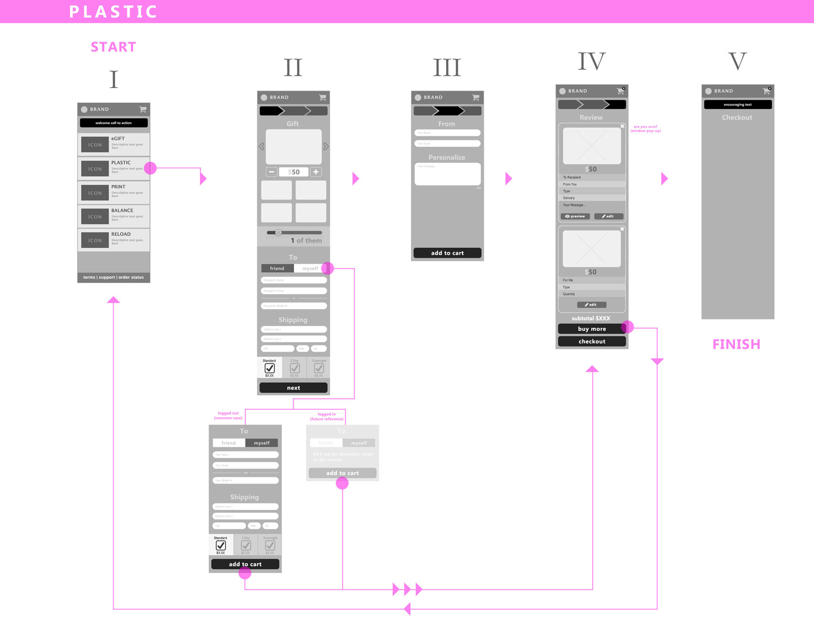
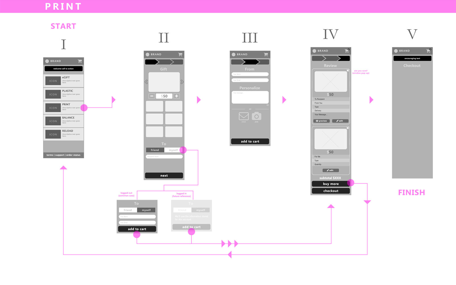
The MVP (Lo-fi)
An iteration later, we nailed the MVP in the digital context as the prime use case. Then each other method, plastic and print, naturally branched from its roots. We eliminated a step and cleaned up a few things to forge our rock solid, fundamental flows.
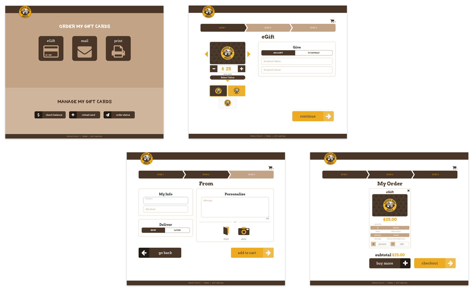
The MVP (Hi-fi)
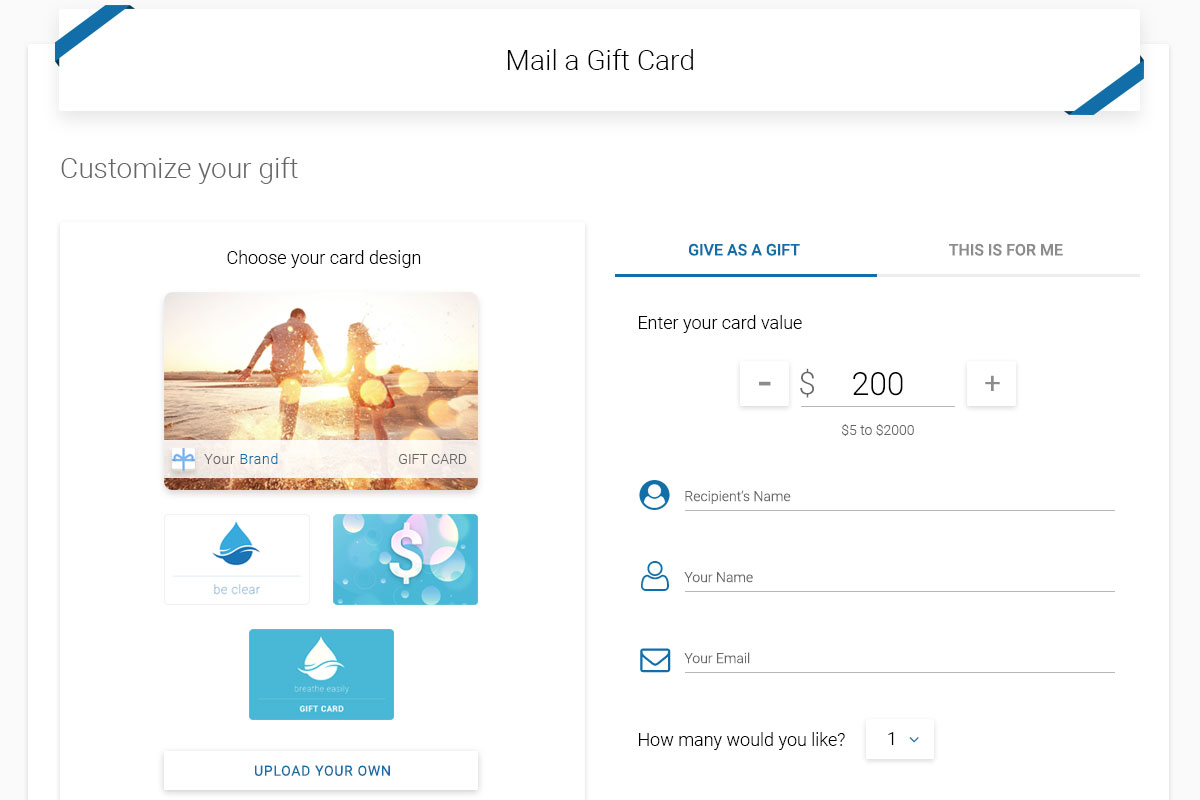
Our core now in place, I proceeded with how the solution would look like, matching match our initial brand, Einstein Bagels. Applying this to other brands would simply be an asset and palette swap so we can spin up any brand, maximizing my team's efficiency.
Taking a Step Back
I made the baseline flow following the MVP on the first pass. The UIUX was clear, yet the language was under debate from various perspectives. There were also many stakeholder questions regarding my mobile-first approach in general, since they’ve never seen a process like mine before. Plus, being our clients have a strong desktop userbase, they all had to see, discuss, believe, then proceed.
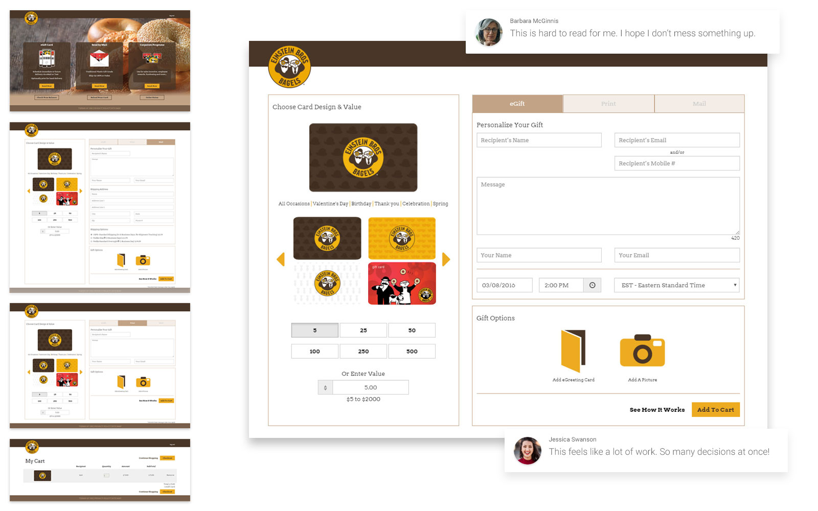
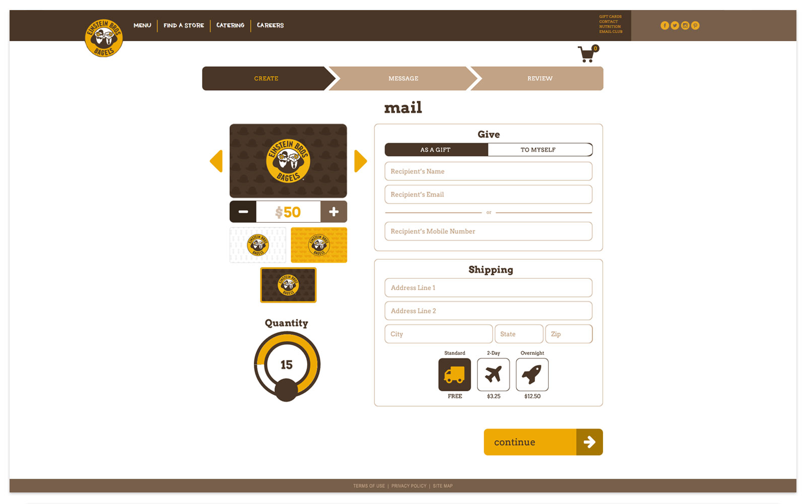
Presenting Heroes to Stakeholders
I picked the most involved screen in this flow from the desktop view. This helped in convincing stakeholders that each element was in place while facilitating comparison with the v.1.0 solution.
Confident Procedure
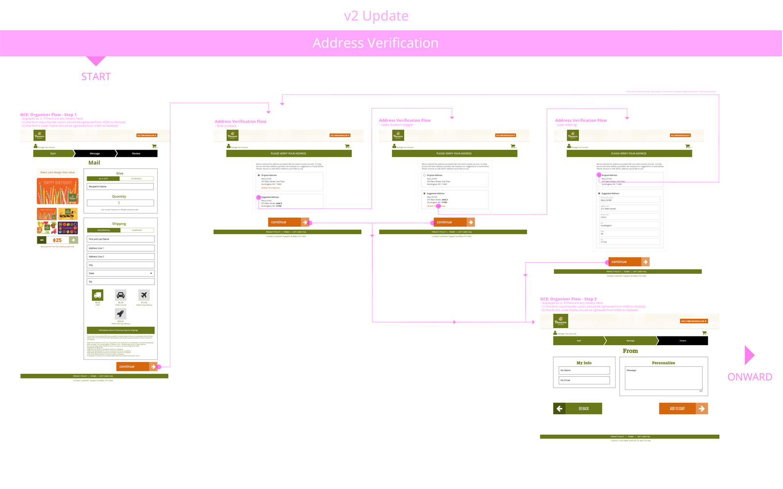
Furthering the Hi-fi polish forward, each screen, case, and state were designed and accounted for.
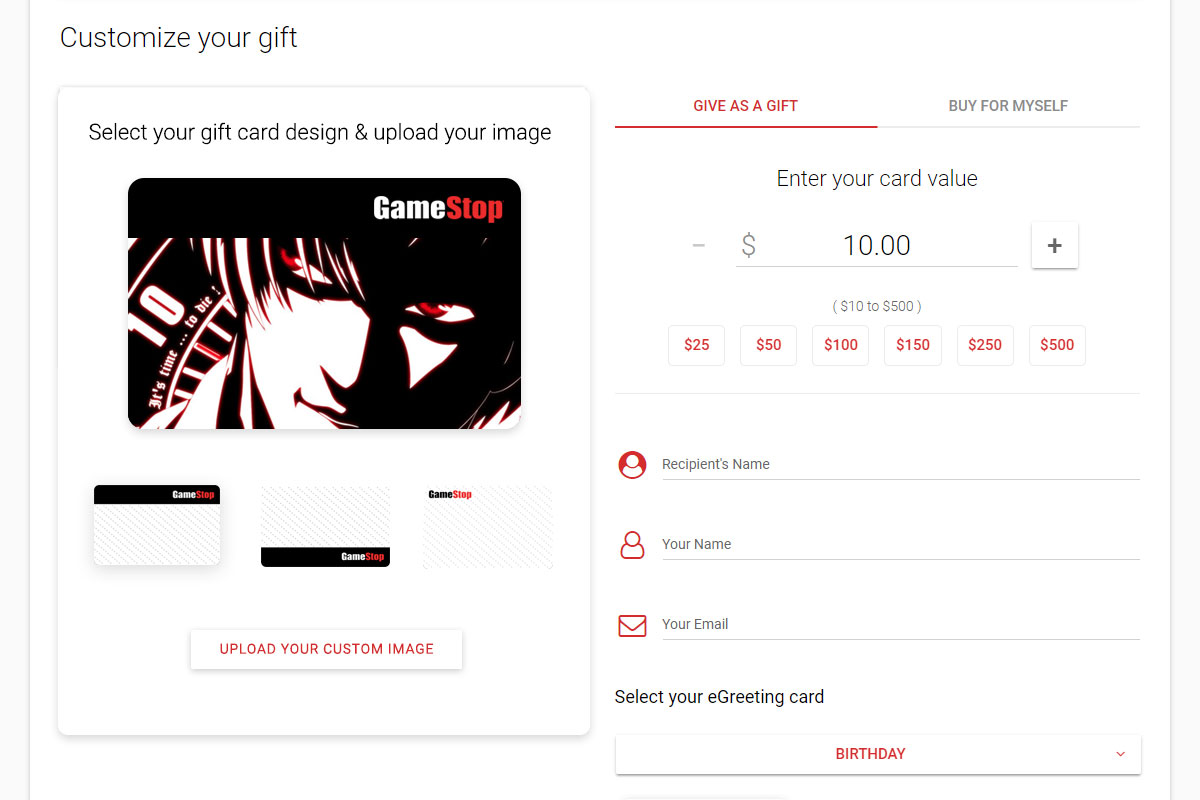
Everything Matters
To show the level of scrutiny each element underwent, here’s one example. Being this was to be structurally repeated for myriad brands, every detail had to be thought out, justified, tested against, requirement checked, and having achieved consensus with high quality.
Adding Platform Features
As our client list expanded, their custom solutions would then increase the amount of feature sets the v.2.0 platform would support. These were variable and my task was to repeat my methodology, design the solutions, then hold design documentation as The Source of Truth for our entire company to have a shared language and vision. Taking my Design First approach, another benefit was that clients were invited to give early feedback while managing or exceeding expectations.
Feature Explosion
Client requests, business rules, and platform requirements were the anvil upon which new abilities were forged. At this point, the massive benefits of my "Lead With Vision From The Front" style was clear, and so no code was written until my "Source of Truth" was created and approved.
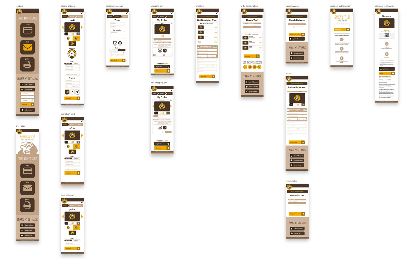
Engineering Schematics
Making an "Atlas" of the product screens proved to be valuable for engineering, development, management, business, marketing, and operations since we all could easily take a zoomed out lens, point, and communicate clearly.
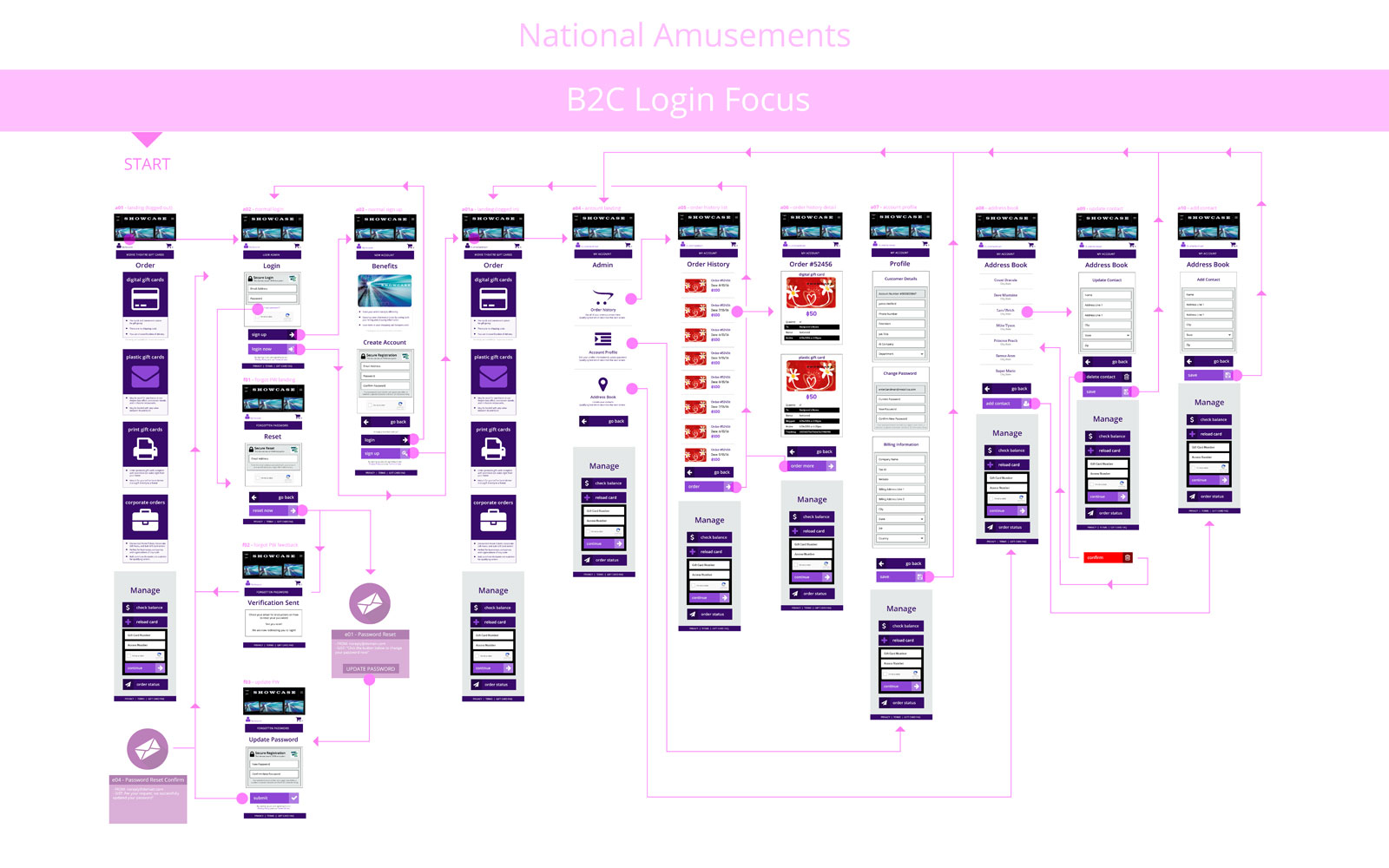
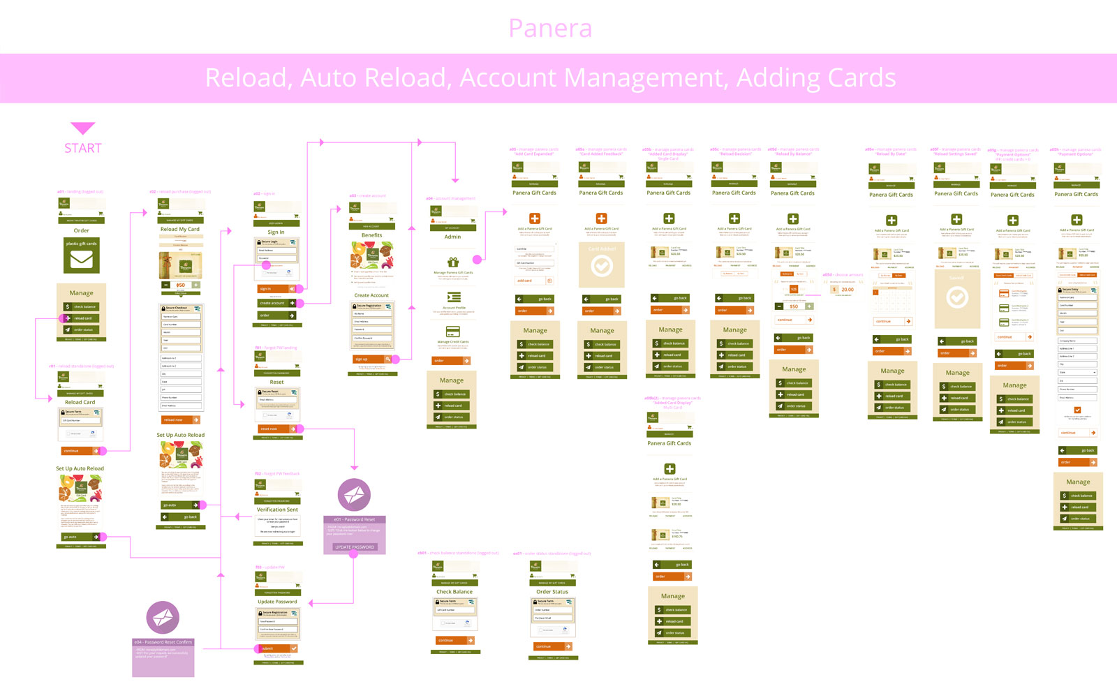
Upgrading The Solution
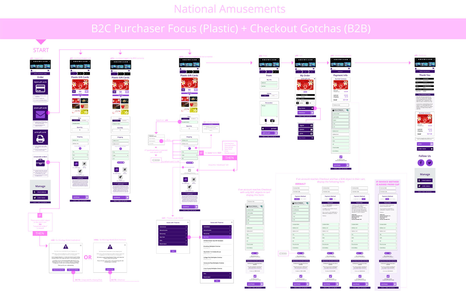
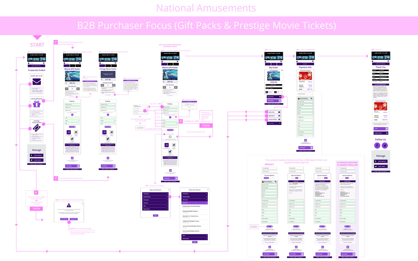
With clients such as Einstein Bagels, Panera Bread, National Amusements, and Overstock served, my status advanced rapidly. Entrusted to design their entire software suite, from Digital Wallet to Marketplace, I took this opportunity to evolve our components, extending Material Design principles, and grow our platform from v.2.0 to v.3.x. Accomplishing this would put us steps beyond our lead in the competitive landscape.
Hershey Park Platform Solution
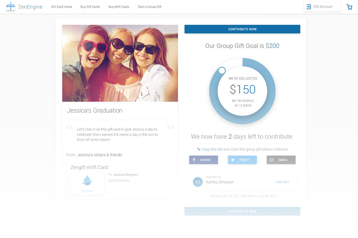
My goal was to put us in an unreachable lead, where competitors could only then hope to copy. Try as they may, we'd be so clear and efficient that by the time they could, we'd already be onto higher grade solutions. Thus, the Gift Card Experience smoothly led into new software in our product suite, such as crowdfunded Group Gifting.
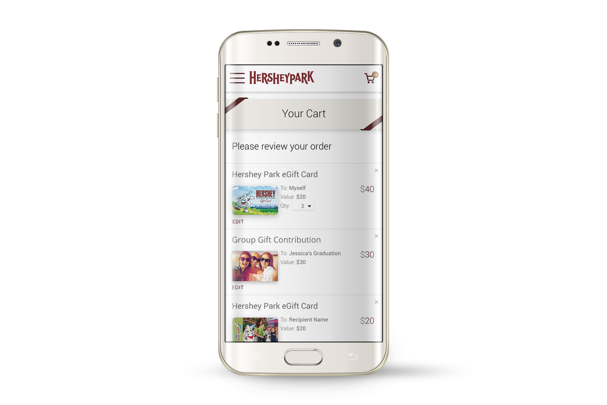
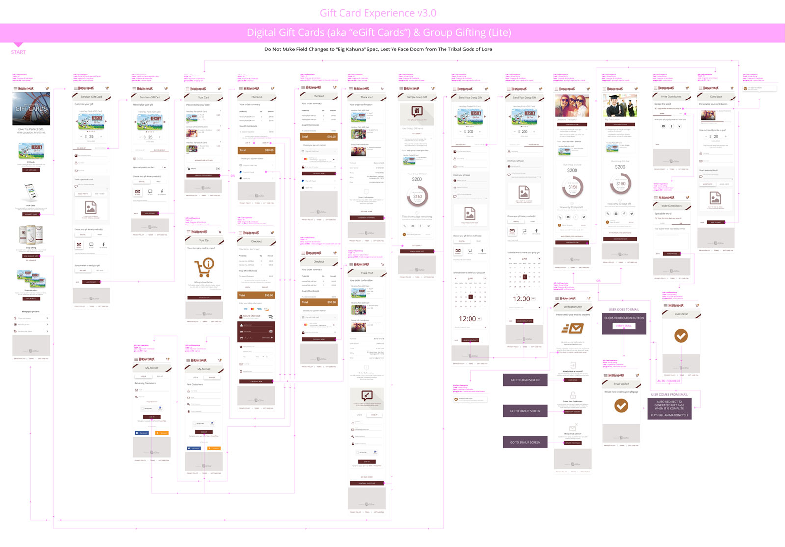
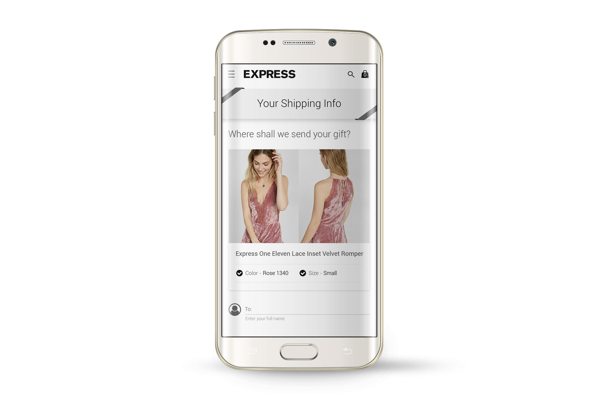
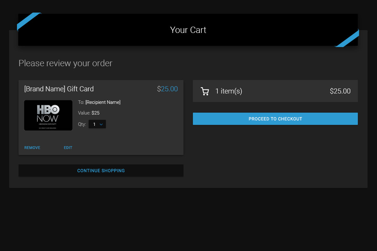
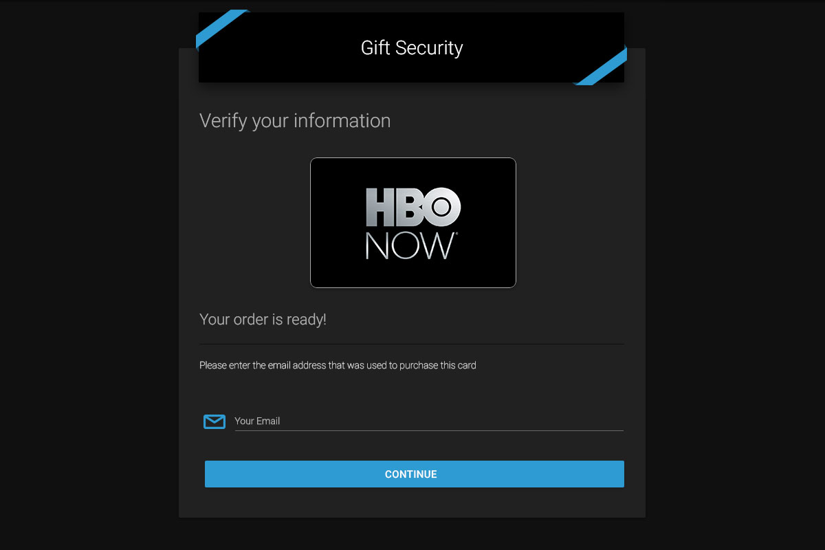
Digital Gift Cards Flow
Check out the prime use case as well as the mobile navigation and landing page
Play Prototype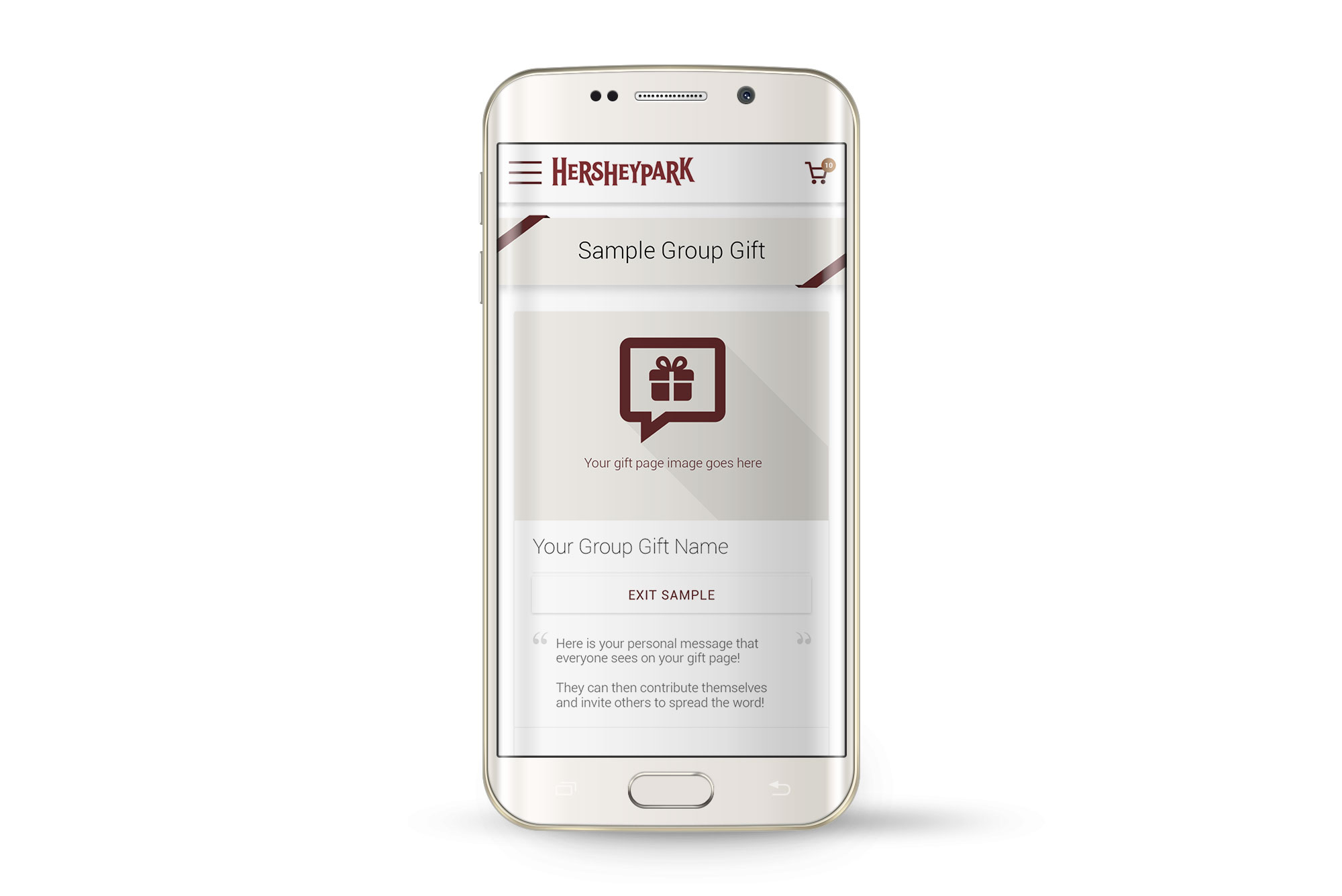
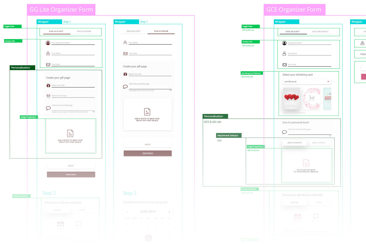
Group Gifts - Organizer Flow
Start with a sample, then run through campaign creation in as few screens as possible
Play PrototypeThe Messaging Nervous System
Streamlining every email trigger was always running in the background.
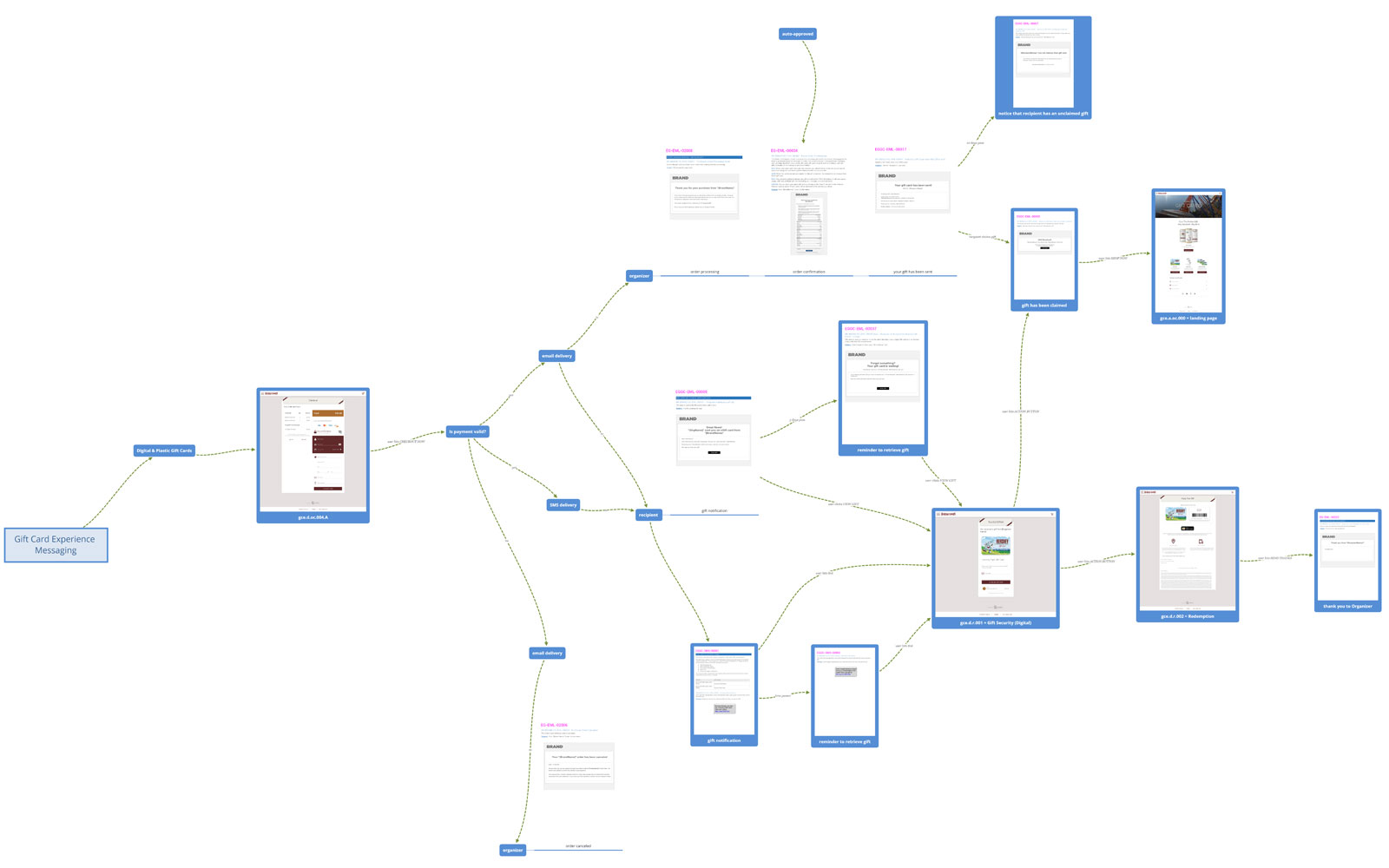
Comparing New Sections and Methods
As new features came in with corresponding email triggers, defining screens along the user journey was natural. To ensure we got it right, I designed various paths and layouts so we'd hit consensus.
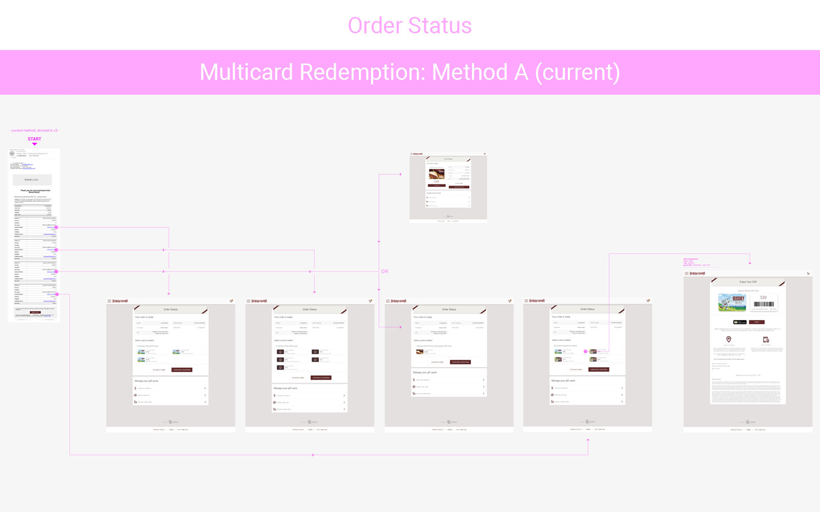
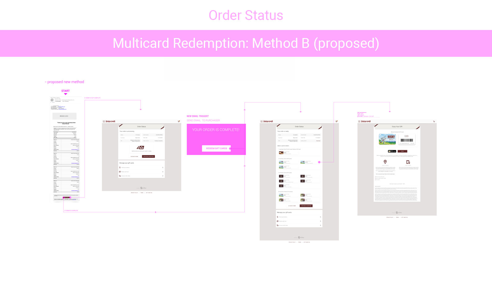
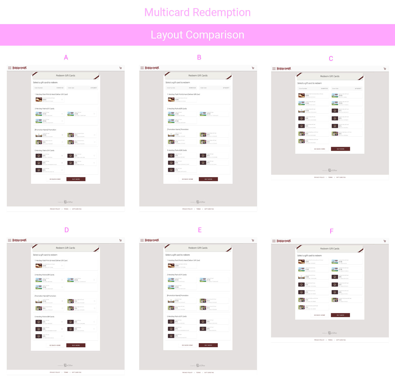
Testing The Ideal Layout
Once our user journey was optimal, I then created several viable layout options.
Victory Laps
Onward we traveled, fulfilling Statements of Work as they came.
Various Injection Styles
In addition to our standalone solution, we would also inject it within a client's existing site and mobile apps, organically growing their customer offerings.
Client Native App - Digital Cards
Optimized for iOS to leverage native mobile components
Play Prototype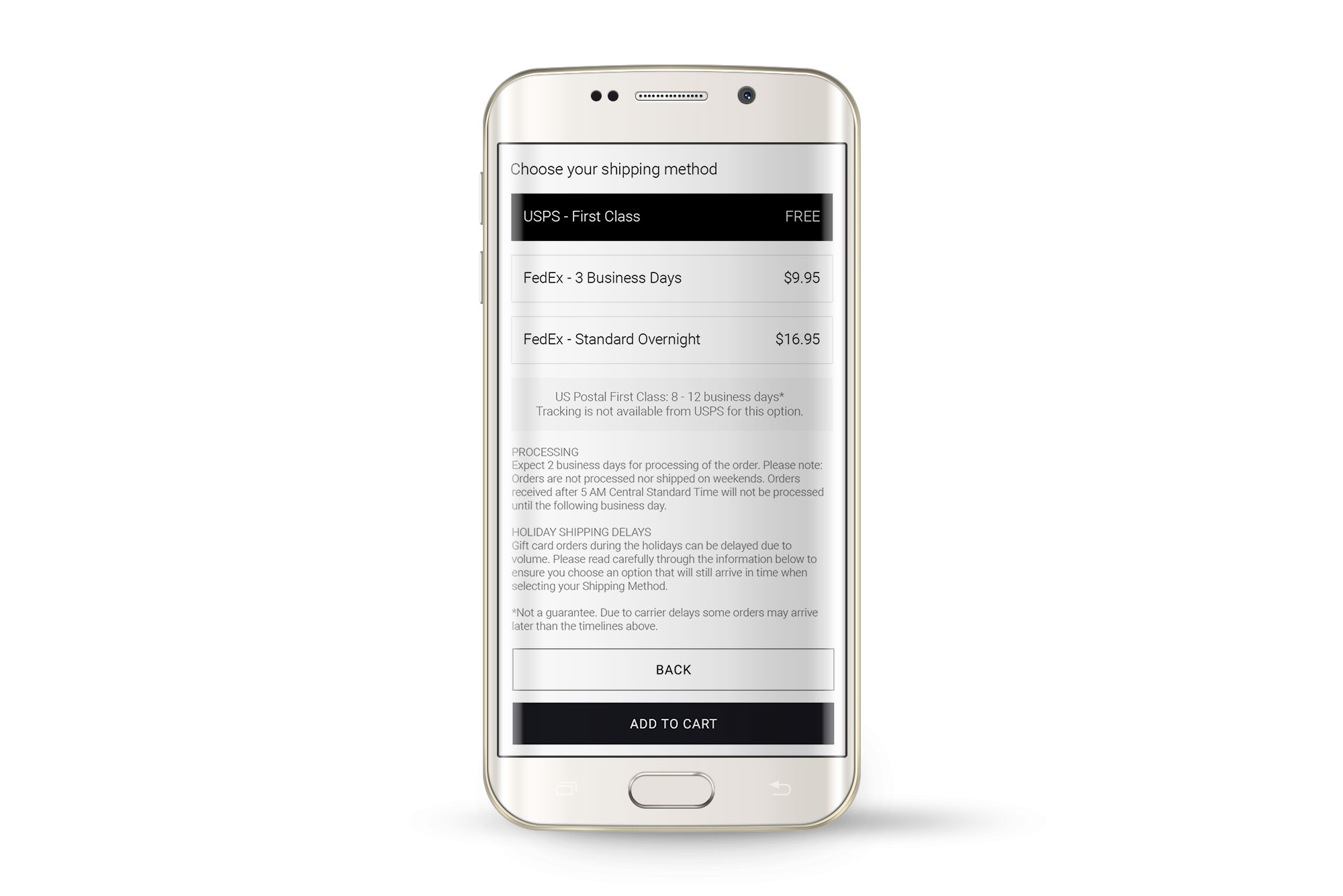
Client Native App - Physical Cards
Mobile components given the plastic gift card context
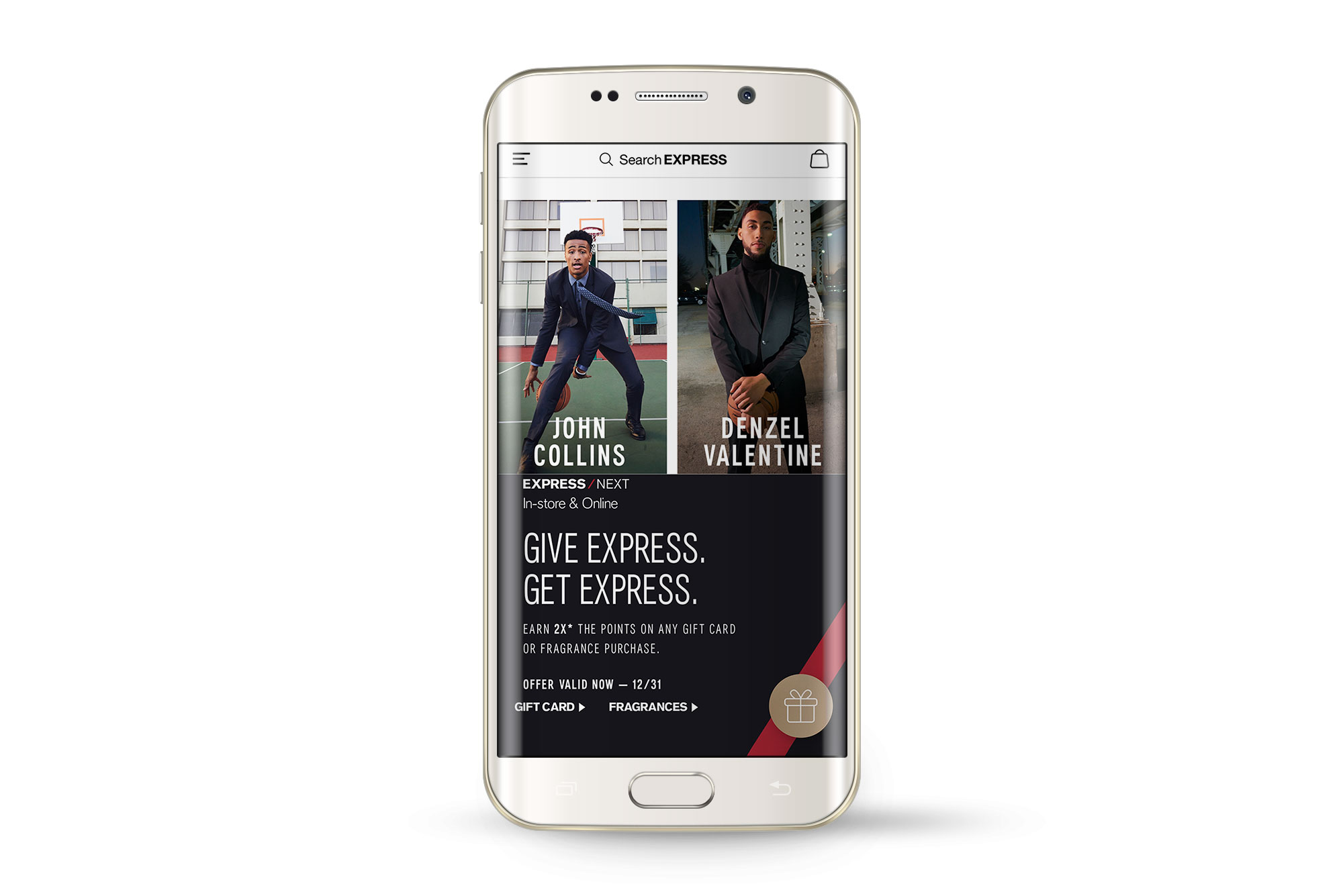
Play PrototypeExpress Solutions
Thought Counted
Did you get a gift that wasn’t it? My solution gives you the option to swap the gift you got with another seamlessly
Play Prototype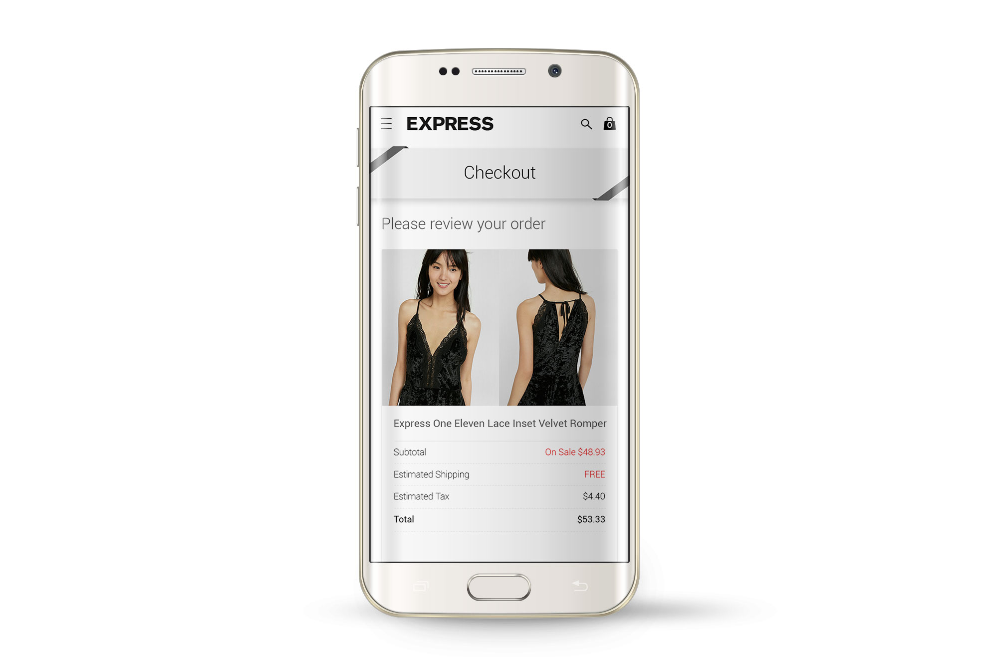
Deep Integration
Injecting our solution within the client’s already existing UI gave them superpowers
Play Prototype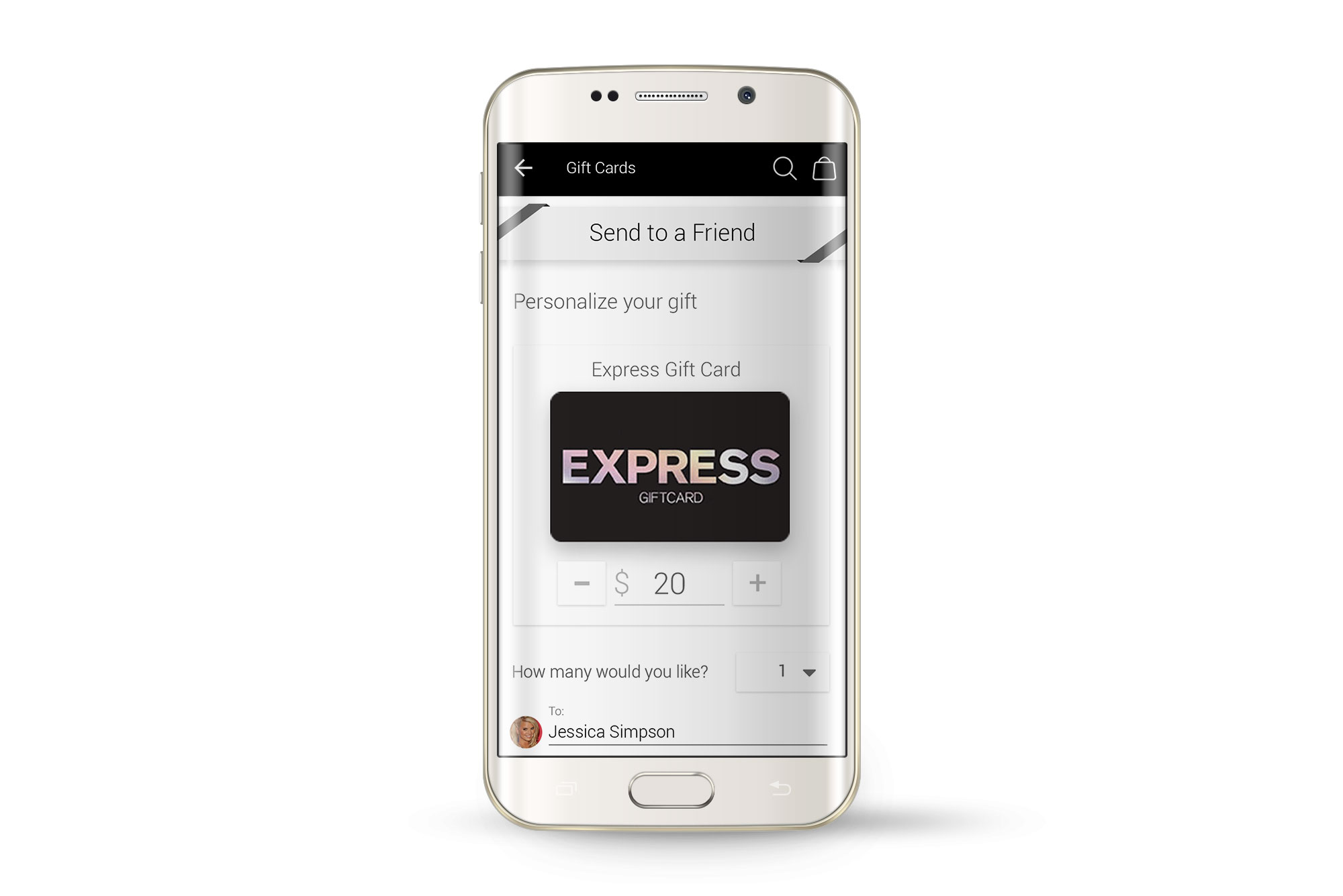
Native App Injected
My solution embedded within the client's mobile header, with screens matching their mobile UI
Play PrototypeClient Promotion System
Defining various platform components to guide the user along their journey to take advantage of client sales campaigns.
System Core
Carrying the promotion narrative to reassure the user through every screen
Play Prototype
Upgraded Top Banner
An interactive component to seamlessly display the promotion in detail
Play PrototypeSurgical Facelifts
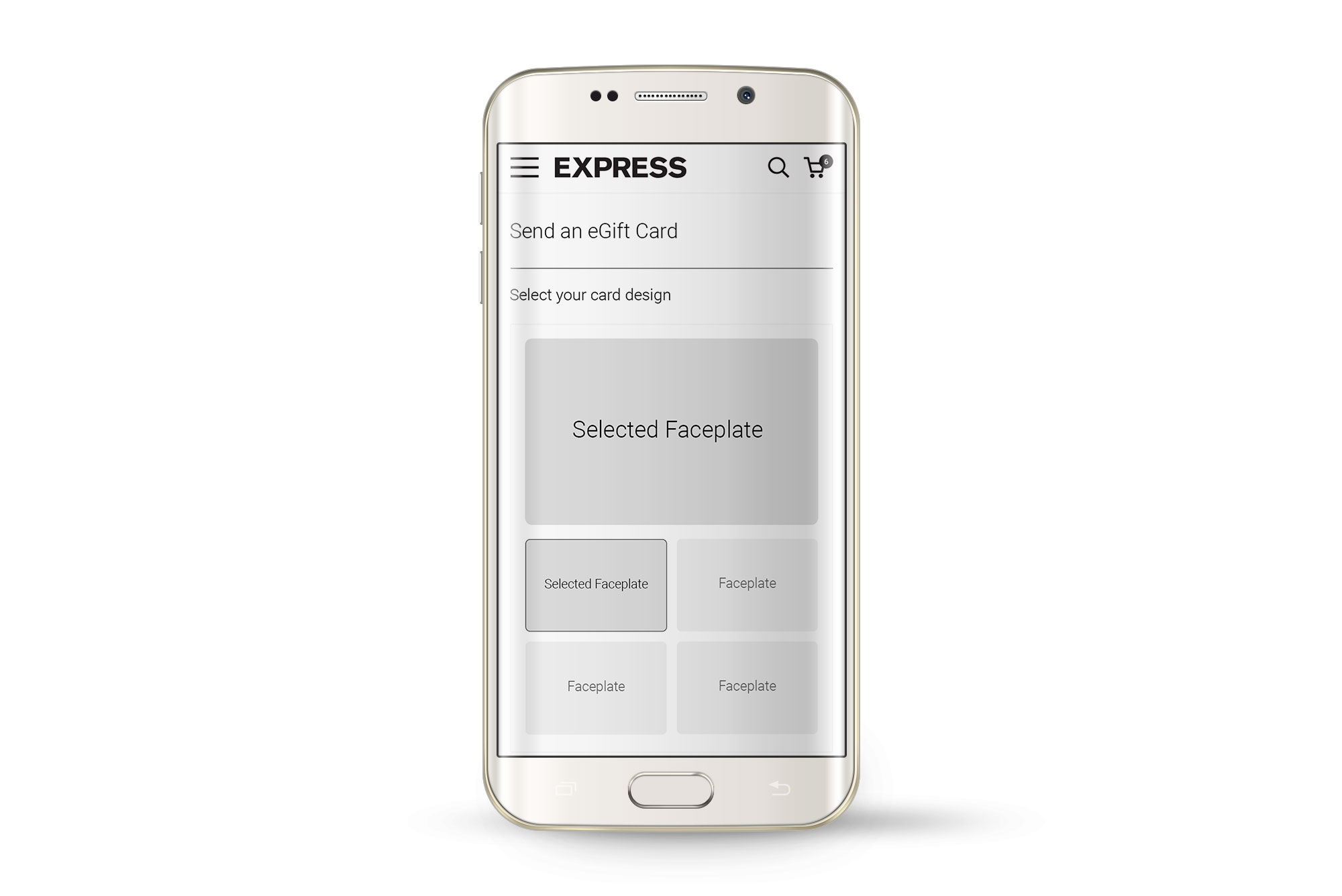
Per client request, this allows user generated images to add further personalization to their gift cards.
Custom Faceplate Variant 1
Another way to handle uploading and cropping for A vs B testing
Play Prototype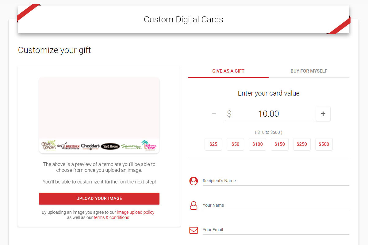
Custom Faceplate Variant 2
In accordance with "The Rule of Threes", here's a third UIUX option
Play PrototypeCorporate Orders (Lo-fi)
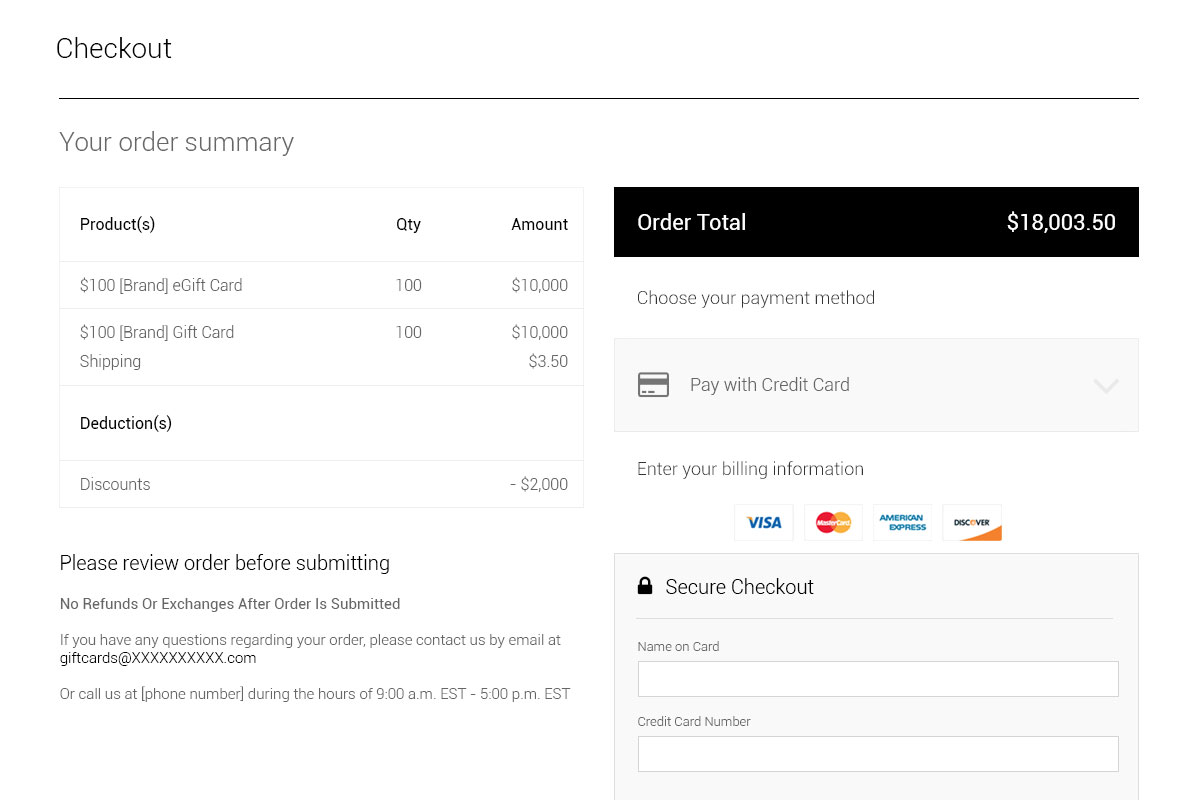
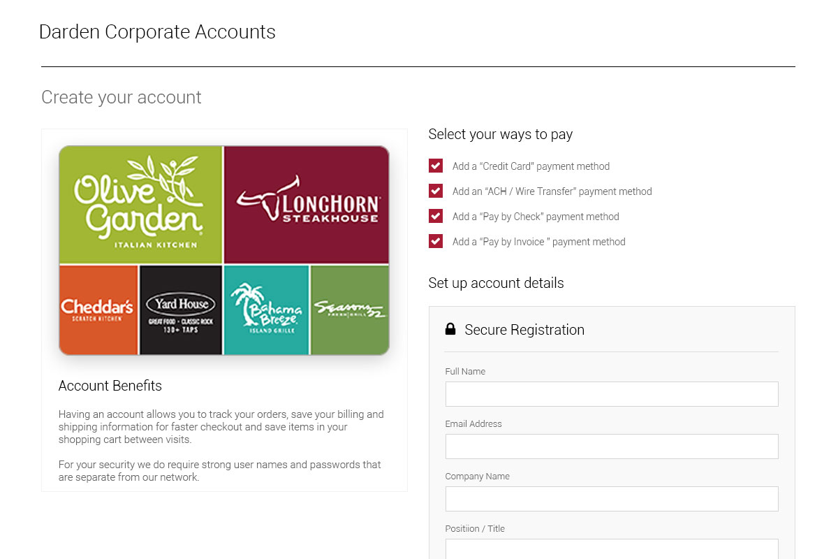
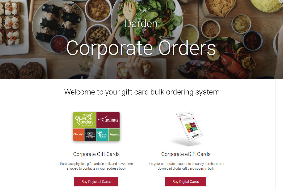
Extending B2B2C to B2B, I defined how client bulk orders would flow, allowing them to internally acquire gift cards numbering in the thousands. Full admin features, order histories, invoice numbers, and so forth are all accounted for.
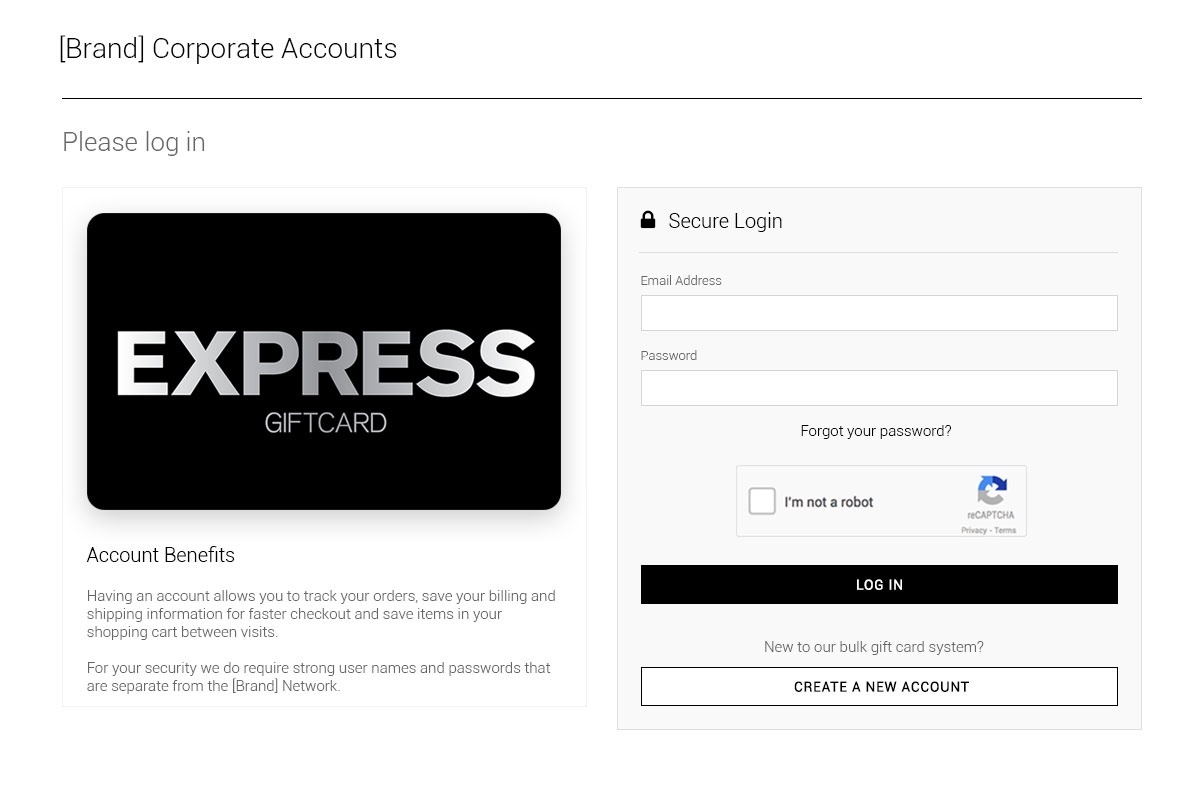
Log In, Sign Up
Being this is internal to our clients, the hard login wall method fit
Play Prototype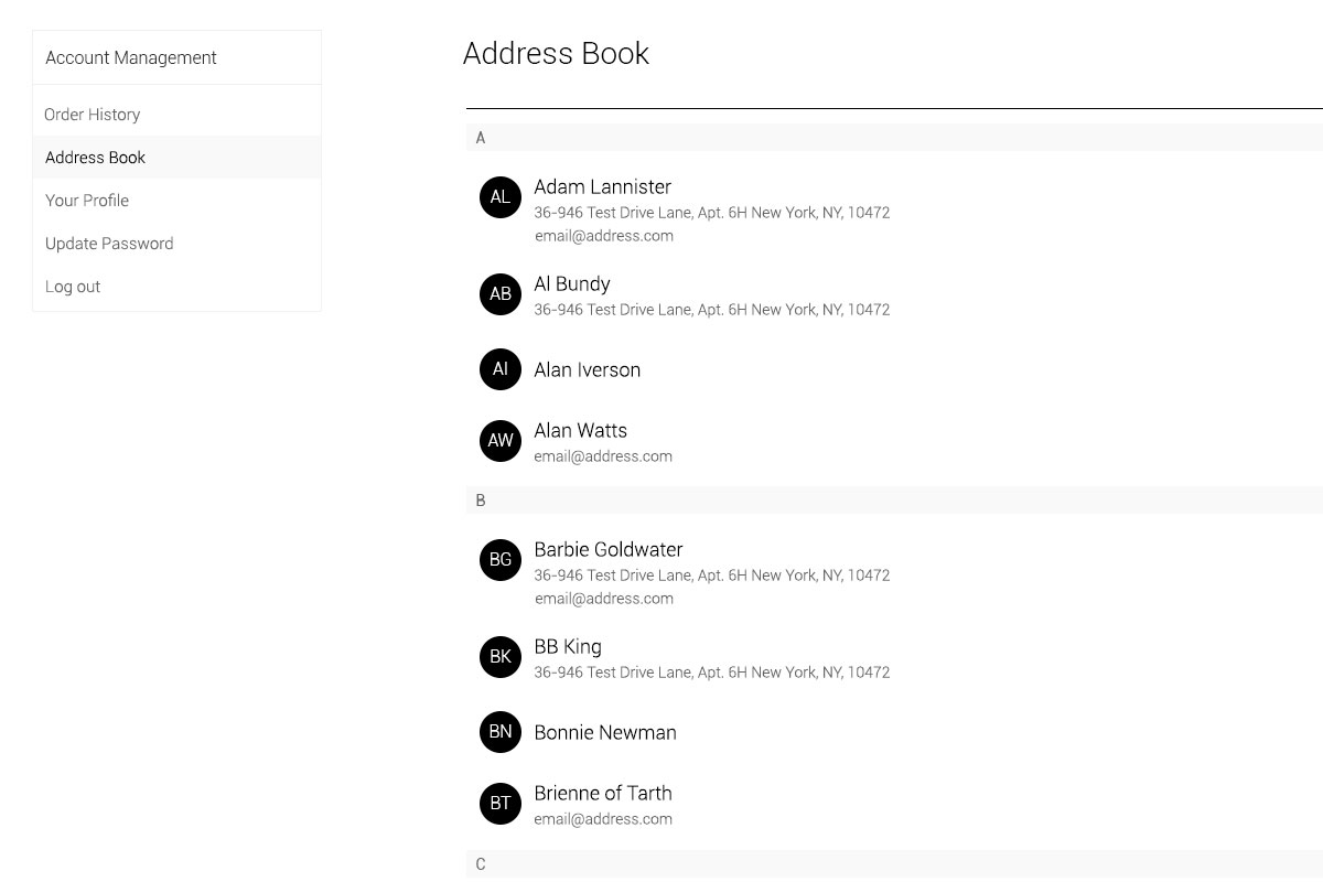
Account Management
Designed to cater to higher degrees of corporate control and accounting
Play PrototypeCorporate Orders (Hi-fi)
Nailing the core experience was straightforward, then fleshing it out towards higher client satisfaction was simply an asset swap away.
Corporate Branches Unlock
Once logged in, all features fitting to any user's access level became visible
Play Prototype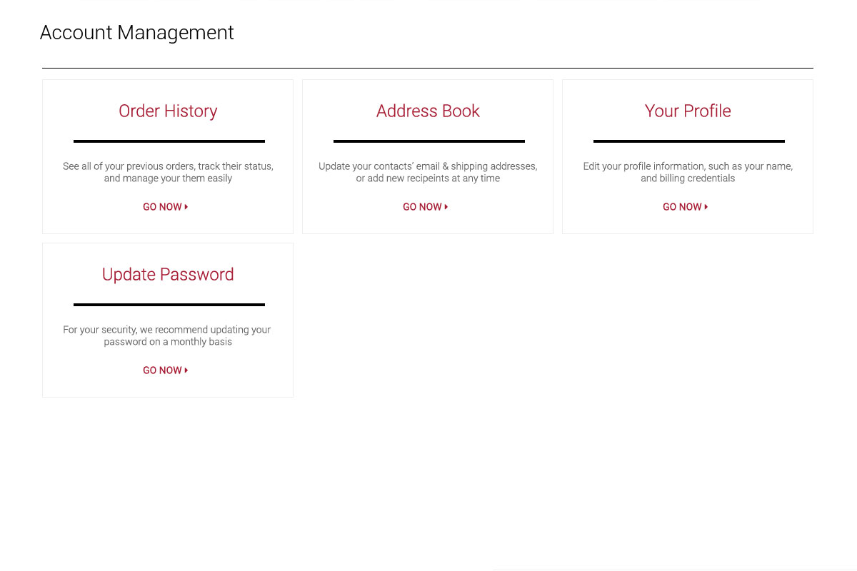
Dark Theme
With brand palette swaps so commonplace, of course we'd need to go dark. It's the new standard anyway. Once I defined all the baseline charcoals, greys, and the role of black itself, I kept my brand-driven primary and secondary coloration logic so we could switch between Light and Dark modes seamlessly.
Dive Deeper
Flow further along this current to see more cases
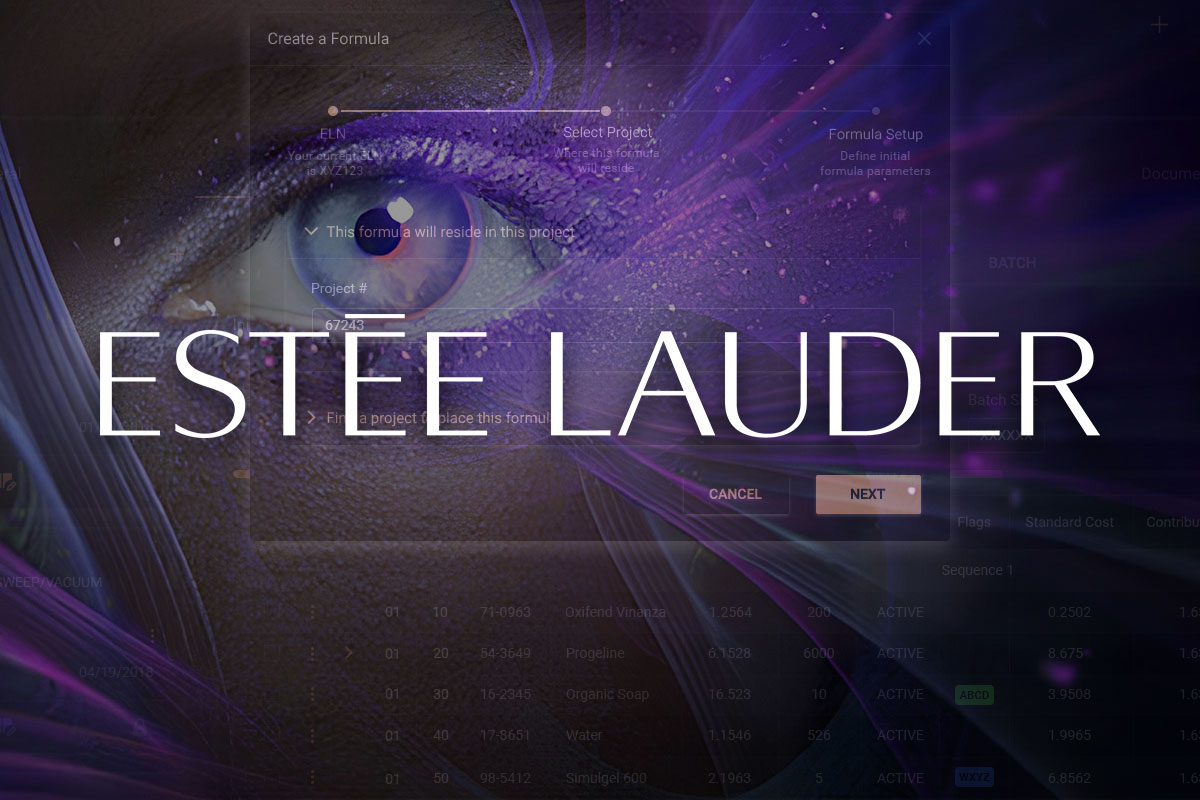
Estée Lauder Product Redesign
Defining The Standard for all critical internal applications
View Project