Atomic Design
The Problem
Occasionally we'd get feedback from design teams who weren't as technically sound or battle hardened. Often their proposals, although appreciated, would either be misinformed or lacking in wisdom. When this occurs, communication, understanding, and standardization are in order.
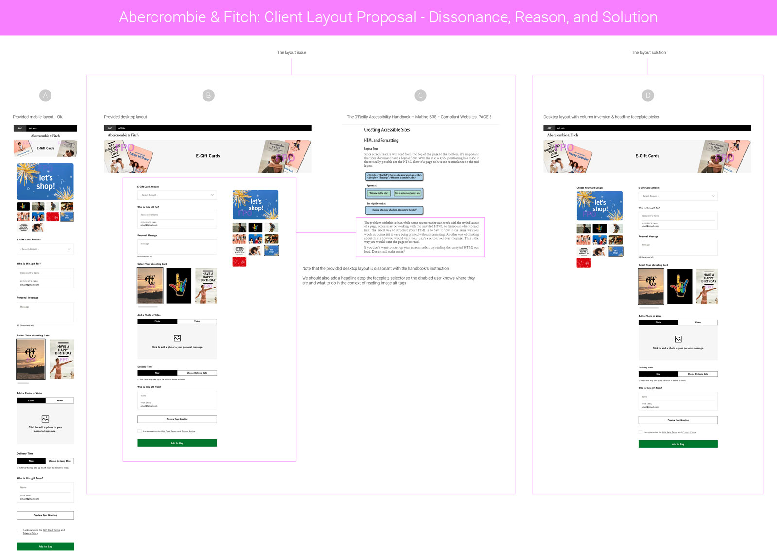
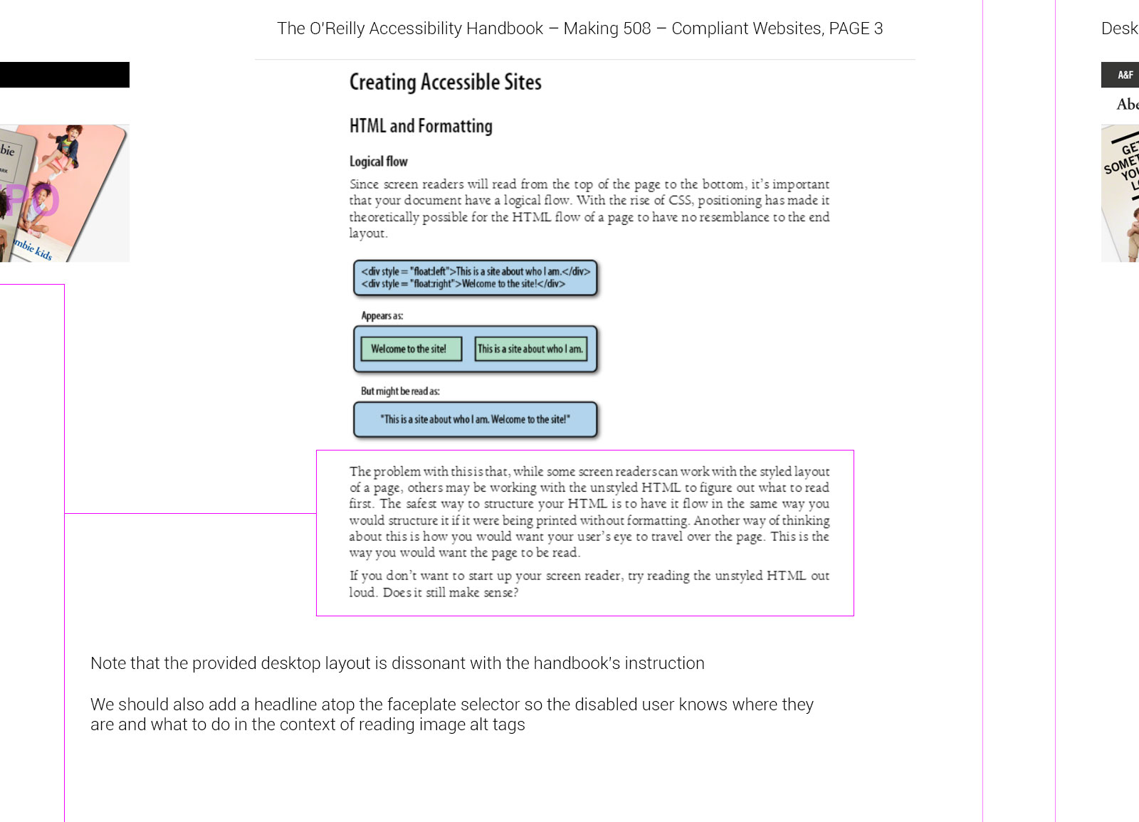
Zooming into this, we can see each layout should follow logical flow in their design as well as in their DIV structure on the front end. Screen readers like JAWS essentially work by targeting all your page's DIVs the way TAB on your keyboard would. Page layouts are scanned and read from upper-left to lower-right in a descending Z-pattern, so when Design blunders logical flow, the app fails accessibility.
To the unitiated this may seem trite, negligible or even irrelevant, yet lawyers randomly do spot-check sites for accessibility standards compliance. Given they find violations, lawsuits could randomly pop up in an inbox. Call them digital ambulance chasers, opportunists, or enforcement agents, the fact remains that it happens; and we don't want that inbox to be ours.
Scare tactics out of the way, making apps the blind could use is just the right thing to do. On a personal note, I took care of my blind father for fifteen years all the way to the end, so I know how it is.
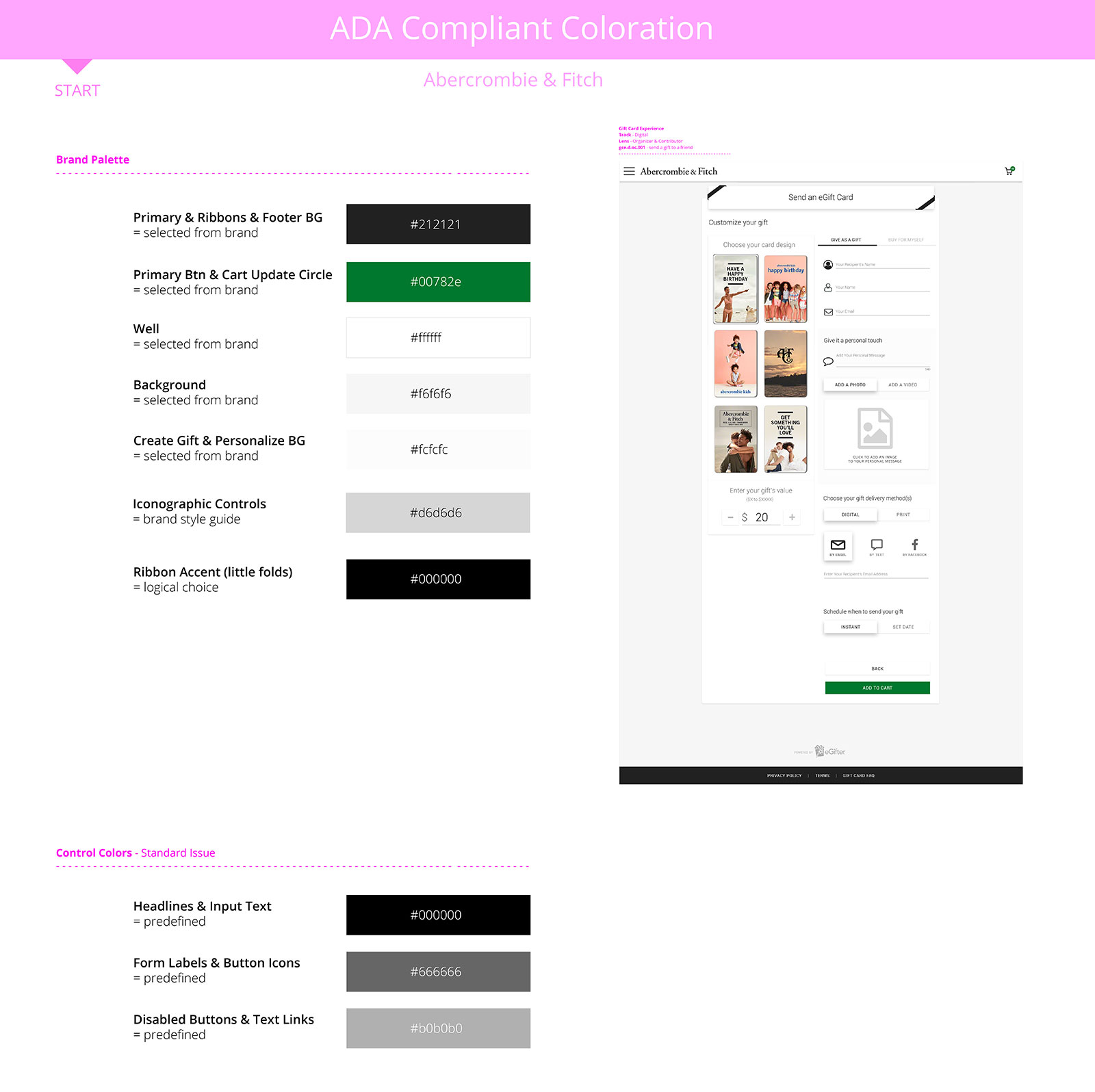
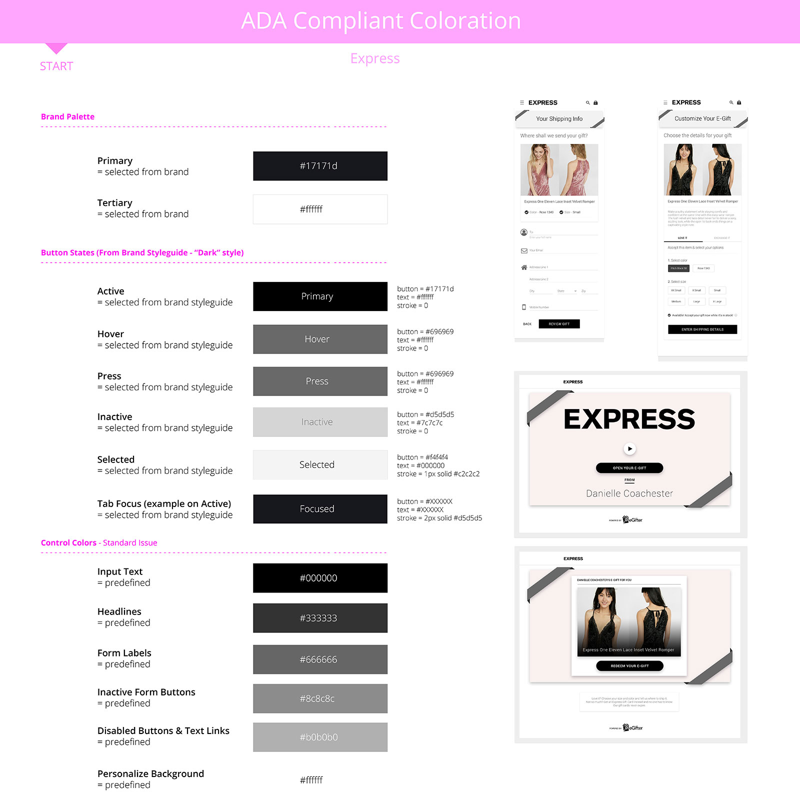
Now, to protect my team, clients, and fellow designers from themselves, I standardized and upheld strict, unwavering compliance guidelines at both the component and layout levels.
A Step Beyond
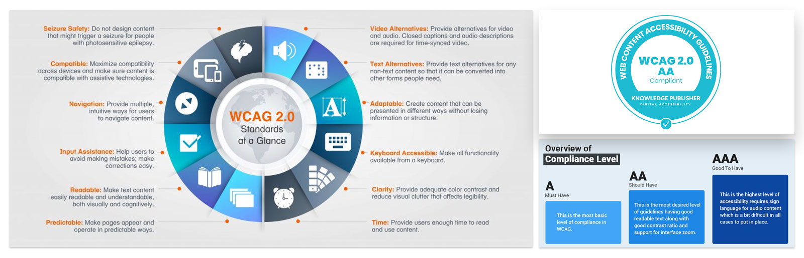
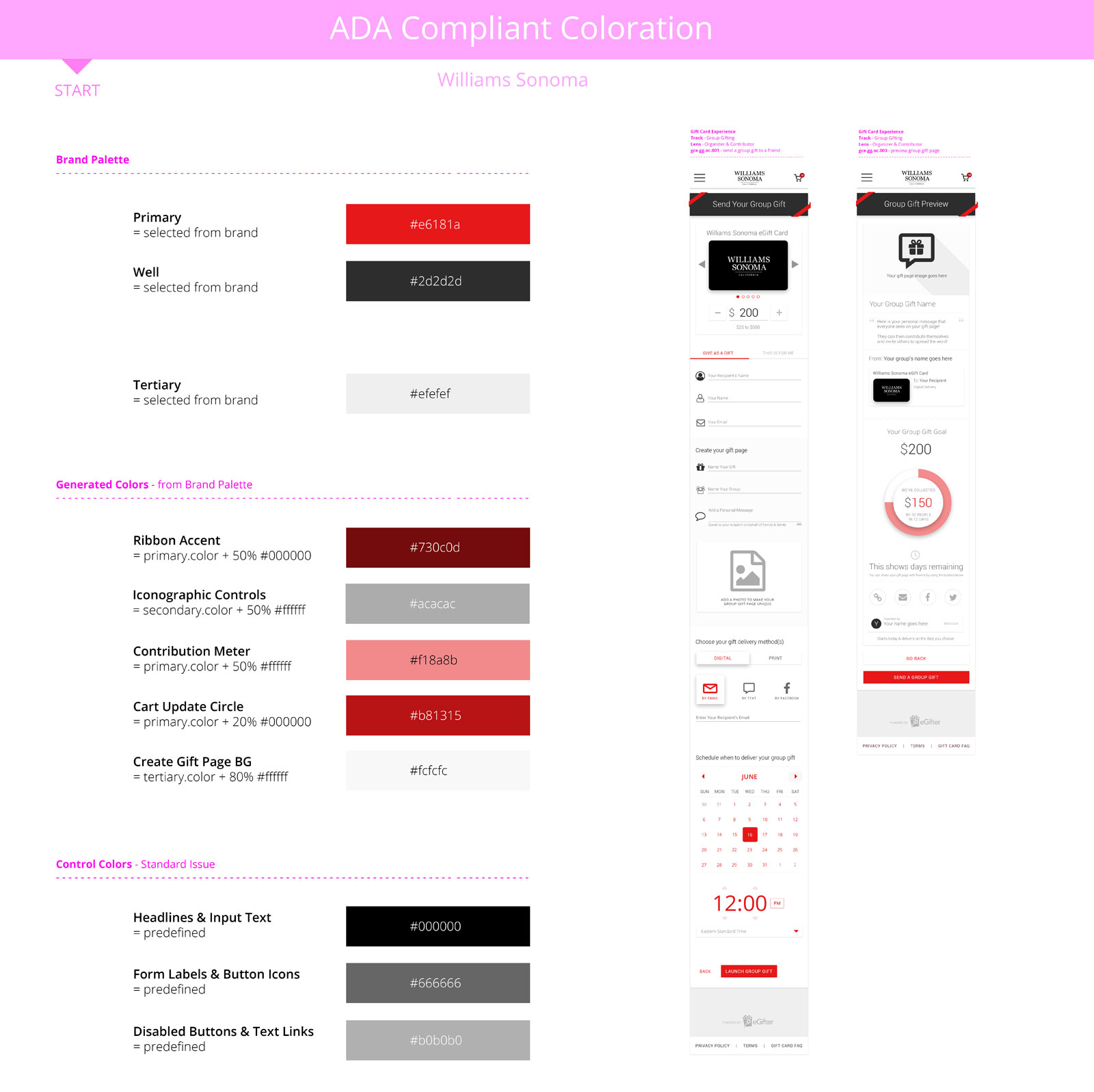
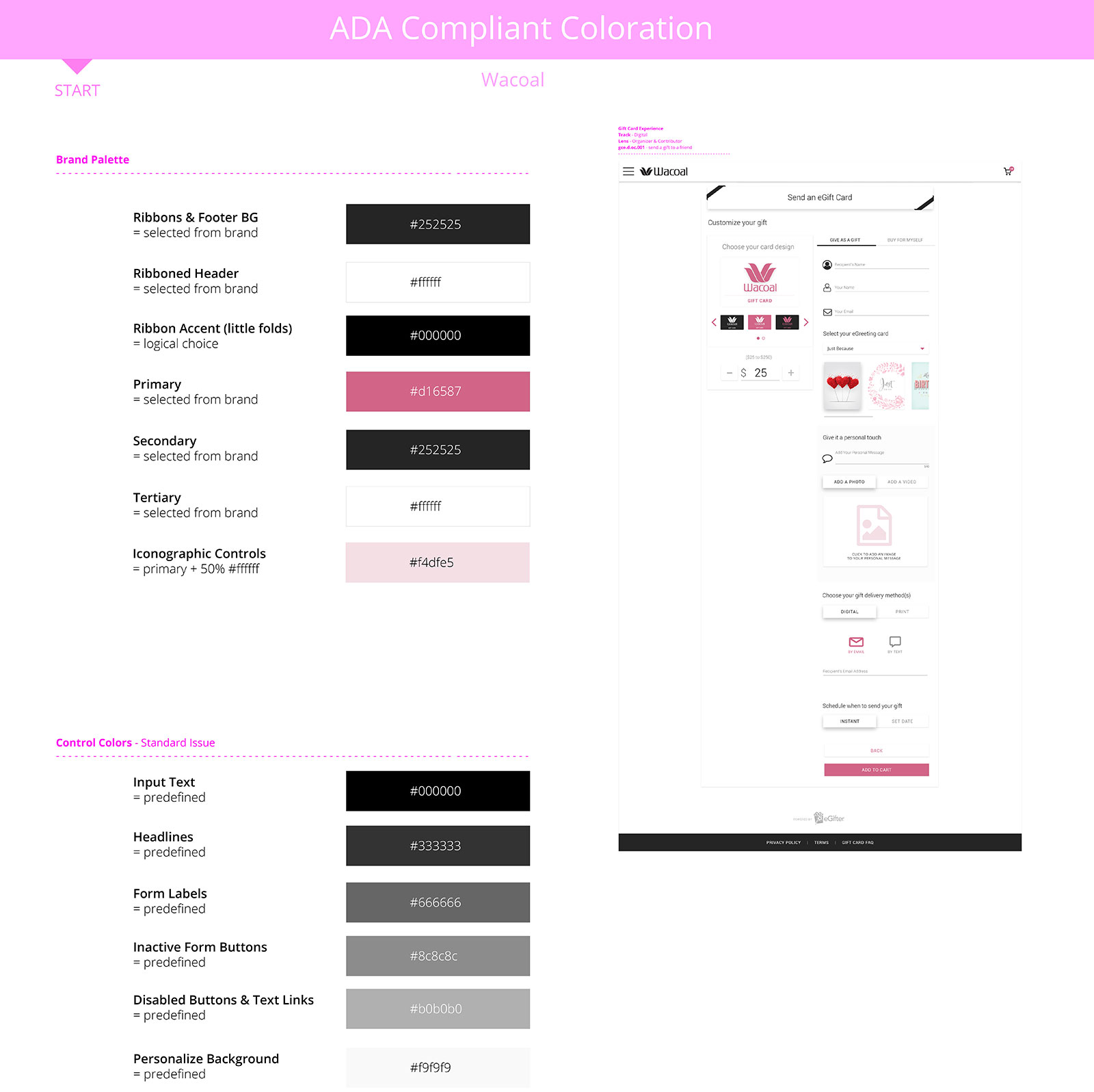
By weaving WCAG 2.0 Compliance Standards within every component, page, and palette, I ensured my designs would meet or exceed the strictest of requirements, achieving an excellent, bulletproof AA rating. This high level of compliance was a major requirement for clients such as Target, and then became a massive selling point for our technology to every client moving forward. Peace of mind is priceless, and they were glad to elevate their game to our premium.
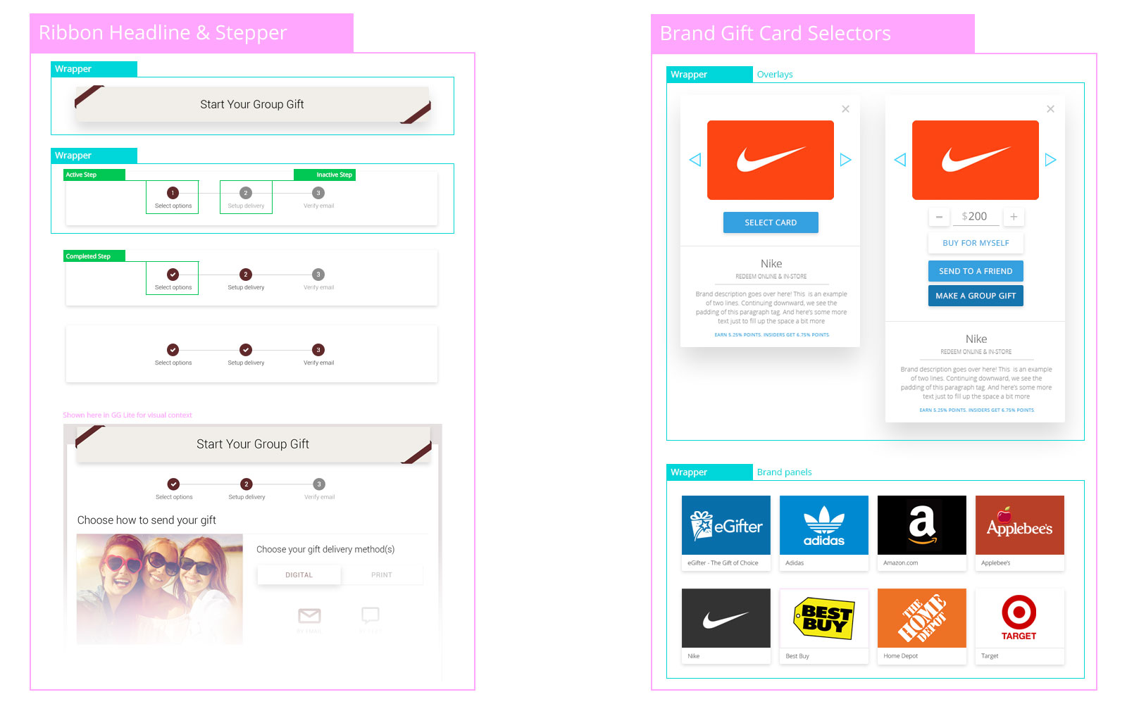
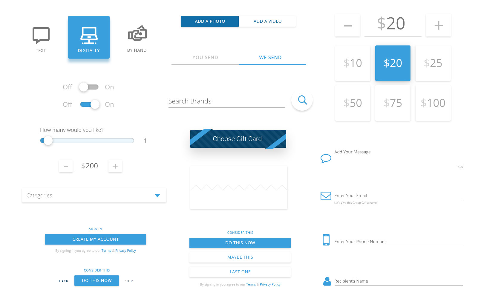
Atoms to Molecules to Flows
Taking a bottom-up approach with quality baked in at the atomic level, every layer up the complexity chain would inherit all benefits from parts further down the chain.
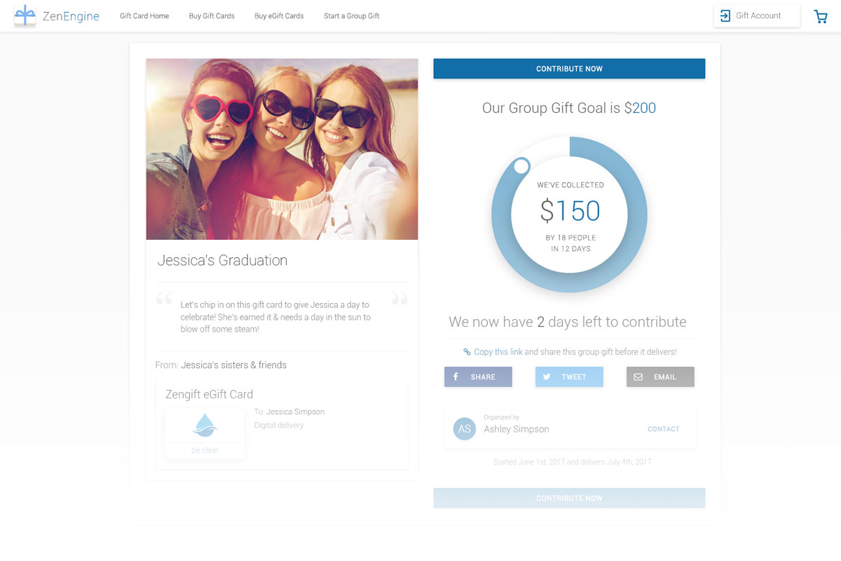
We had tight time constraints, so designing repeatable and efficient pieces was critical. My Gift Card Experience v.2.0 design was strong enough to thrill Einstein Bagels, Panera Bread, and National Amusements, plus it earned us the room to build more platform features. Yet we could do better.
Now that I had bought us time and resources with my aforementioned solution, I had the bandwidth to design our higher end.
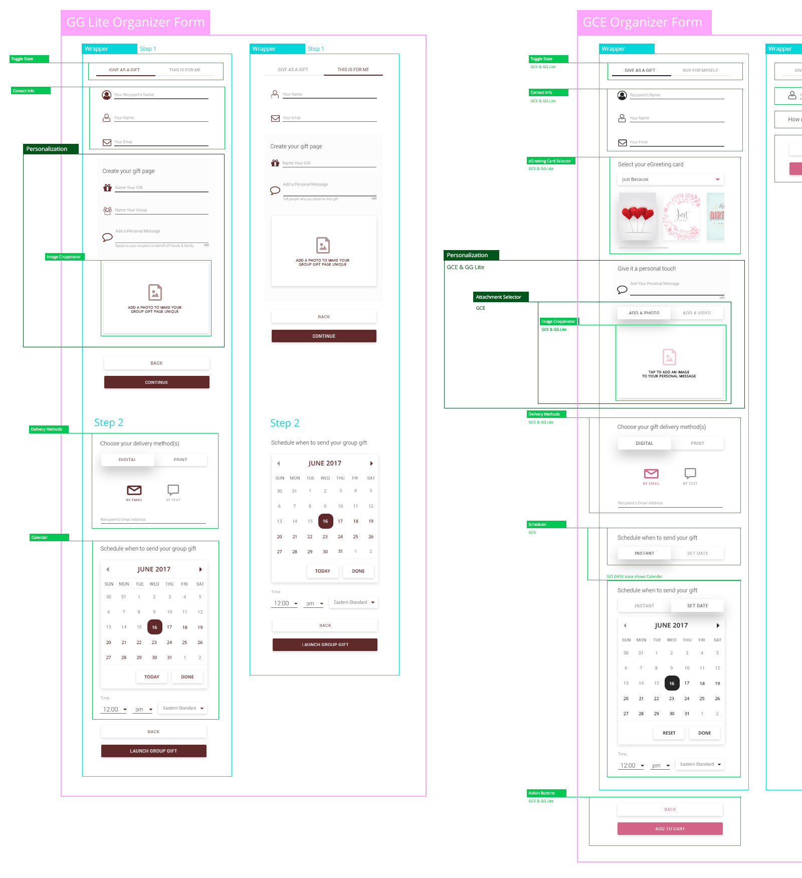
Handling Variants
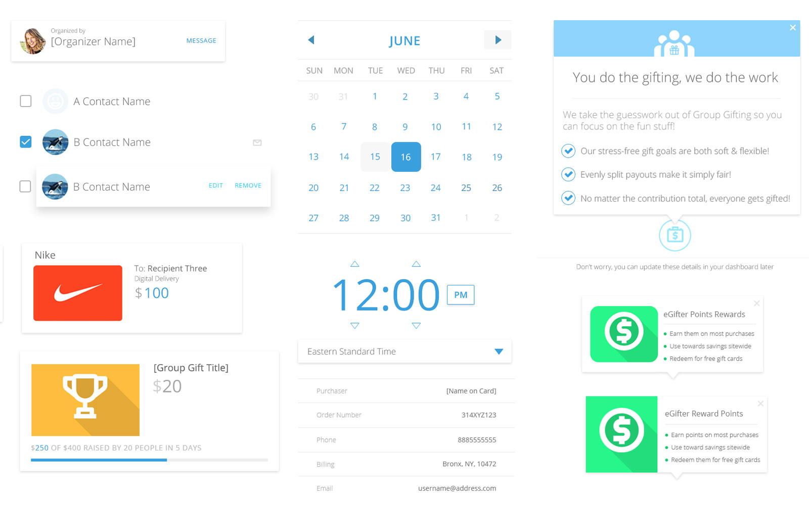
Many products had variations given context, user entry points, client requests and so forth. Thus, the request was to define which elements and components went into each of those flavors. Naturally, Engineering and Development found these definitions useful to ensure we’re capturing all the right user data in their appropriate subproducts.
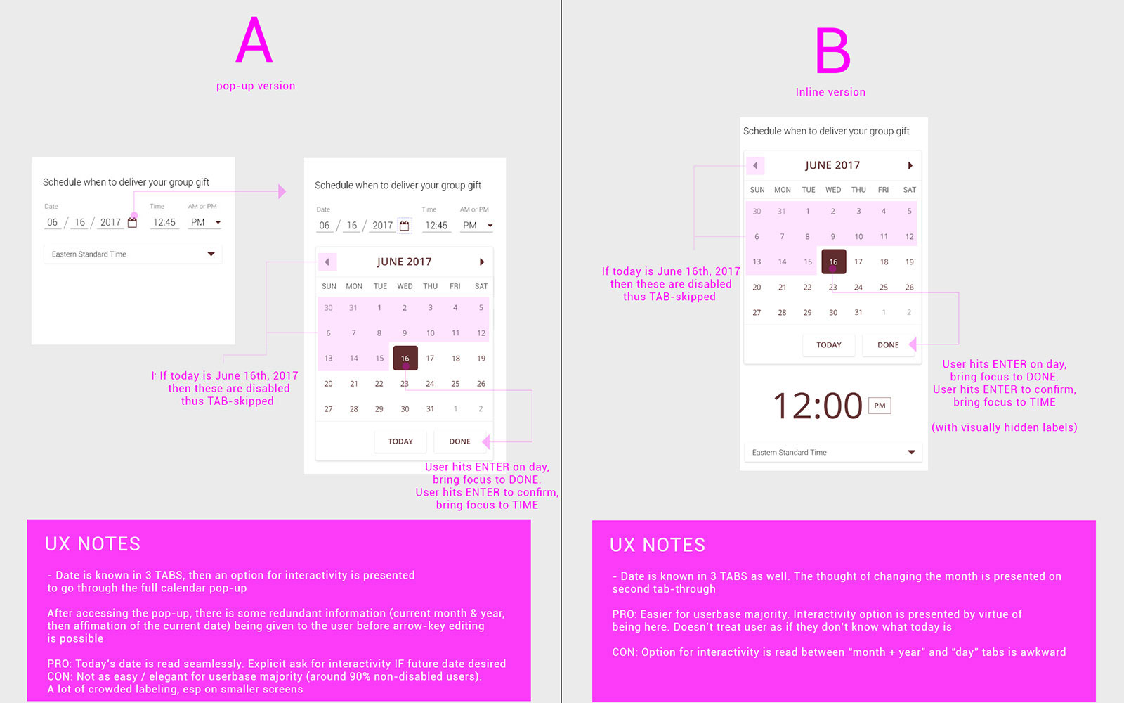
Balancing Trades
There are always trade-offs to consider. When deciding whether we should have a specific component be either A or B, an analysis proved useful for discourse. This was important to decide upon before we repeated the component hundreds of times across scores of products. We were a little beyond "global search and replace" h4xX0rz at this point.
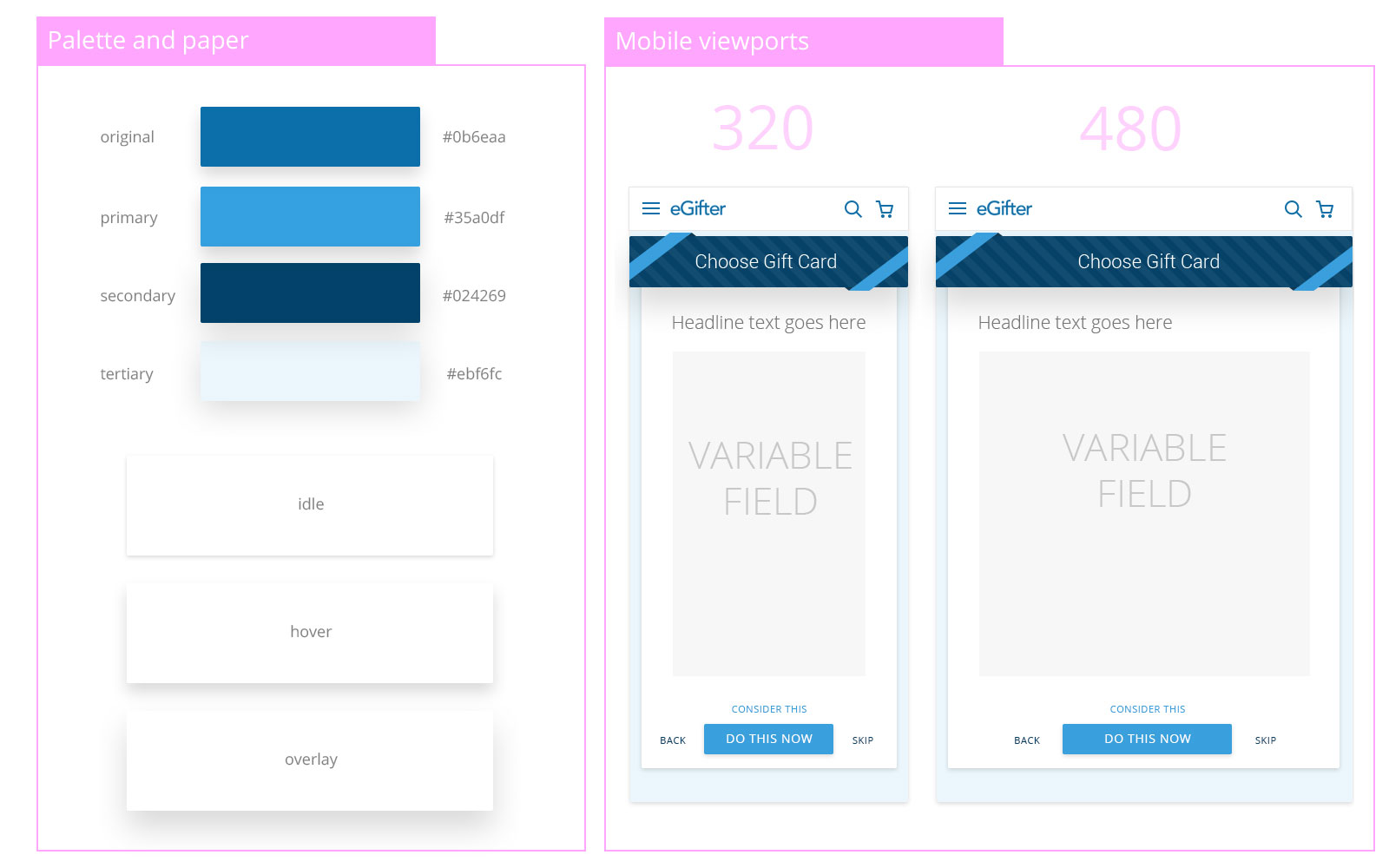
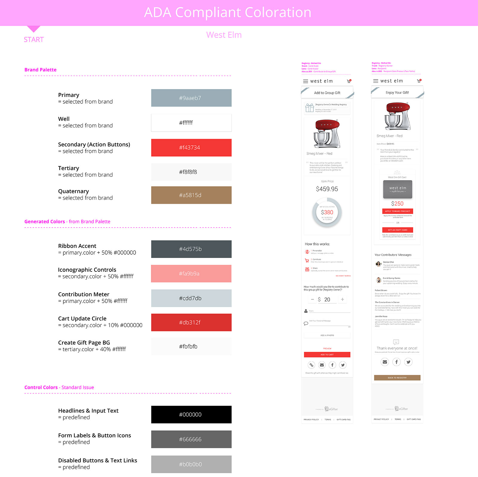
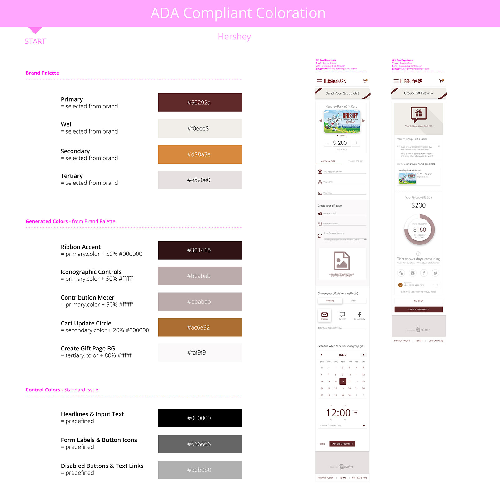
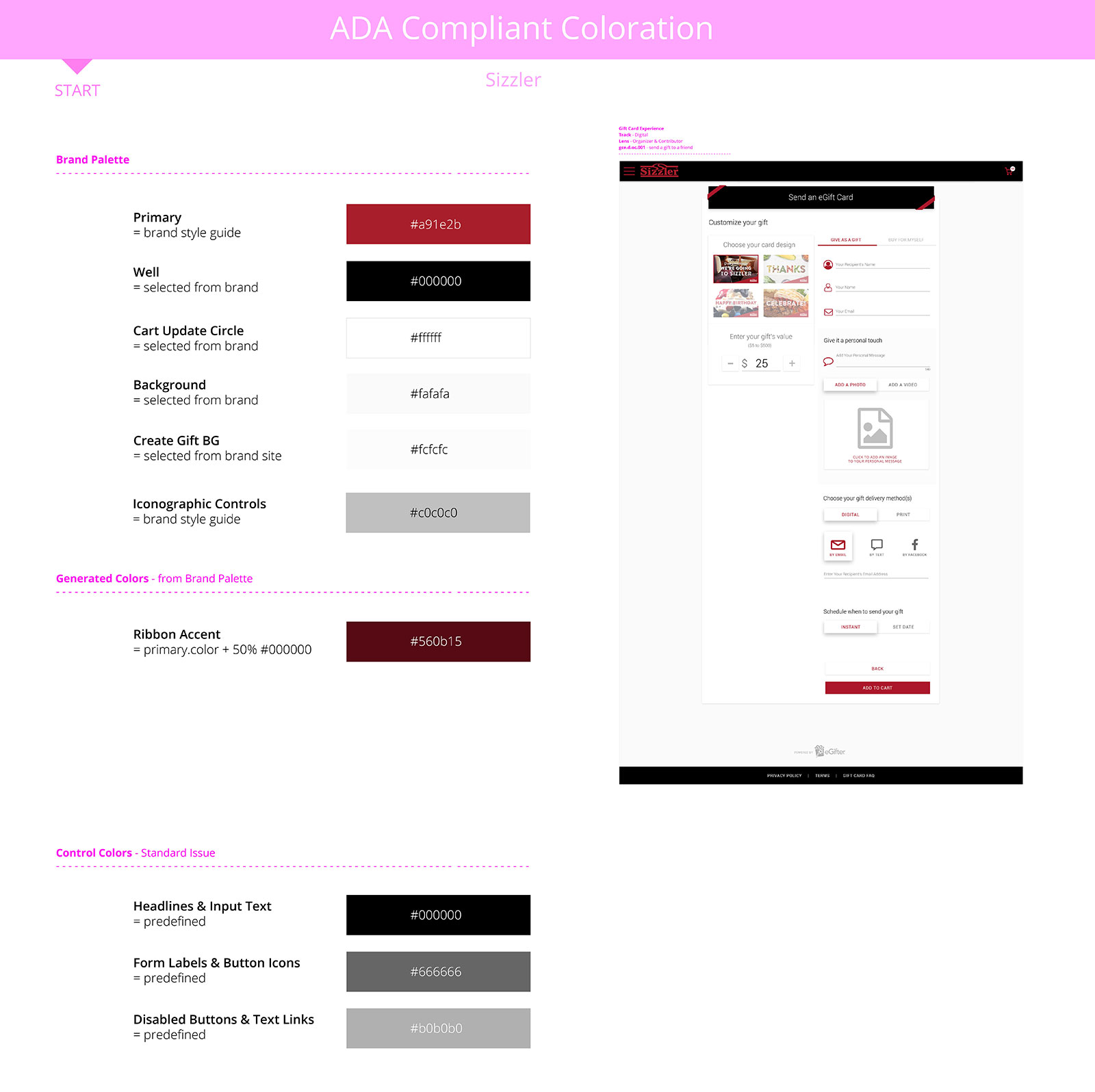
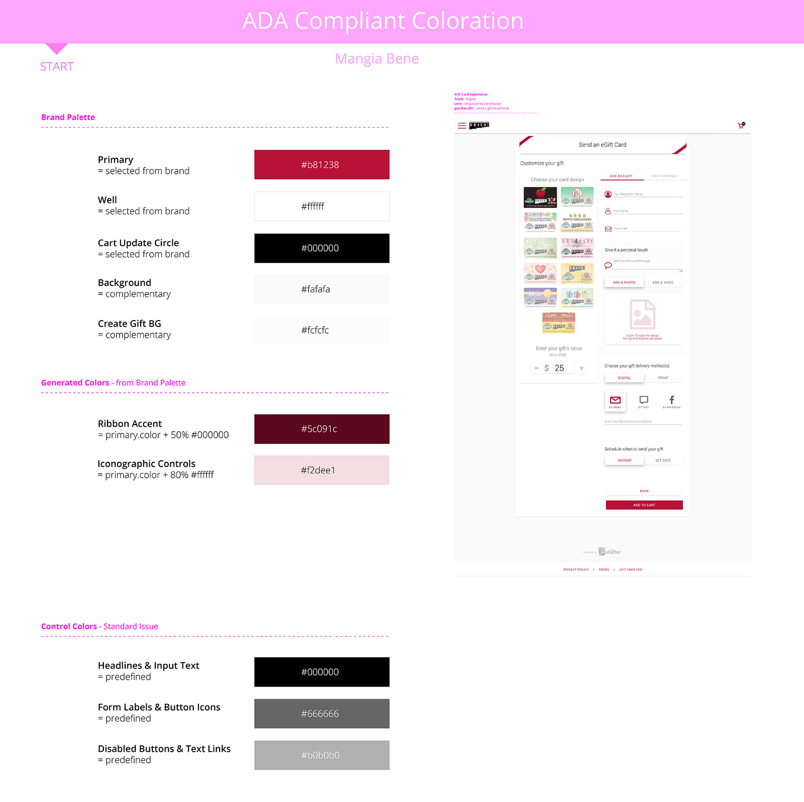
Defining Palettes and Pieces
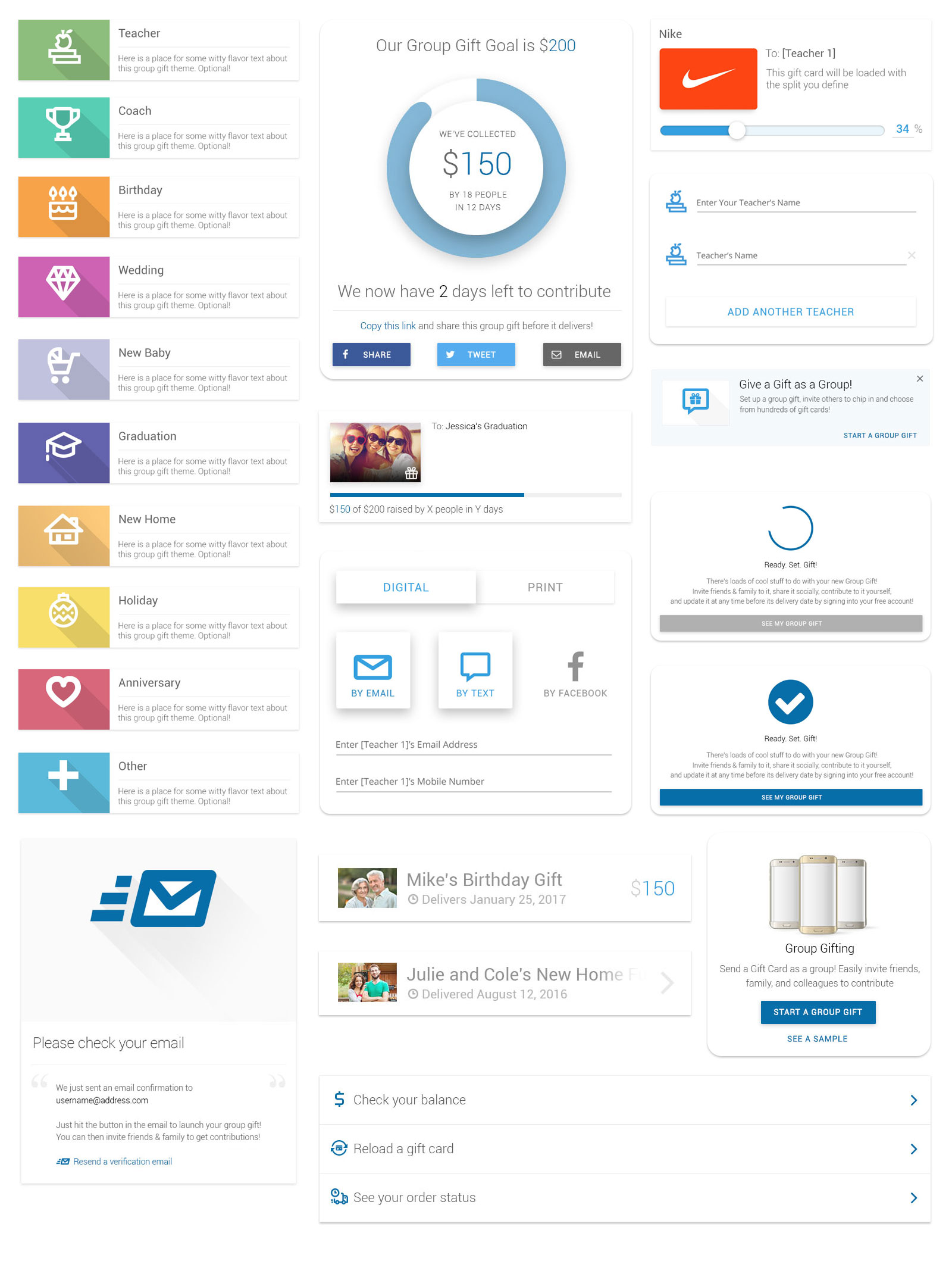
Advanced Components
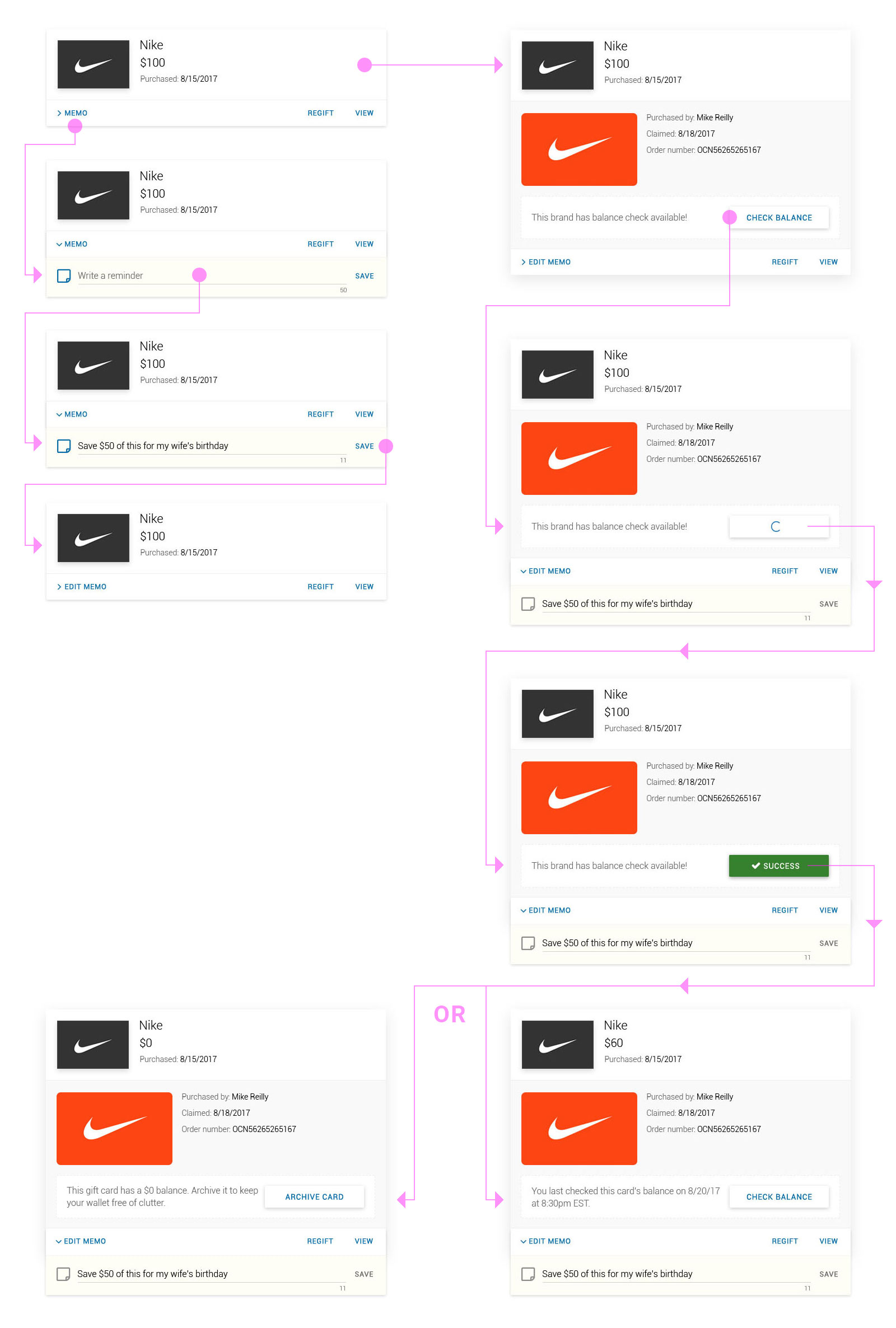
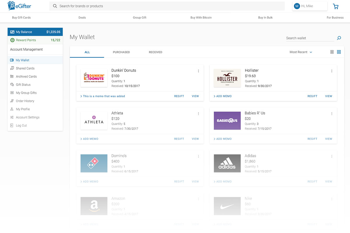
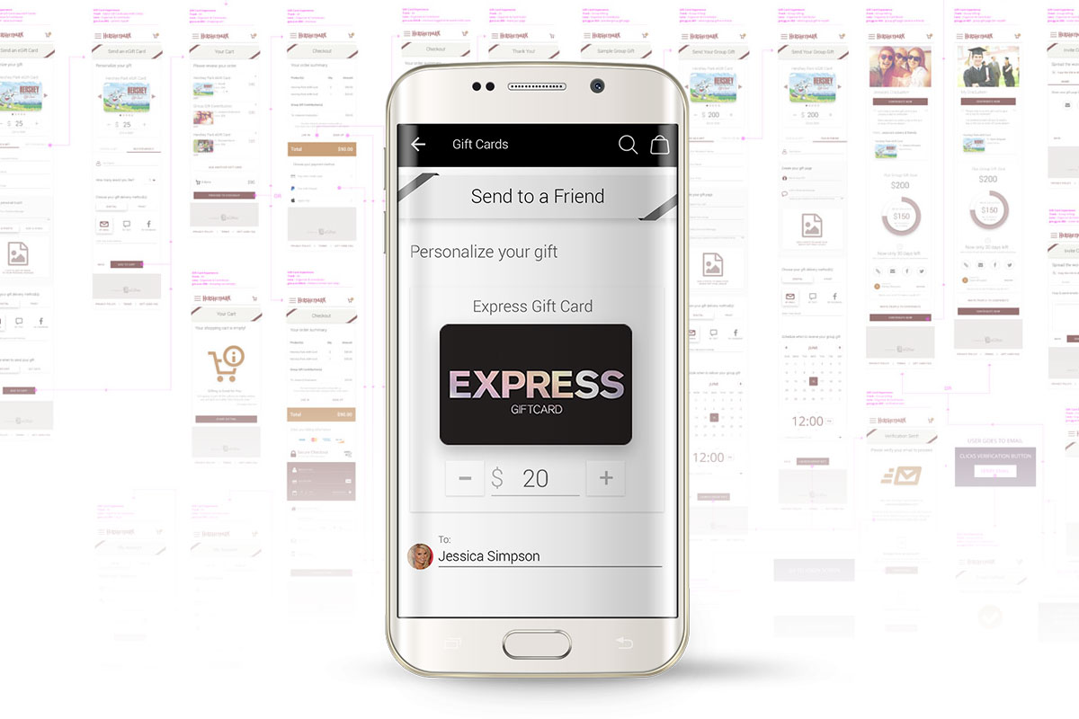
Fulfilling requests often required more in-depth design, both in schematics and prototypes. Here you can see one sample of my design process for an advanced component we used in The Digital Wallet, which allows users to write memos and check balances to any gift card they have.
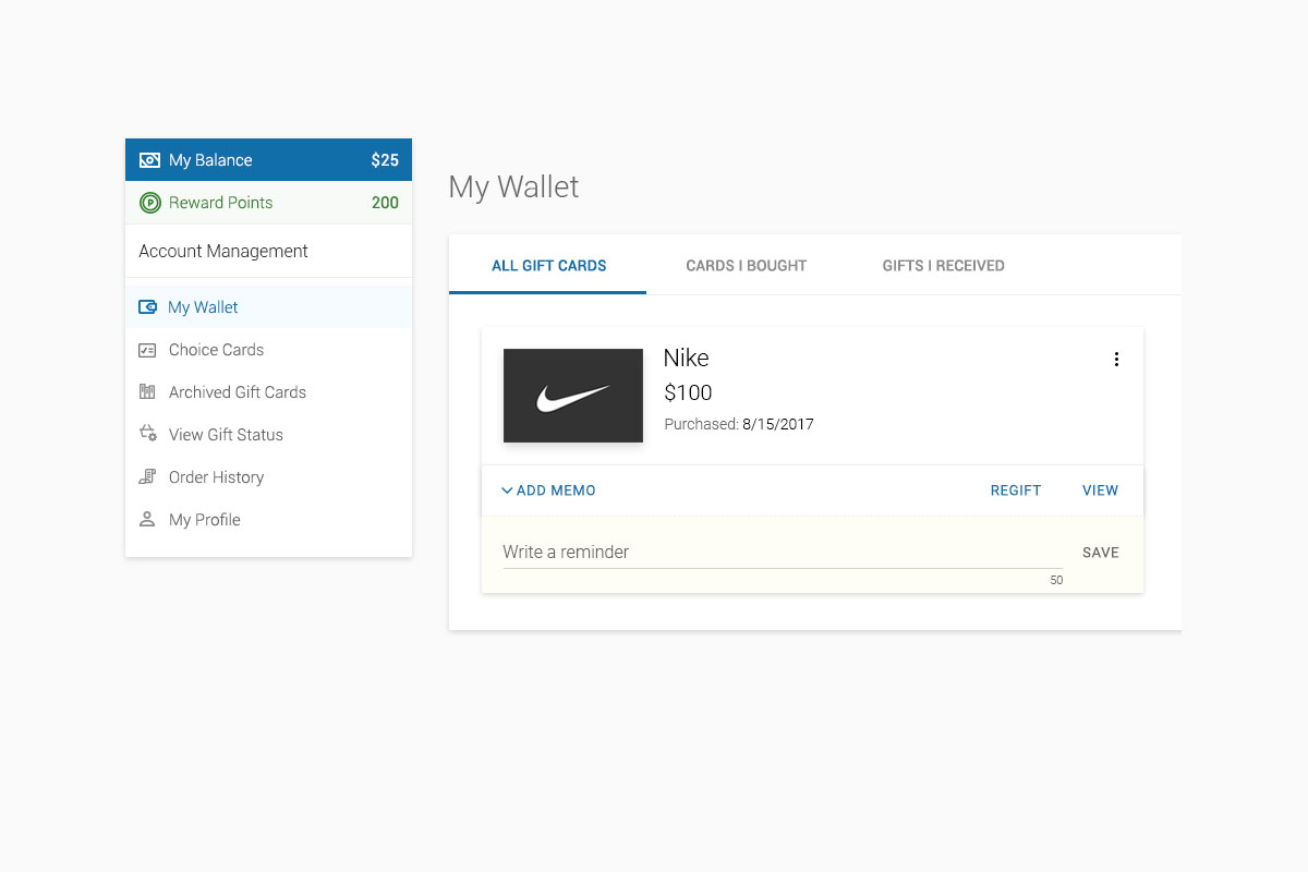
Custom Memo
Users frequently requested the ability to write, save, and edit memos to each of their gift cards. So it is.
Play Prototype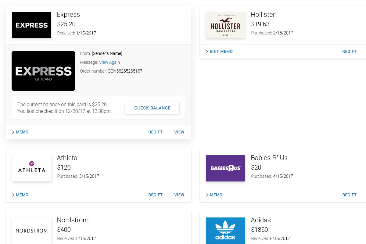
Balance Check
Another highly requested feature was updating card balances. Each brand handled this differently on their end, yet I designed all cases similarly on ours
Play PrototypeSnapping It All Together
Creating such a streamlined design system allowed us to spin up new brand implementations and solution instances at incredible efficiency. Once a new brand came in, I simply selected their ADA Compliant color palette, created a few assets, then handed it off to Development. Our developers would then apply my values to their CSS variables... and boom, we're done.
Dive Deeper
Flow further along this current to see more cases


Estée Lauder Product Redesign
Defining The Standard for all critical internal applications
View Project